We helped make an exclusive members’ club the place to be
Audley Travel
- Logo design
- Brand naming
- Visual identity
- Motion & video
- Print design
Audley Travel creates tailor-made, experiential journeys across more than 80 incredible places worldwide. Each trip is personally designed by a destination specialist with first-hand experience and unrivalled local knowledge. With a focus on authentic, culturally rich, and responsible travel, Audley helps clients discover the world in ways that are as individual as they are. We worked with them to create the identity for their new agent members’ club that was as distinctive as their offering.
A New Direction of Travel
Audley Travel were closing the door on a previous loyalty scheme that had served them and their travel professional partners well but it wasn’t without its issues. The time was right for a change. This new B2B agent members’ club was to focus on the individual, recognising for their hard work and loyalty to the brand, offering exclusive, bespoke rewards, incentives, and experiences Individual agents. This new programme had reflect the Audley brand. Loyalty programmes are common; Audley’s shouldn’t be.
It’s All in the Name
The first task on the agenda was a new name. Working with the trade marketing team, with buy-in from the brand team, too, we workshopped a series of potential new names for the programme that had to feel ‘Audley’ as well as exude a sense of exclusivity and scarcity. This was to be an invite-only programme, and a sense of unattainability – in an aspirational way – was a key aspect. Kindred – a name that was both inclusive and exclusive – ticked every box.
By Invitation Only
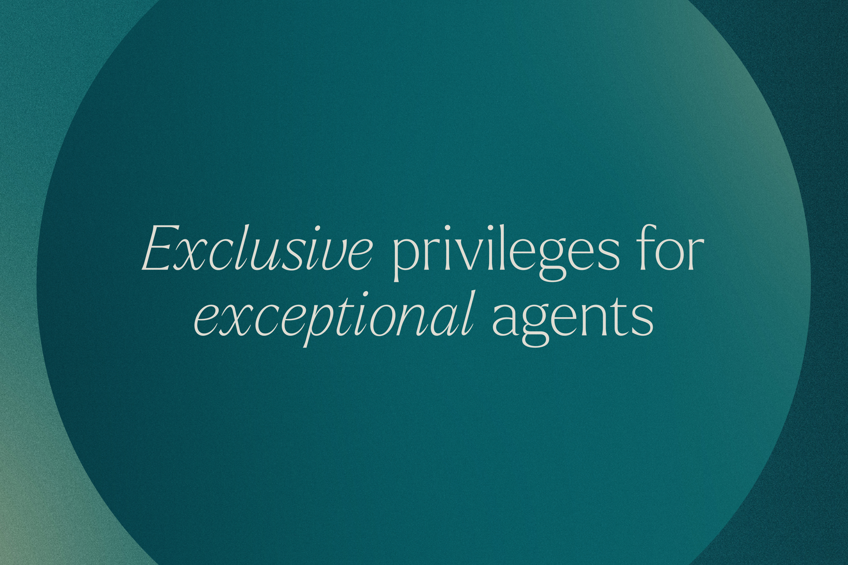
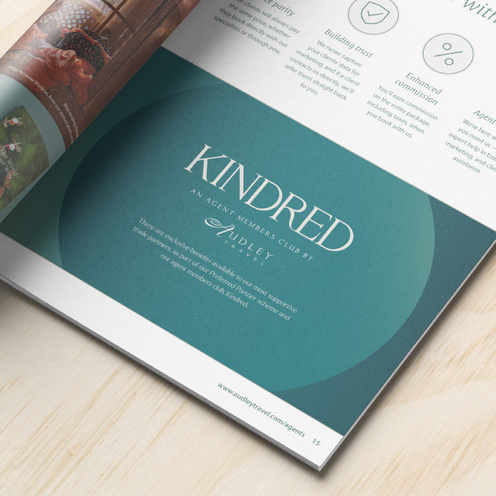
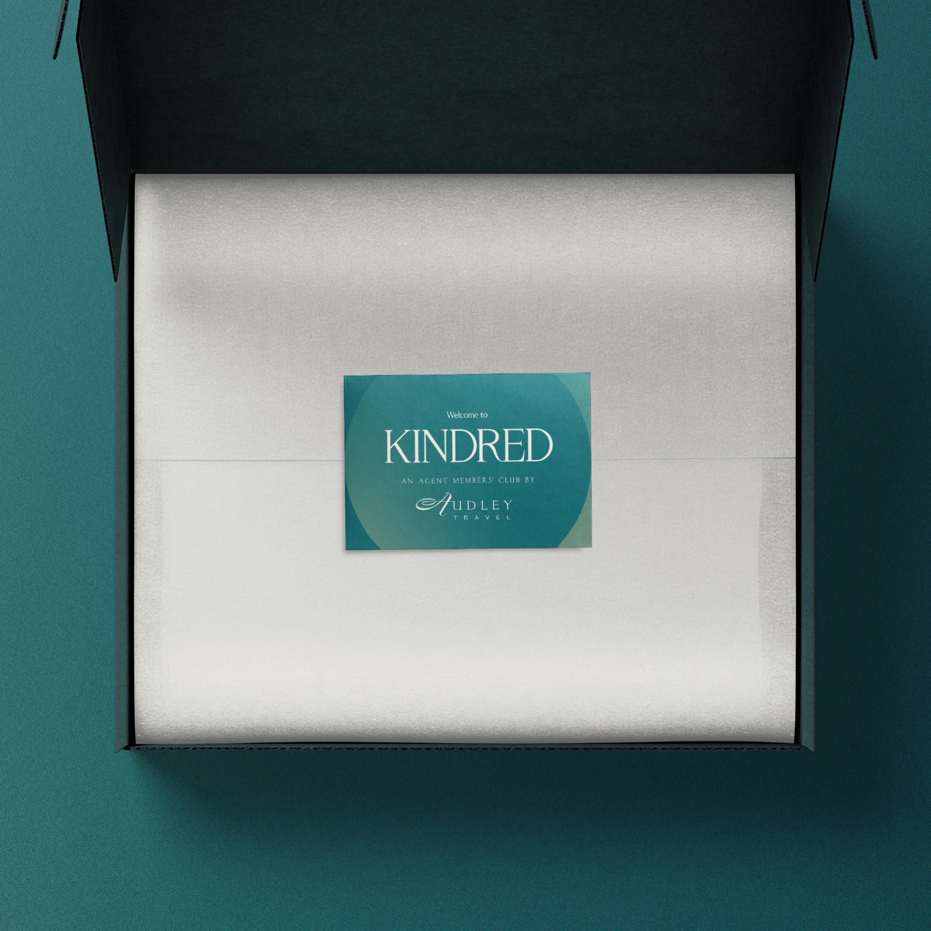
The brand’s key signature device was a simple circle – nodding at the idea of ‘inner circle’ – that flexed and adapted to hold messaging and imagery, coming to life in beautiful, luxurious-feeling motion design and animation. Underpinning everything was a deeper, richer shade of the Audley core brand colour, keeping it close to the main brand while giving Kindred it’s own distinct look

Brand Evolution
Kindred has been created especially for Audley’s inner circle; a select group of their most valued travel agents. This manifested in the simple shape of a circle, which became the foundation of the identity. Working through a series of creative directions and territories, the deep green colour scheme ultimately stood out. It was traditional yet luxurious, sophisticated yet welcoming.
Just Our Type
The Kindred logo is set in a refined, sophisticated serif with a simple ‘R’ and ‘E’ ligature further expressing the idea of connection.
Badge of Honour
Additional brand elements that further added to the sense of luxury included a KNDRD emblem (inspired by luxury fashion) and individually-numbered members’ badges.

Spreading the Word
In addition to the logo, we also designed a KNDRD badge that embodies the club’s sense of prestige, acting as an emblematic shorthand for the identity. Audley were drawn to the idea of modern heraldry, a visual language that conveys tradition, honour, and exclusivity. The emblem builds on this concept, blending classic symbolism with a contemporary aesthetic that feels timeless. An additional brand asset we created was individually numbered members’ badges, which further added to the sense of personal connection.

