Back
Case study
Helping tackle discrimination in the workplace
Our Reality
what we did
- Logo design
- Visual identity
- Workshop templates
- Information pack
- Asset toolkit
- Social templates
- Posters
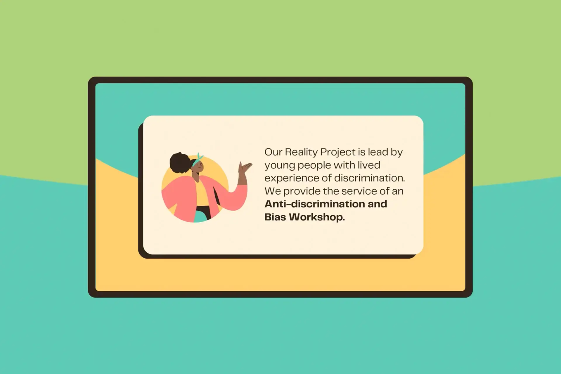
Our Reality Project is led by young people with lived experience of discrimination. Keen to raise awareness and help others, they identified the need for interactive, informative, and empowering workshops that encouraged discussion and tackled discrimination and bias in the workplace.
Time for change
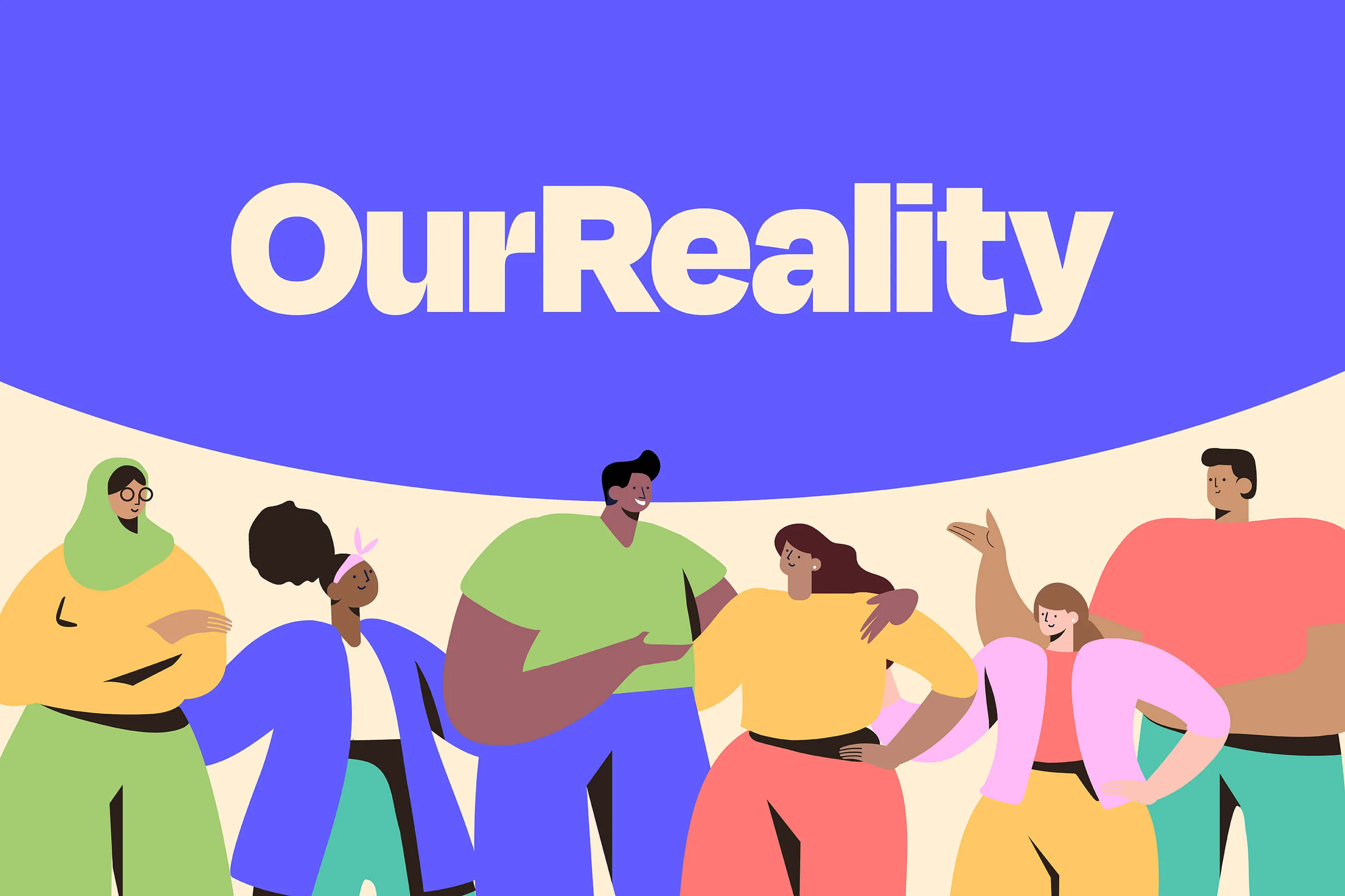
Although the rationale behind Our Reality’s existing visual identity was strong, there were some issues. Their palette used different shades of brown to show racial diversity, but they felt it didn’t reflect their youthfulness or passion for the project. They wanted a brand identity that was flexible, professional, not overly business-like but still retained the link to diversity.
Power to the people
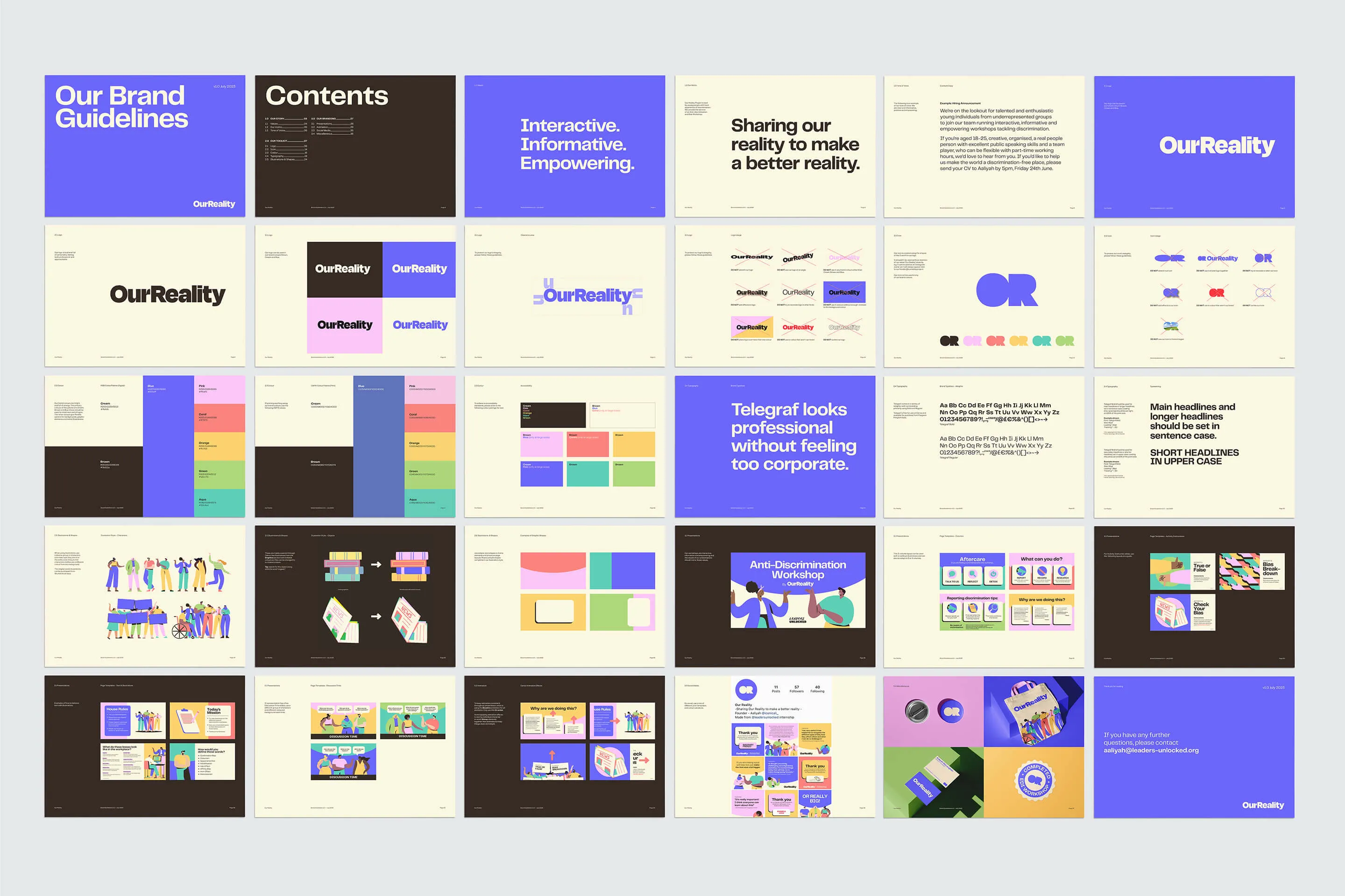
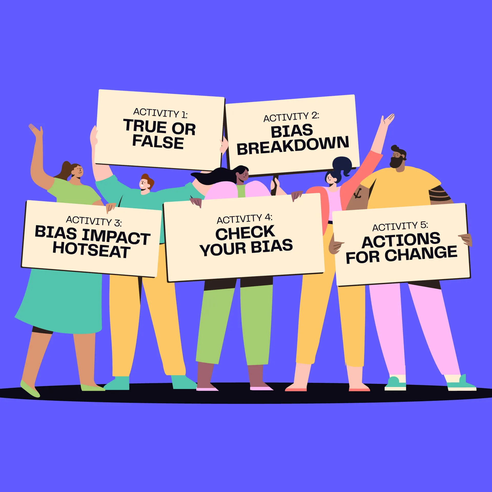
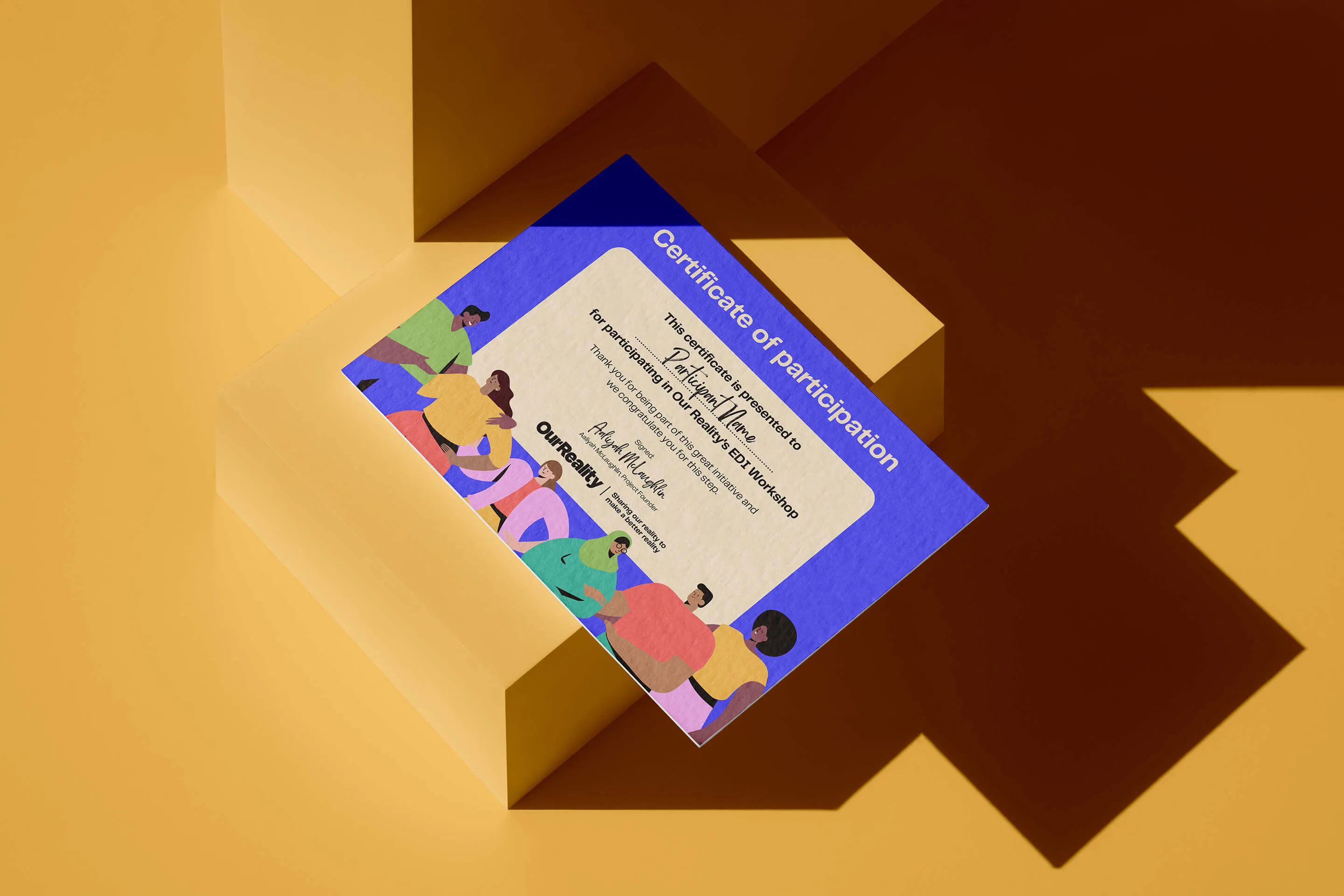
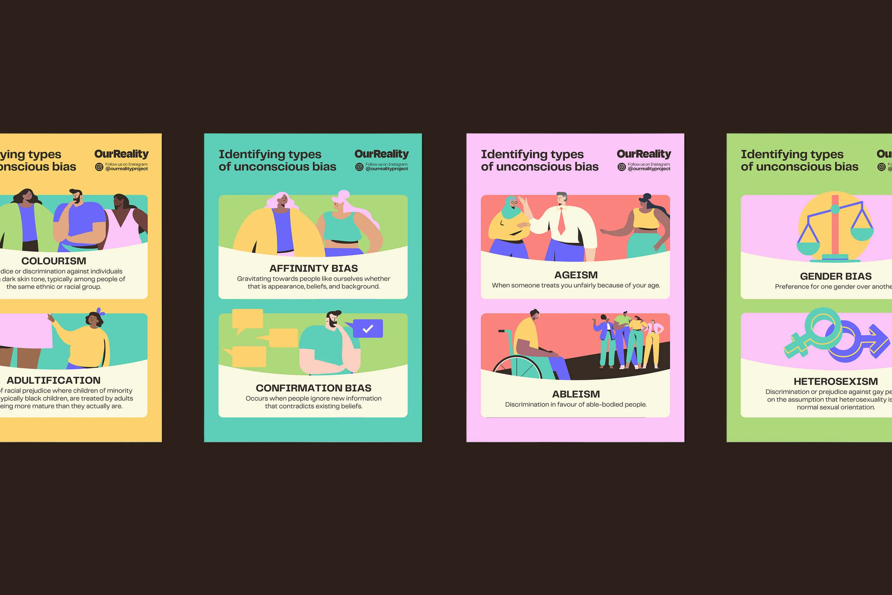
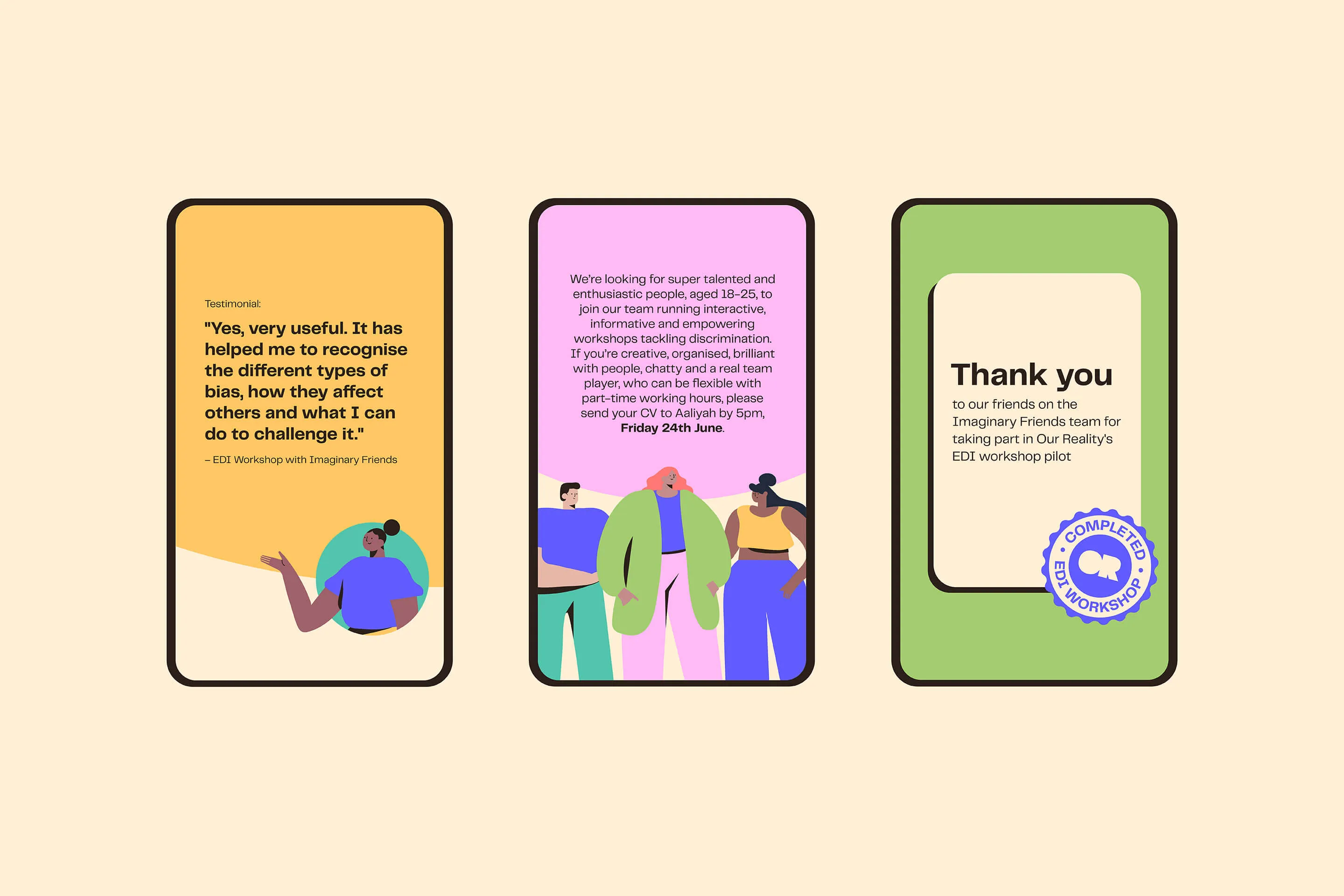
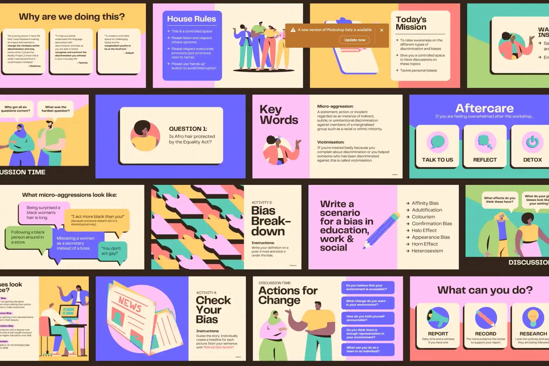
People are at the heart of everything Our Reality does, so we introduced bright and colourful illustrations of a wide range of characters. This injected loads of personality into the brand and ensured a consistent style that was clean, contemporary, and super friendly even in the hands of non-designers. A new palette of vibrant colours was underpinned by a deep brown and pale peach – rather than their existing black and white – to give the identity a softer overall feel. All of which created to fit with their brand tone of voice which was simple, informative, positive, and empowering.
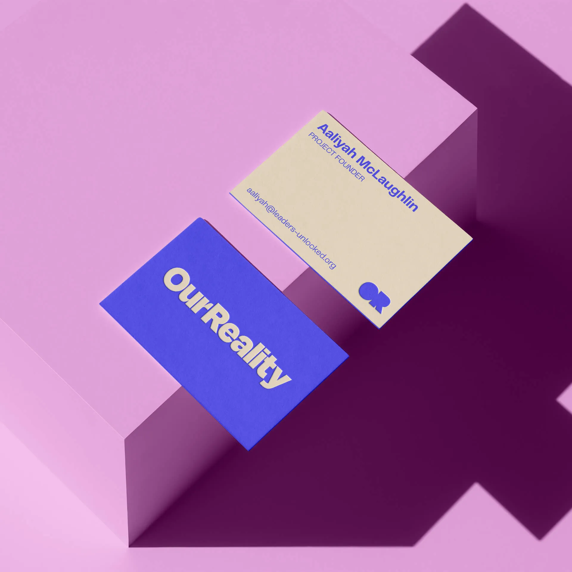
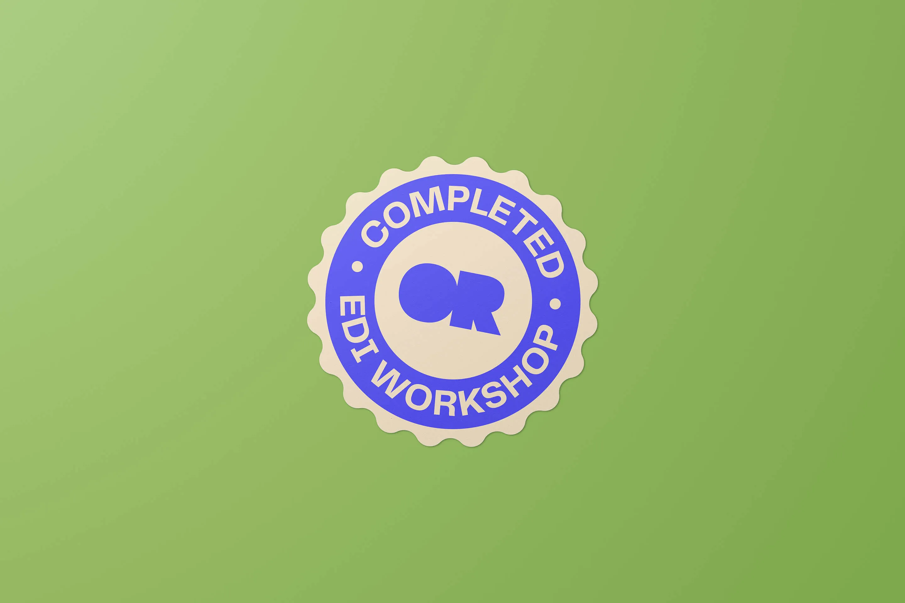
Their new logo is bold, full of character and, importantly, has an approachable feel to it too. We built a toolkit in Canva – perfect for non-designers to use – for Our Reality to work with going forward so our designs can easily be adapted for any future assets that will be required.
A Bright Future
Our client couldn’t have been happier with the end result, which encapsulated their positive and youthful essence while remaining coherent and professional. Armed with a wide-ranging toolkit with so many variations possible, Our Reality is going from strength to strength with their workshops. We can’t wait to see what’s next.
Travel
Royal Caribbean
Digital
Travel
ExperienceFirst
Brand
Tech
Vibe
Brand
Travel
Barrhead Travel
Campaigns
Non-profit
Playlist for Life
Brand
Manufacturing
Calfurn
Brand
Travel
Swan Hellenic
Brand
Non-profit
MCR Pathways
Digital
Education
ICS Learn
Tech