We helped a university show what it was made of
University of Stirling
- Campaign concepts
- Campaign development
- Multi-channel campaign toolkit
- Copywriting
- Video production
University of Stirling approached us to create a campaign focusing on the importance of place. When choosing a university, the location and surrounding area is a significant factor in the decision-making process. And while University of Stirling are lucky to have an award-winning campus, which is safe and green, and photographs beautifully, they were keen to develop content that looks beyond the campus to the experience that students can have while studying in Stirling, with its great links to cities around Scotland.
Our brief was to create a visual identity for this campaign. While University of Stirling were keen to develop a distinctive visual style for this campaign, with a device or graphic that can be used easily across all channels to easily mark content as part of the campaign – we had to be mindful of the existing University brand identity, ensuring that any designs fit alongside that parent brand and respect the existing brand guidelines and straplines.
The place to be
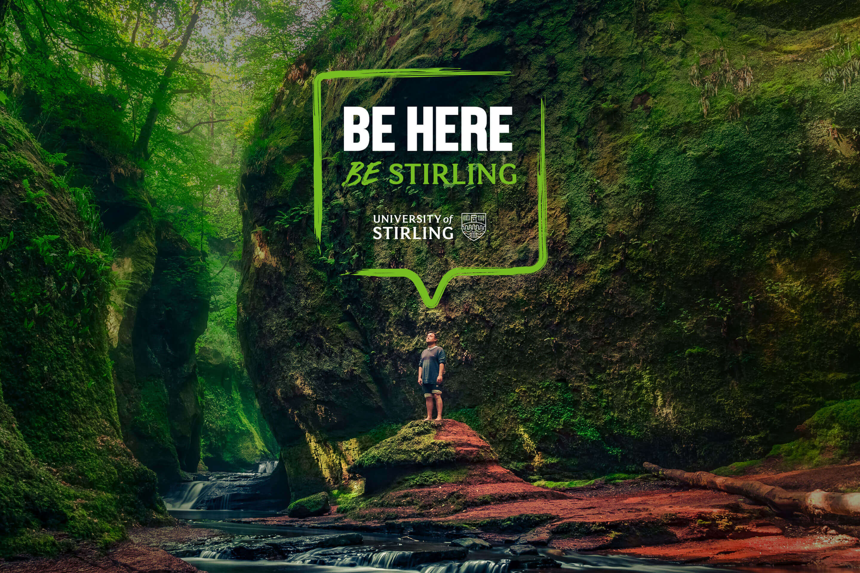
We created a campaign name which would sit at the heart of all our campaign material. This line was a direct link to the University of Stirling brand strapline ‘Be the difference’, while still offering a compelling message about place, and the importance of place when making decisions about University.
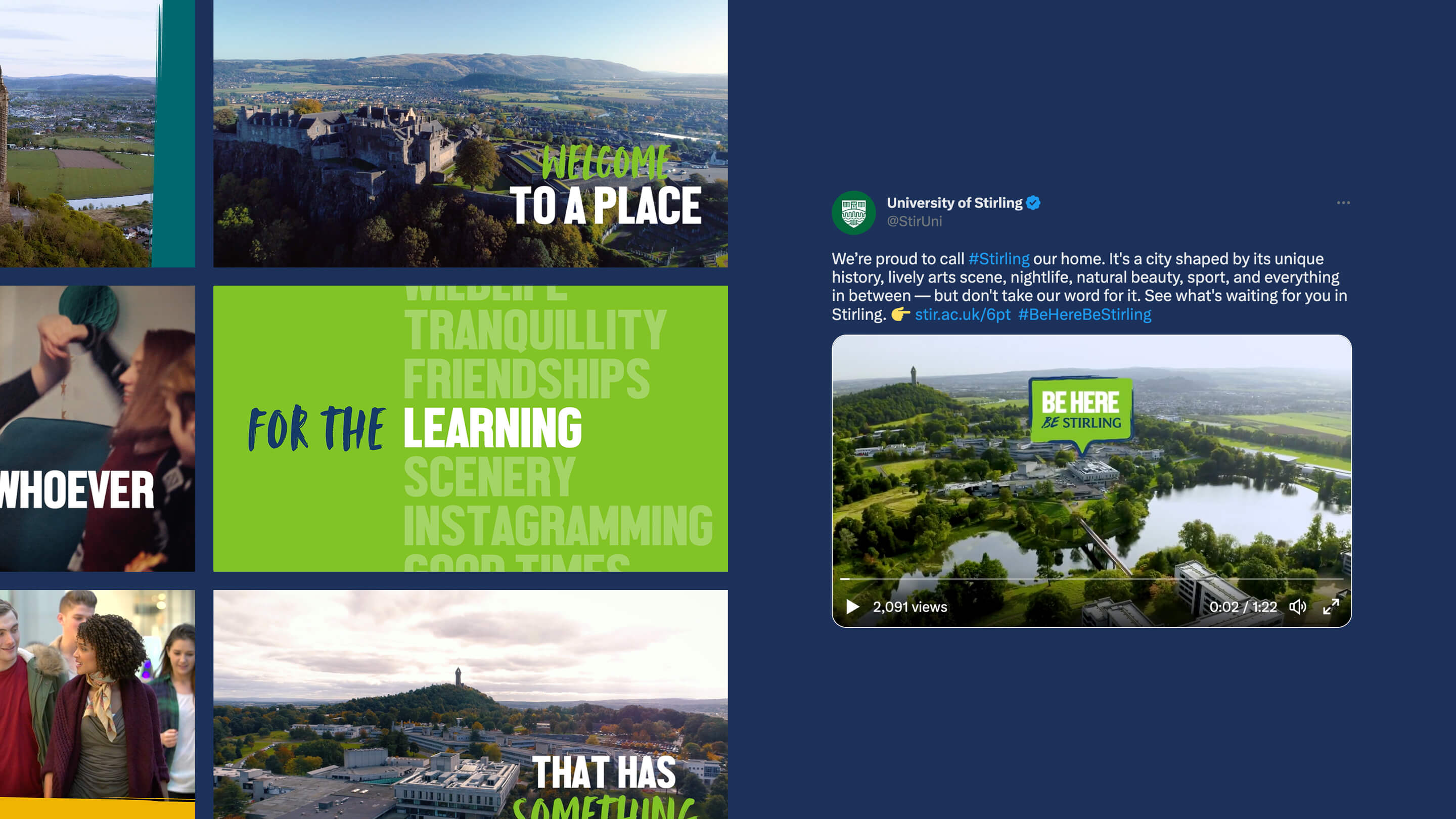
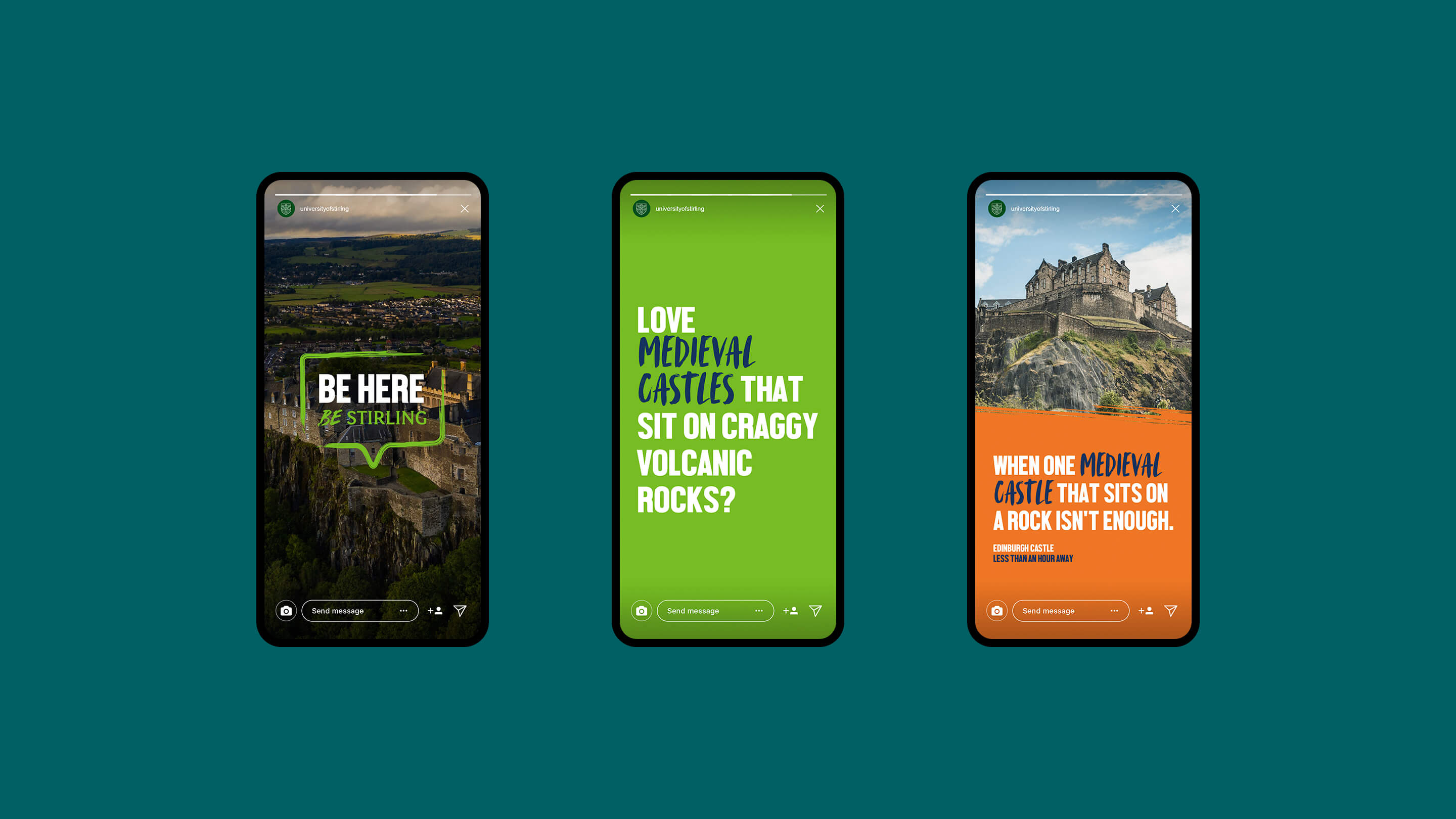
This ‘Be here’ message was then housed in a graphic device reminiscent of a map pin, that quite literally creates a pin-point within all hero imagery, putting the viewer right at the heart of that location. Hand-drawn to emphasise this campaign is all about the individual experience, this pin device can be used to highlight a focal point on the image, bringing colour and focus to a shot, and helping the audience imagine themselves in that particular – often beautiful – location. This device is also animated to add richness to imagery and video, or can be used to top and tail partner content.
A flexible identity
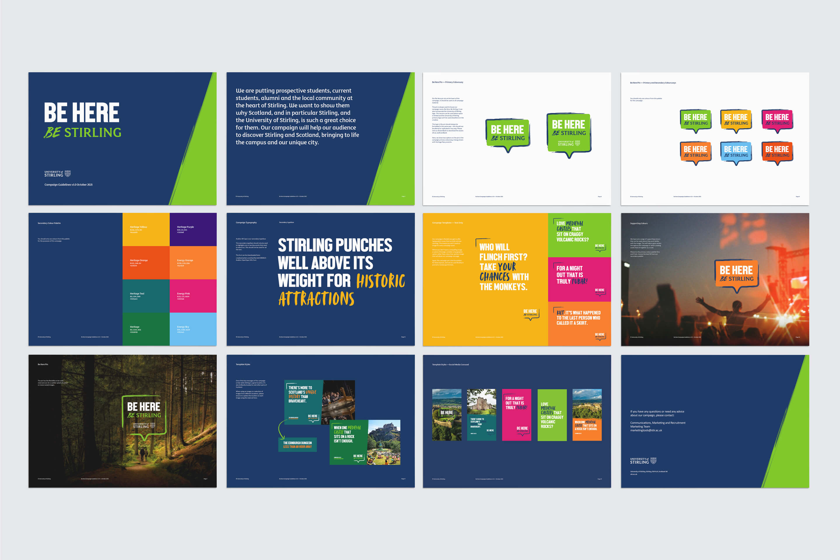
This incredibly flexible device can also be expanded to create a speech bubble around longer copy lines on typographic routes. This offered the client a lot of scope in terms of content – not every message would have an accompanying photograph, but it could still be clearly recognisable as part of the campaign.
The University has a very wide colour palette, and so we recommended the use of a smaller tighter colour range, chosen from the brighter colours already part of the brand guidelines.
Typeface choice also had to link to the parent brand, where we created a partnership between the main University brand font and a more distinctive handwritten font which had been used sparingly elsewhere but was perfect to further emphasise the human touch needed for this campaign.
A joined-up campaign
All of this resulted in a warm, welcoming, and – importantly – distinctive campaign visual identity that was also easy for the client’s in-house team to implement across a range of channels and materials. We created a range of templates and animations that we then shared with the client and their in-house team, including social templates for stories and posts to host a variety of different content types.
Following on from this campaign style, we created a campaign launch video and an edit for TikTok. Our campaign video has so far reached 2.5 million views on YouTube, and the flexible campaign style we created is still in use for student tours and vlogs that highlight the importance of place for the University.
2.5 million
views on YouTube
