Back
Case study
A campaign that got a bit weird (in a good way)
Air New Zealand
what we did
- Strategy and planning
- Campaign creative and roll-out
- Campaign development
- Microsite design and build
- Digital tools – design and build of random fact generator
Air New Zealand have been flying London to LA for over 35 years, but their audience generally only associate them with their New Zealand routes. They needed a way to counter the perception. Deciding the answer was a high impact above-the-line campaign, we created a bold and playful copy-based concept, with a host of outdoor and online media as well as a random fact generator for the campaign landing page.
Unknown quantity
Air New Zealand have been in the skies for almost 80 years, and as well as transporting passengers to and from New Zealand, they’ve also been running the Los Angeles to London route for over 35 years. Problem was, many people didn’t realise it.
LA story
The airline wanted to find a way to increase awareness of their LA route. And not only that, but at the same time to demonstrate that Air New Zealand offered a premium product worth switching to. Anything we did would need to sit under the banner of their brand positioning: ‘a better way to fly’.
A fact-finding mission
Since Air New Zealand’s brand tone of voice is playful and straightforward, we resolved to tackle the lack of awareness head on. We decided they needed a high impact above-the-line campaign that would take their target audience from awareness, to consideration, to conversion in less than three months.
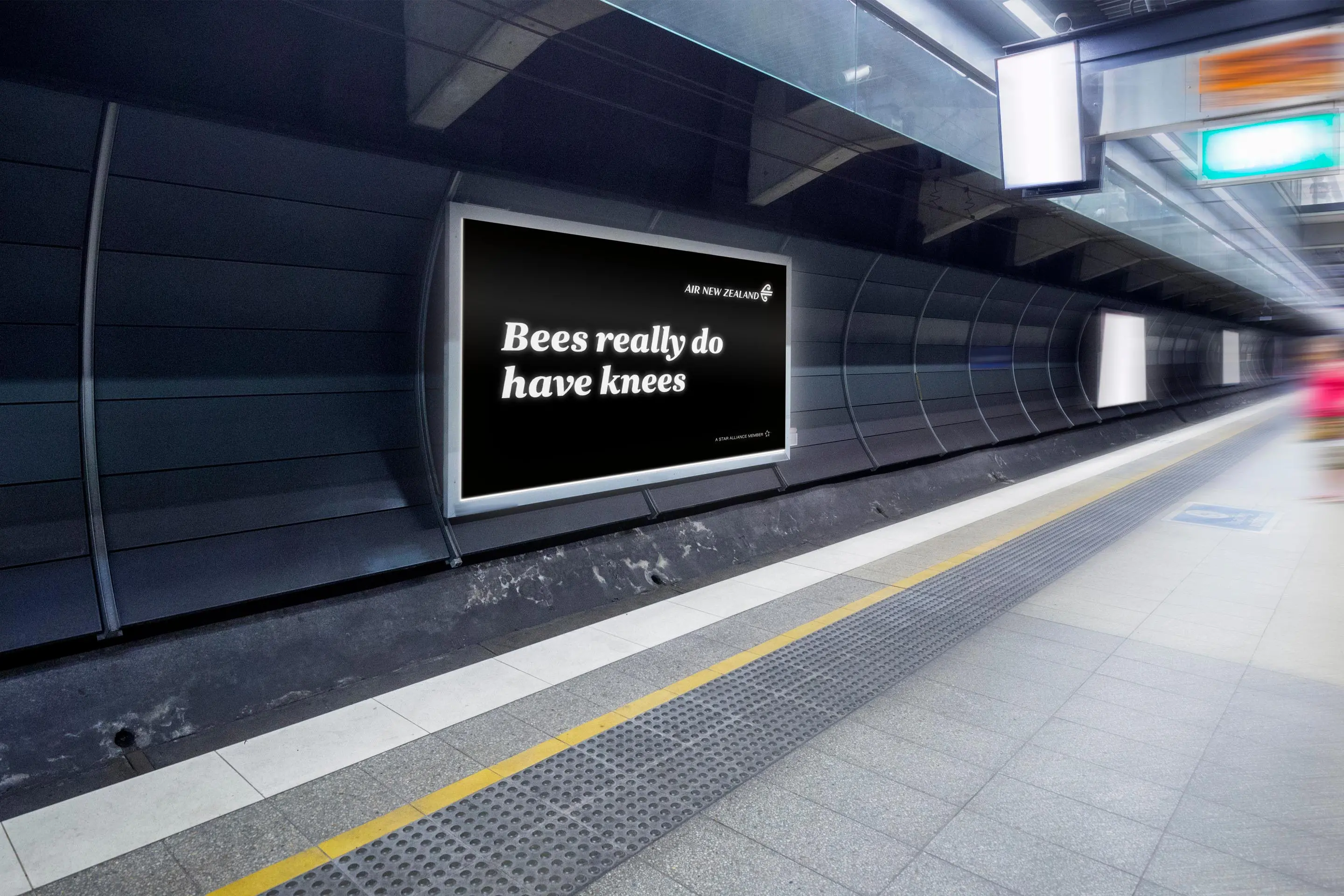
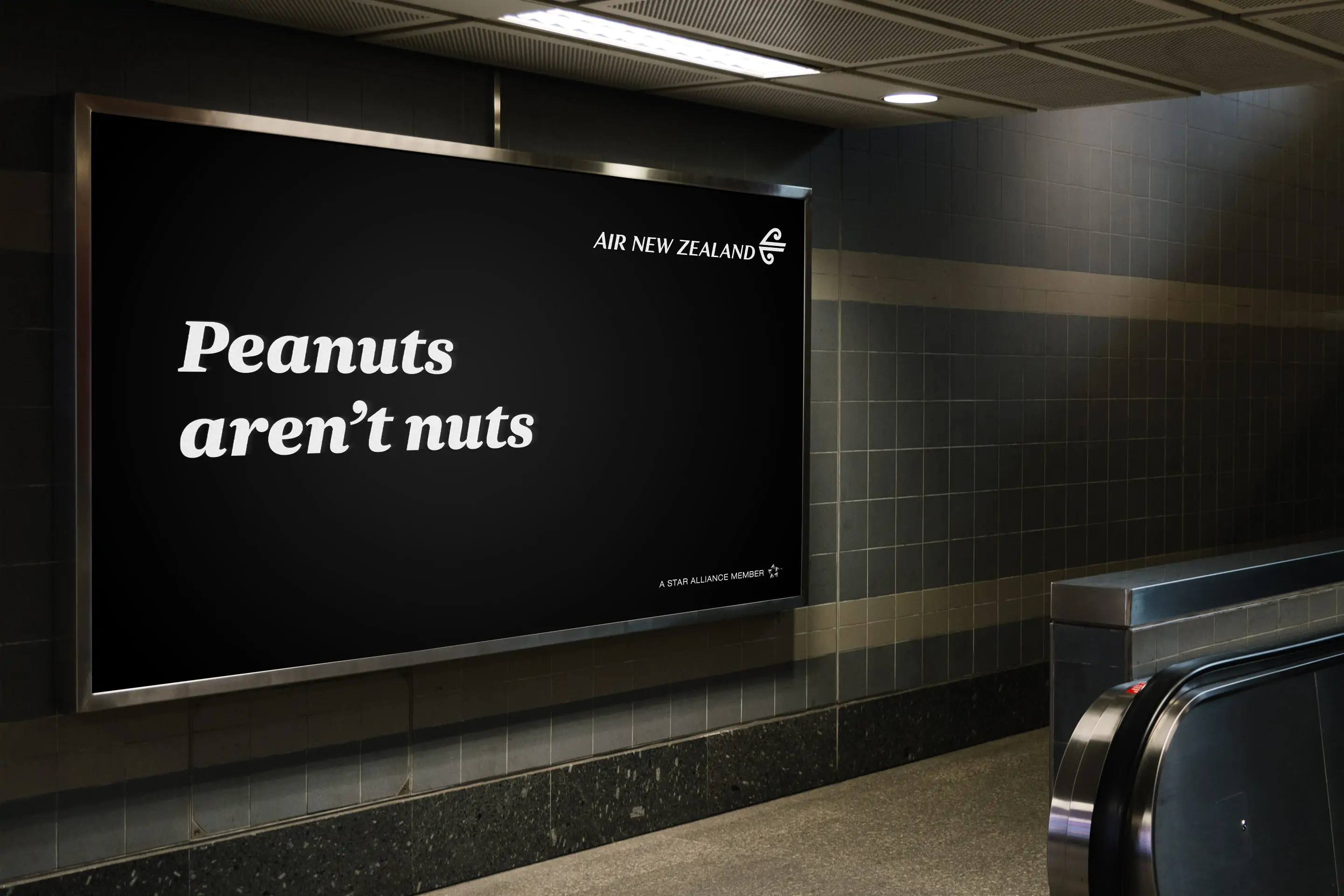
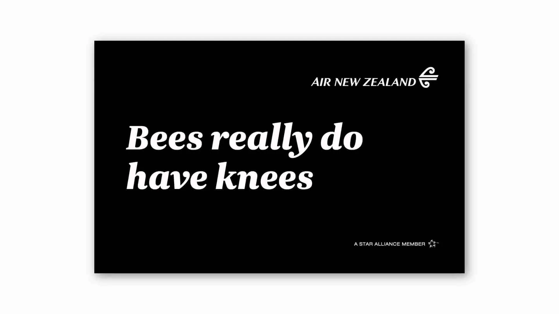
We created ‘Bet you didn’t know’: a bold yet conversational concept that presented the product messaging alongside a host of other generally unknown facts. The approach offered almost endless scope for switching up the content throughout the campaign, and also allowed us to talk about the superior Air New Zealand onboard experience in the same way.
Bold and beautiful
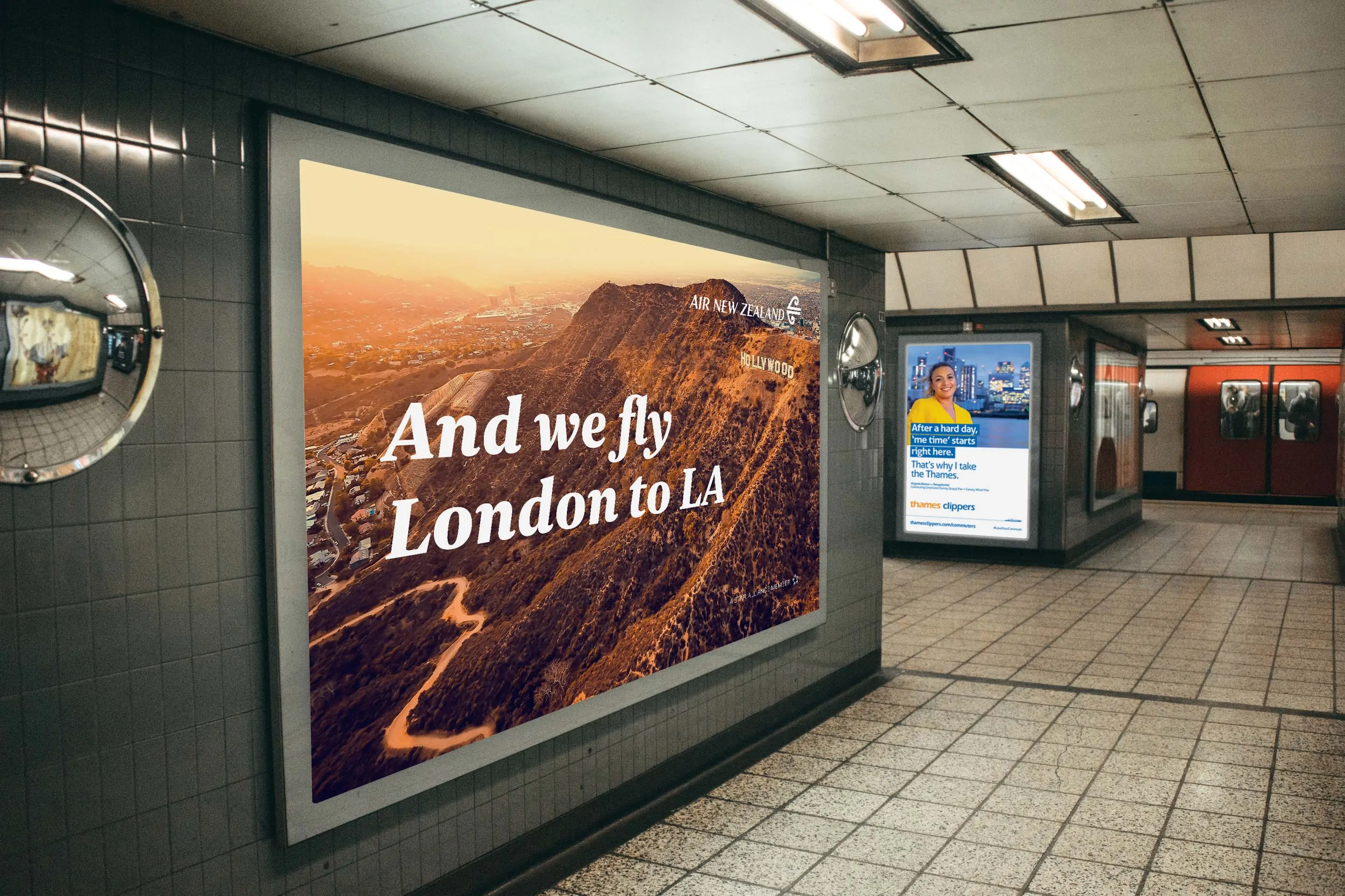
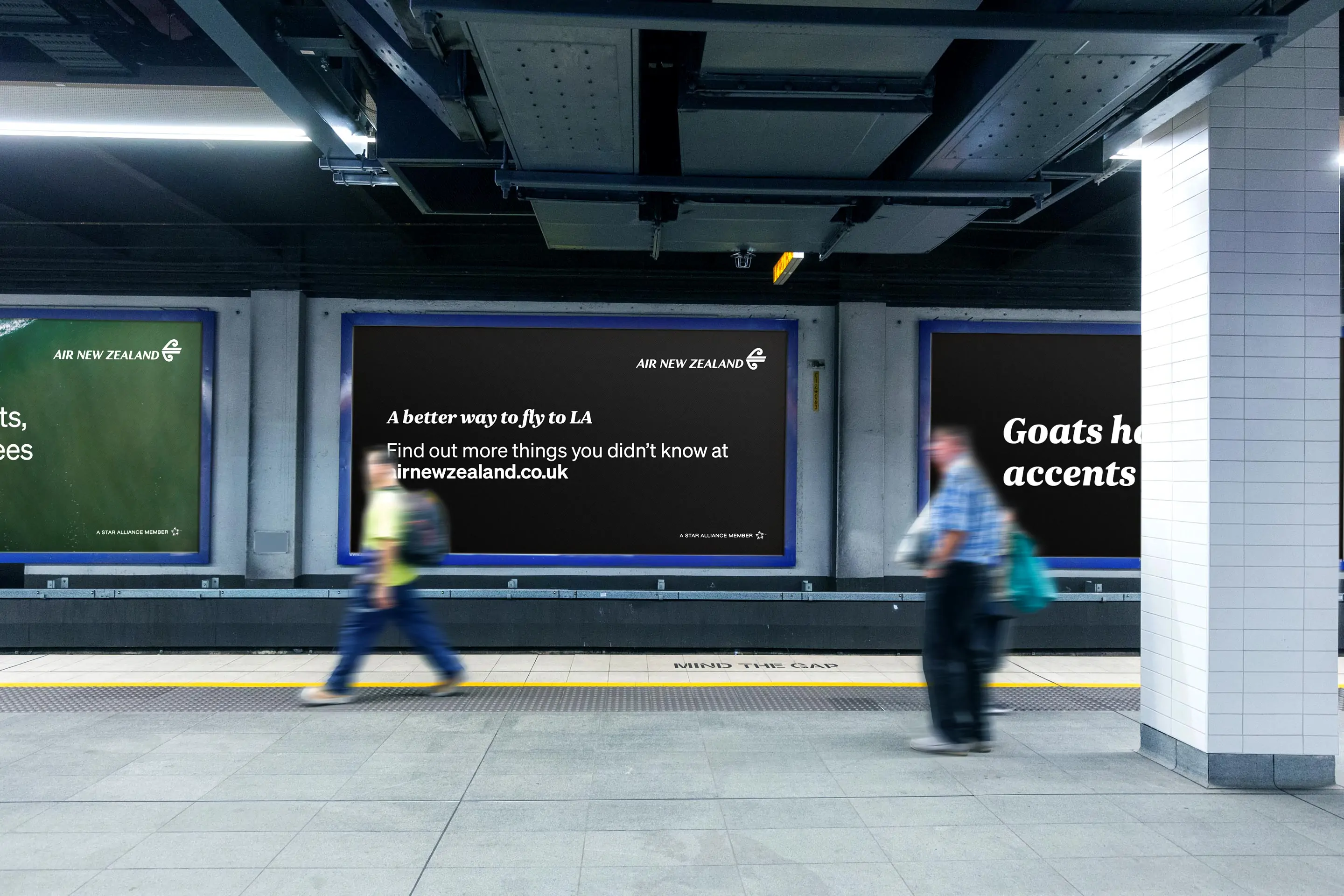
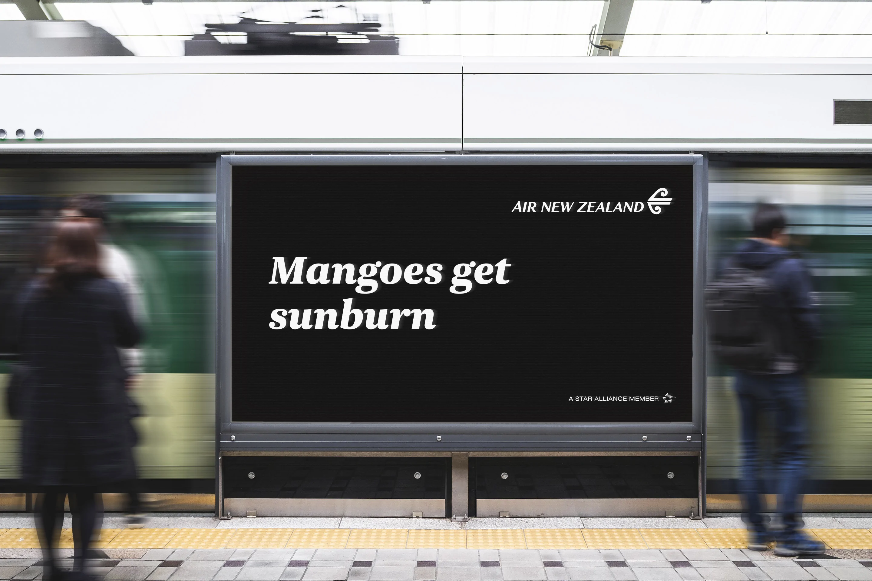
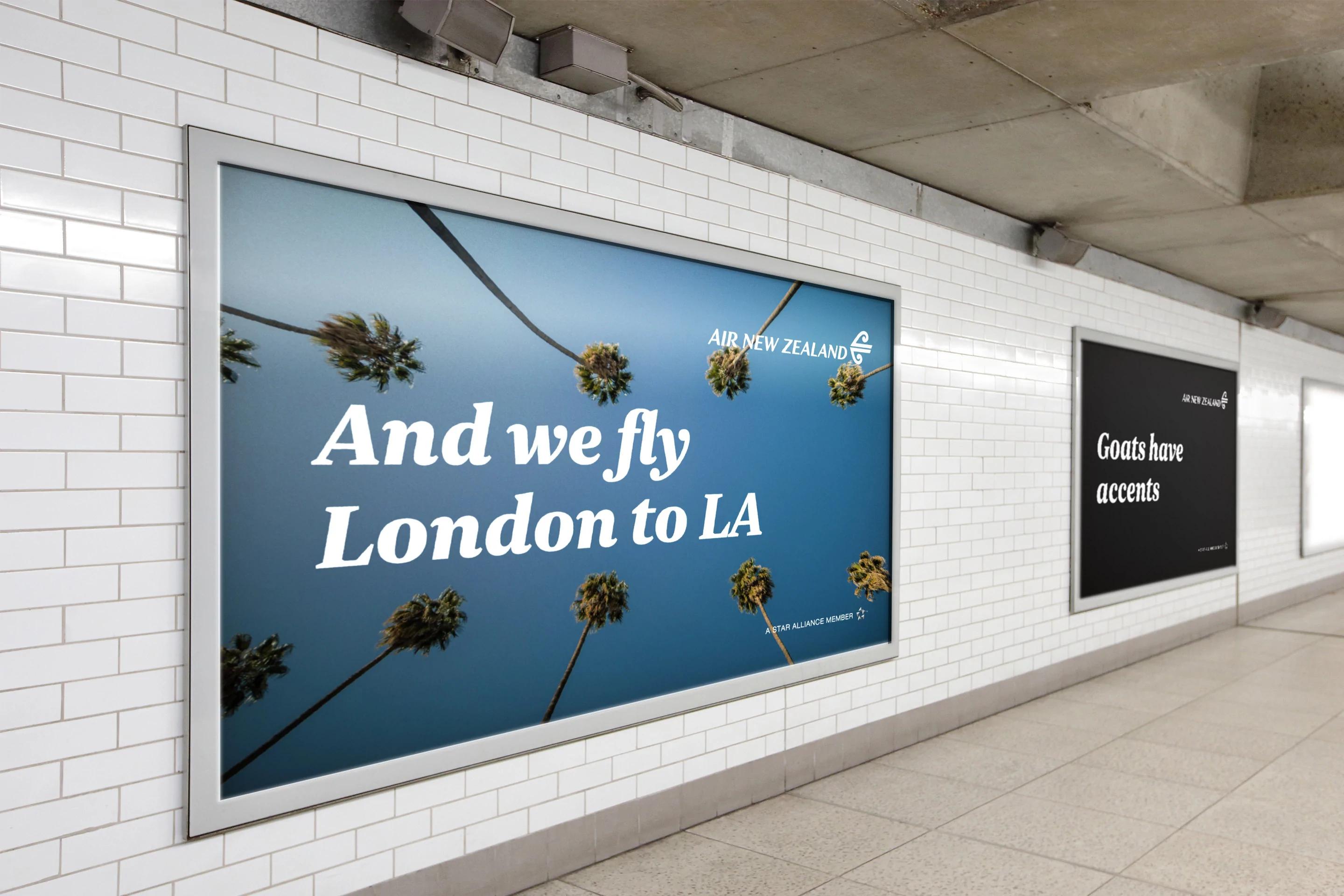
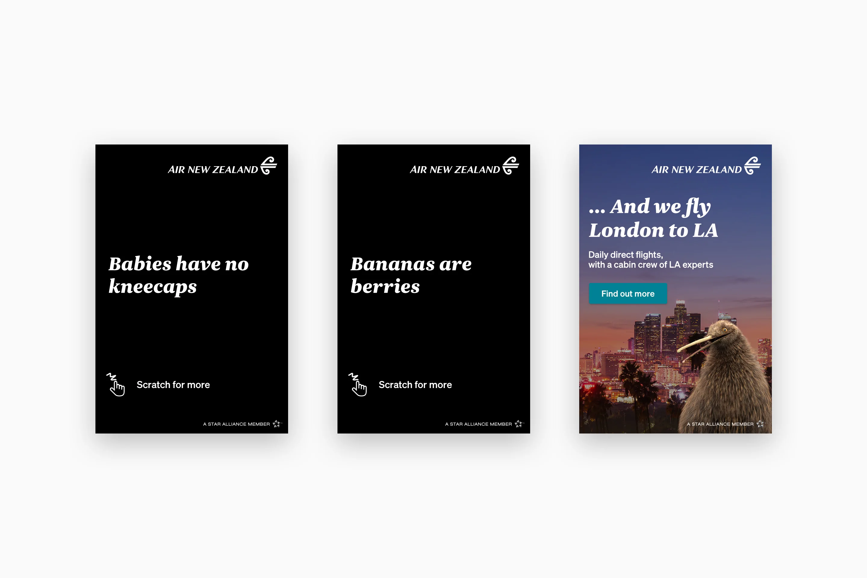
The campaign would be seen on multiple channels, with digital outdoor in London underground and train stations, plus online display, paid social, native and chatbot advertising.
To compliment the bold copy, our visual design was simple and stand-out. We paired strong typography and the airline’s signature black and white palette, with alternating Los Angeles images to firmly anchor the location in consumers’ minds. We kept the content fresh by changing the facts for every piece of media, and adjusting the messaging through the campaign phases, introducing base pricing during the last month.
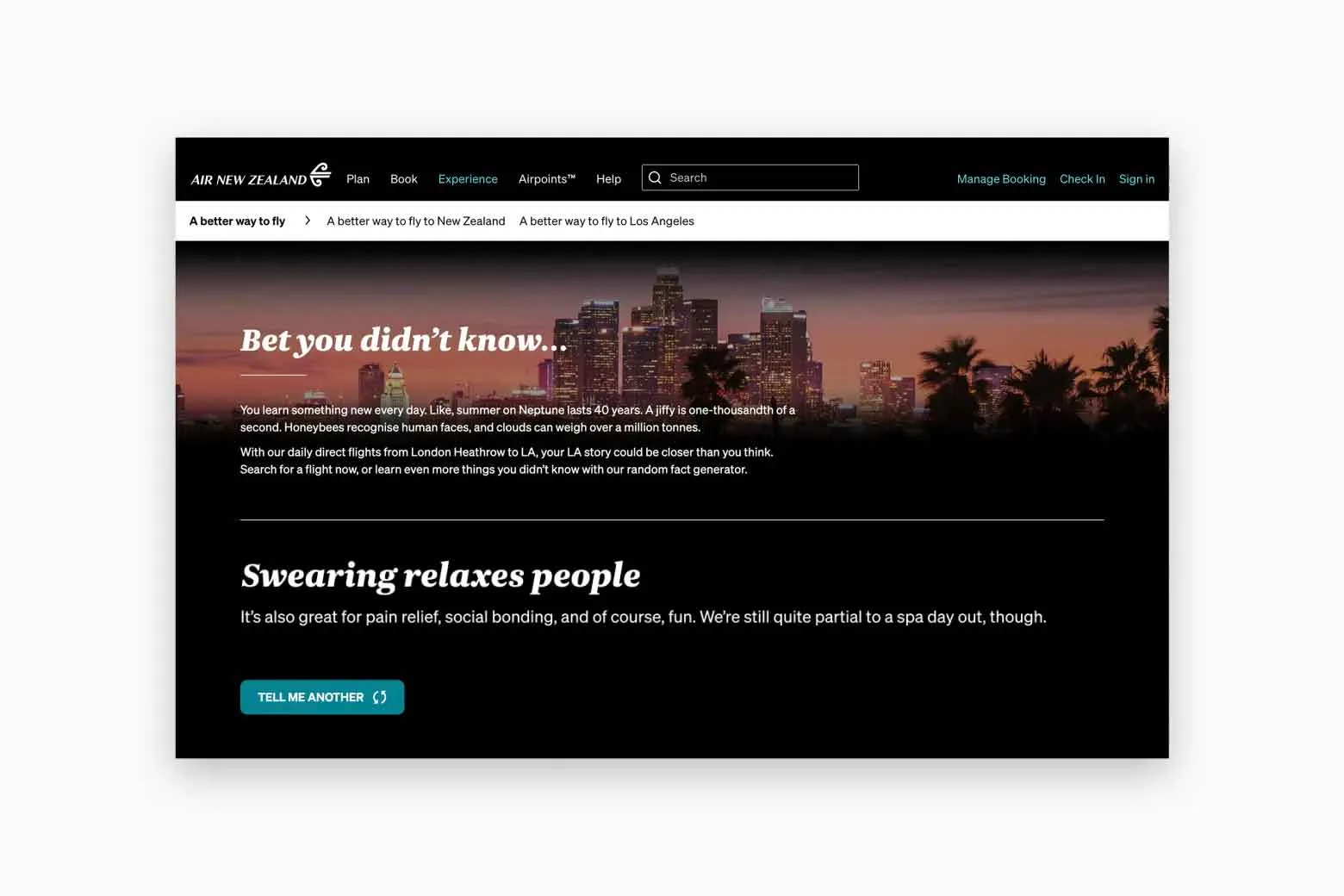
For the campaign landing page, we built a ‘random fact generator’. Users could continuously hit the refresh button for more new facts (from a curated bank of dozens), interspersed with product points about the airline’s premium onboard experience. We created additional lines of copy for each fact to further engage the user and embed more of the Air New Zealand personality.
Our integrated campaign delivered impressive results, and won two Travel Marketing Awards.
Our OOH campaign was delivered across London underground stations, where commuters were served a range of high impact mobile formats in partnership with AMS London.
WINNER Travel Marketing Awards – Best Ad Campaign <£250k Media Spend, Gold Standard
Travel Marketing Awards – Second Place Best Integrated Campaign <£500k Media Spend
+48%
arrivals to site YOY
+82%
flight searches YOY
+111%
bookings YOY
Education
ICS Learn
Tech
Travel
Uber Boat
Campaign
Manufacturing
Calfurn
Brand
Sport
World Gymnastics
Brand
Venues
SEC Glasgow
Campaign
Travel
ExperienceFirst
Brand
Non-profit
Playlist for Life
Brand
Travel
Swan Hellenic
Brand
Travel
Royal Caribbean
Digital