We made business easier (and more fun) for Disney
Disney Destinations International
- Research and workshops
- Logo design
- Visual identity
- Copywriting
- Brand book
- Website design and build
- Launch campaign materials
- Ongoing website support and future dev
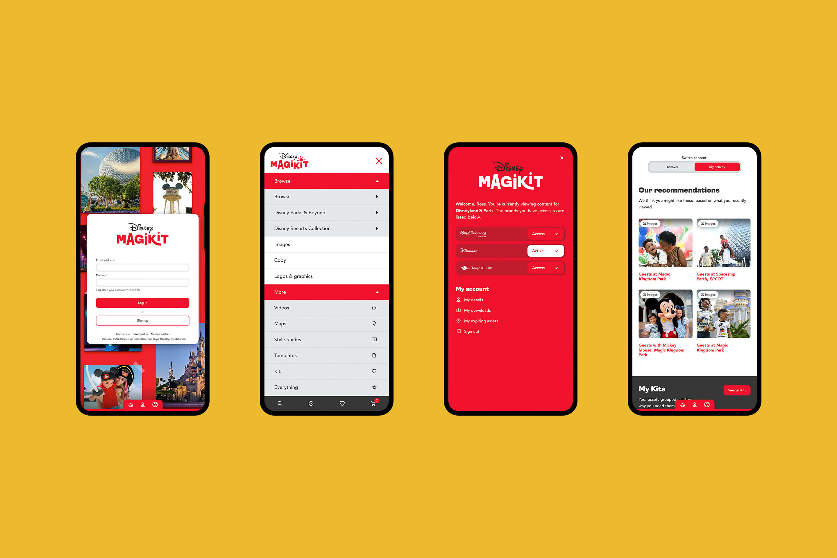
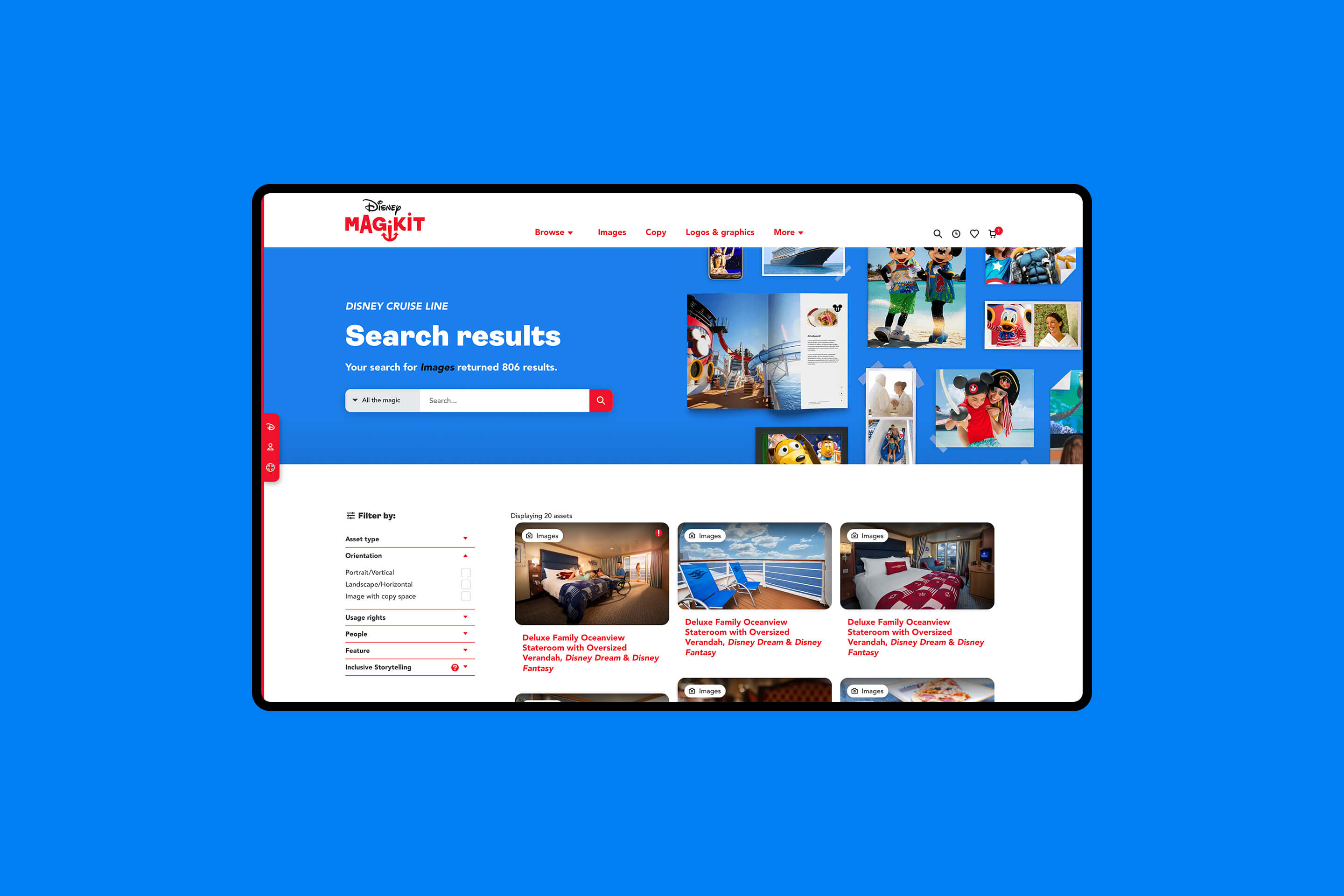
We were tasked with completely transforming Disney Destinations International’s online asset management platform which housed all the marketing materials for each of their three brands. Used by everyone from their own employees to external travel agency marketing teams, we needed to retain the ease of having everything in one place, while improving the user-journey and functionality, as well as introducing a brand-new look and feel.
Building bigger and better
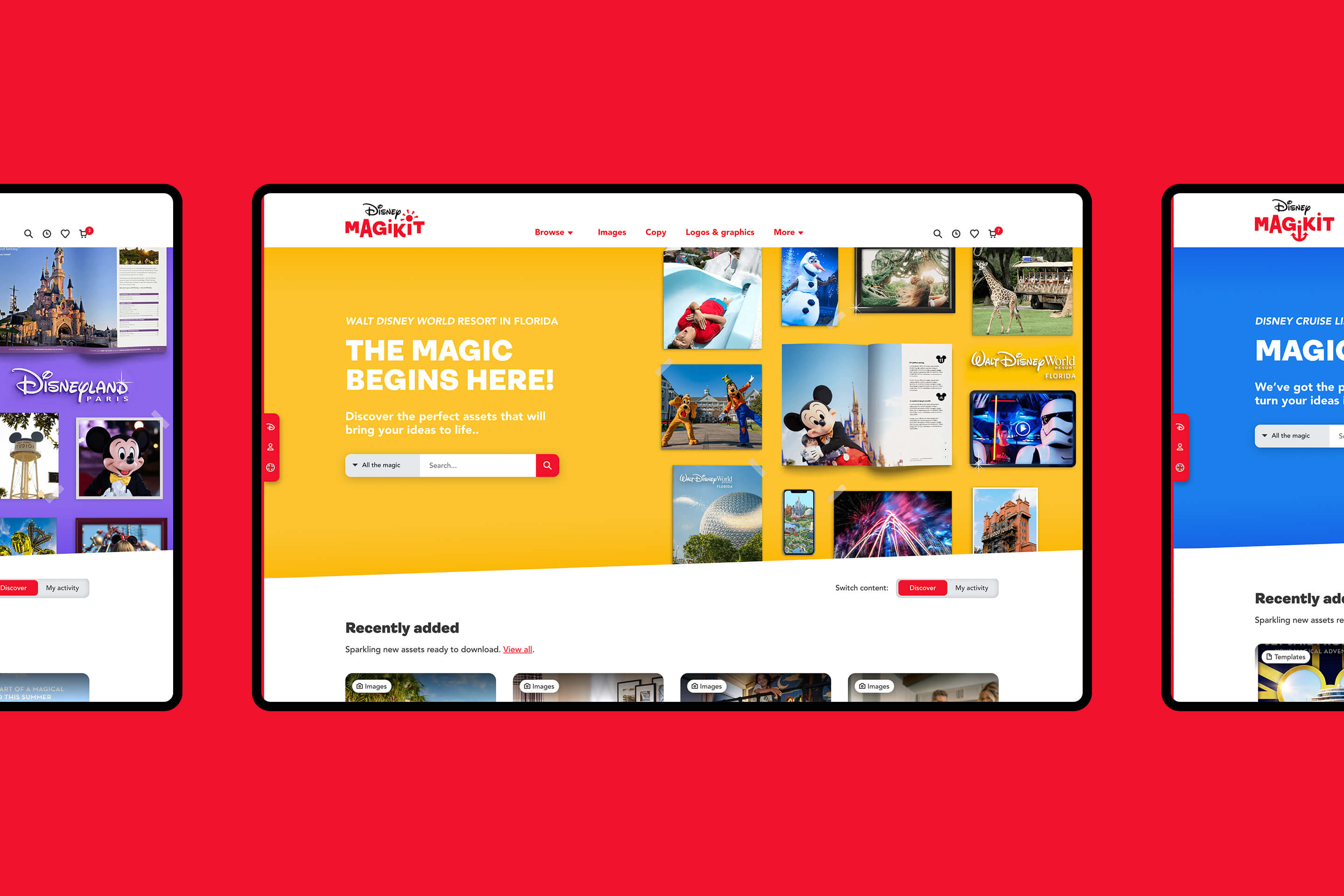
The key to building a successful site was keeping the user at the heart of the project. To deliver a tool that was intuitive for people to navigate, manage and update, we carried out in-depth research with the teams who used the platform. This allowed us to identify areas for improvement, plan user journeys around very specific audiences, and develop and implement user-first functionality.
Exciting new identities
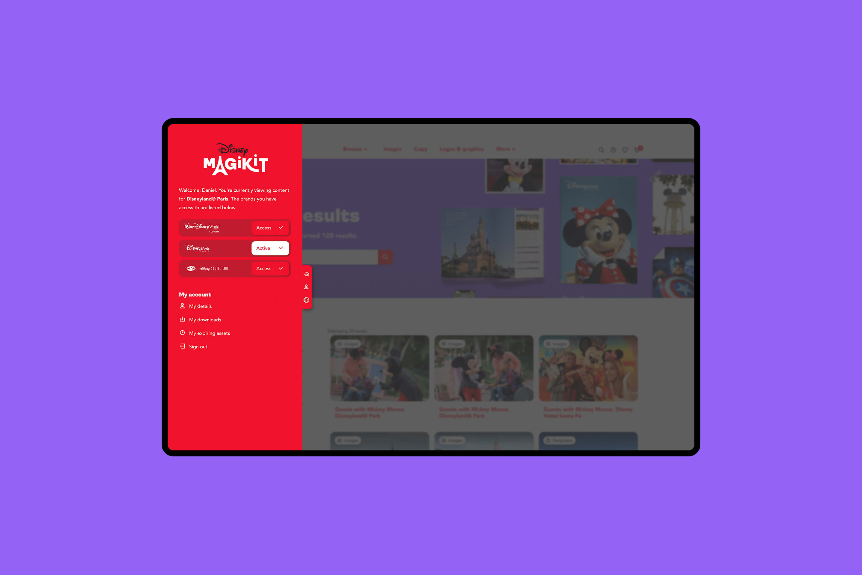
The new identity had to be practical. Our research discovered that users had found it hard to differentiate between the different products and their assets. So, we developed three distinct but cohesive identities for the brands which made it much easier to recognise the site’s different sections, introducing vibrant colour coding and quirky tweaks to the main logo that went beyond the client brief of a simple new logo and colour palette in order to directly address user feedback.
One Kit Wonder
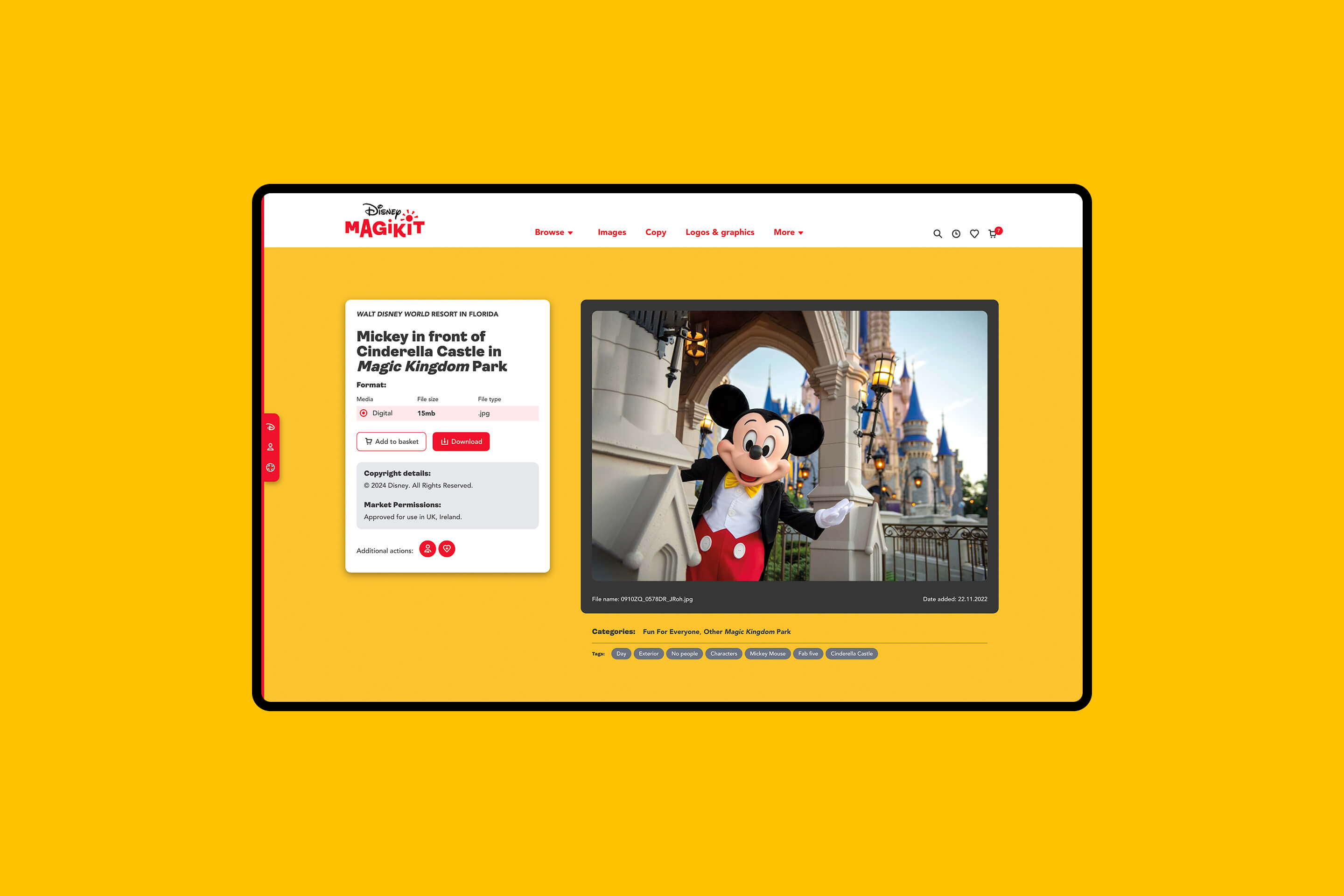
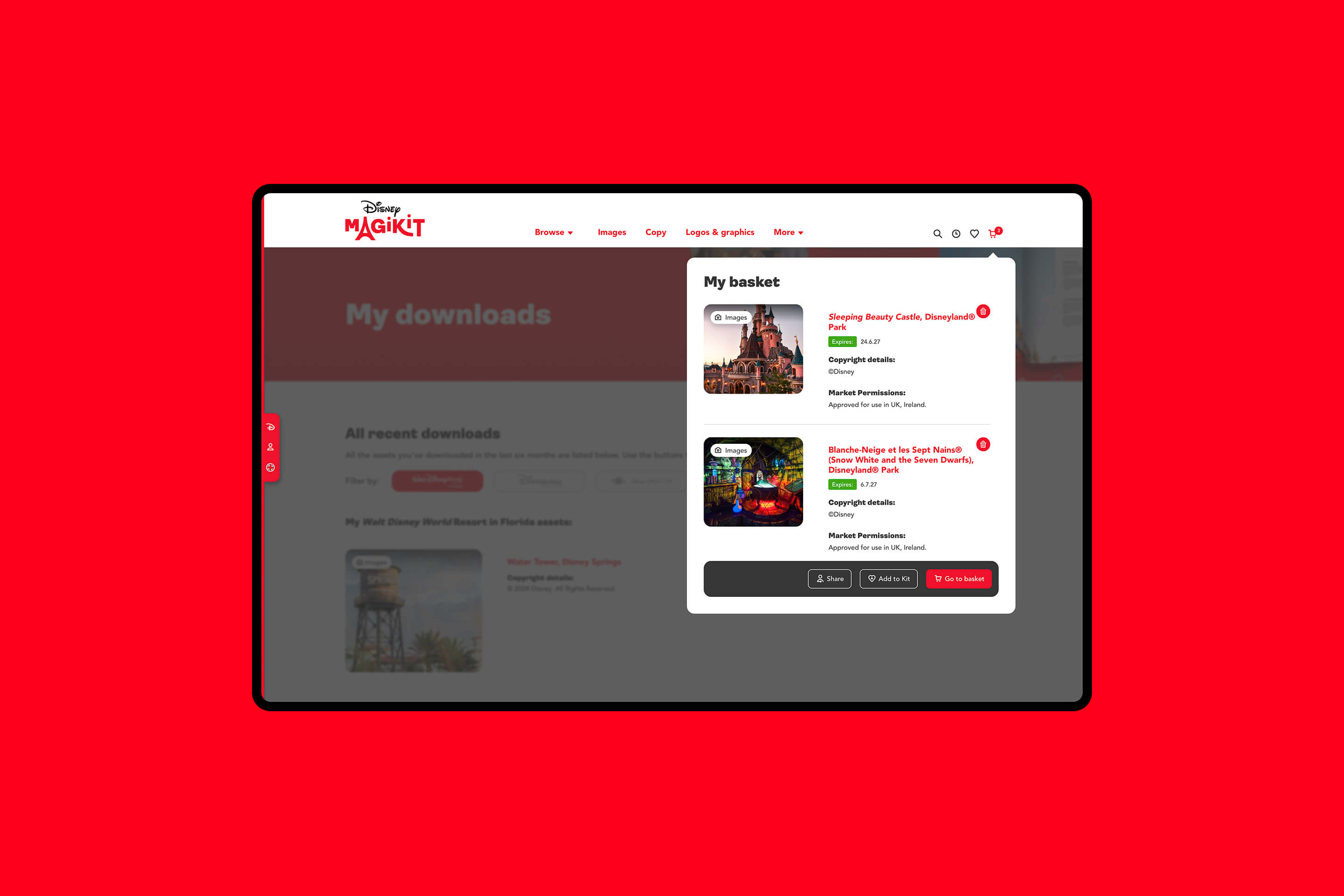
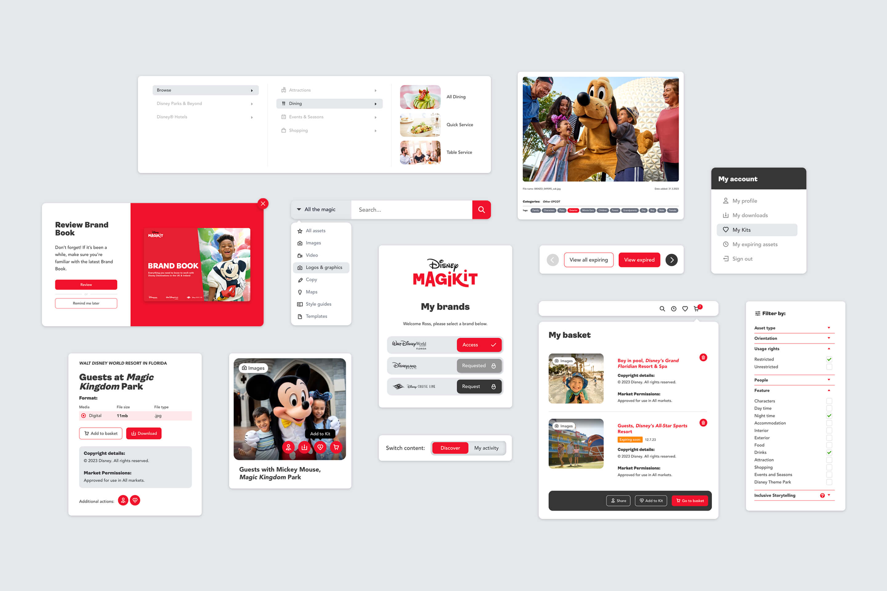
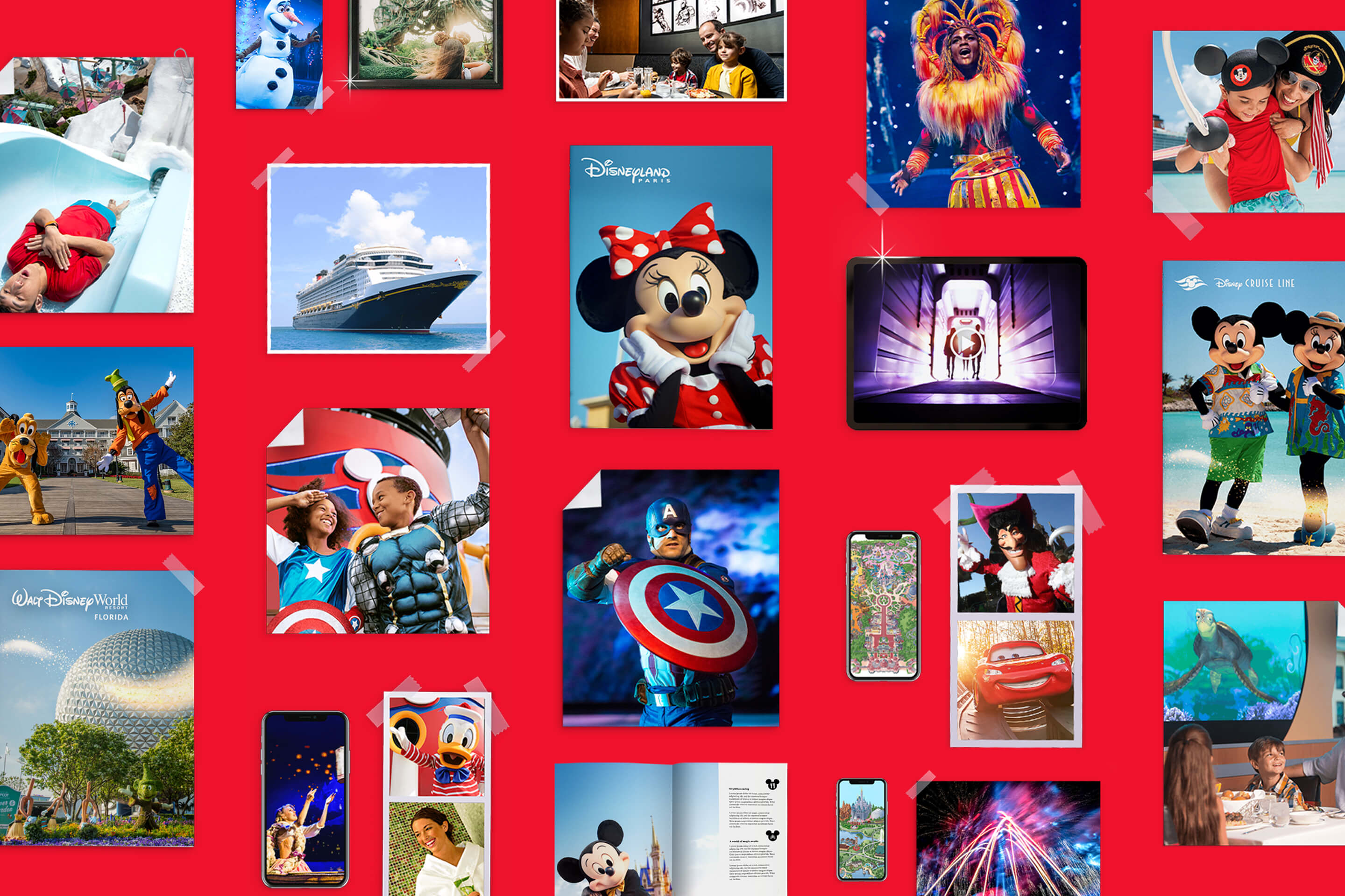
The overall visual aesthetic leaned into the concept of a ‘kit’, displaying a selection of assets in a way that was reminiscent of a photographer’s ‘toolkit’. This simultaneously signified the site’s ease of use and improved content organisation, as well as the huge variety of assets available to users. The ‘kit’ concept applied to the site’s functionality too, allowing each individual user to be able to create and share collections – whilst retaining the complex copyright descriptions that the usage of each asset must adhere to – something that was not included on the original site.
A Happy Ending
We gave the platform a bright, clean and modern design, optimised for mobiles, tablets and computers, improved browse functionality and a smarter, more efficient search function. Each step was carefully considered, mapped and wireframed to provide a more intuitive experience. Users now have their own account and dashboard, which keeps them up-to-date on things like asset expiry dates and recently added assets.
After a successful UK launch, including an in-person event in London, showcasing the key new features, the accompanying brand guidelines book and a step-by-step launch video, the platform was also translated into German and Spanish and released into those markets, and is easily scalable for future growth needs.
