Back
Case study
Branding that raised expectations
ExperienceFirst
what we did
- Brand strategy
- Brand positioning
- Logo design
- Visual identity
- Copywriting
- Motion design
- Design system
- Brand guidelines
- Art direction
- Social templates
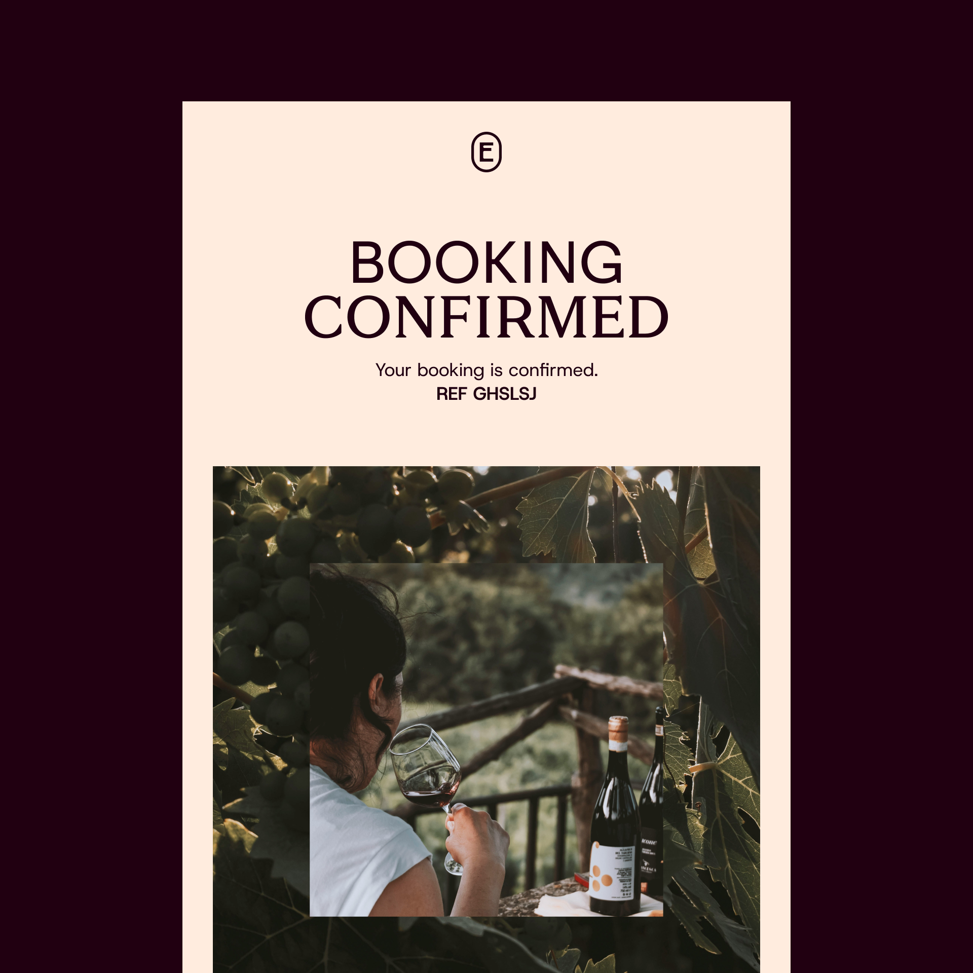
- Email templates
ExperienceFirst is a global tour company specialising in authentic, story-driven, guided walking tours across major cities in the US and Europe. Founded in 2009 and headquartered in New York City, with their first tour focusing on the real story of Wall Street, they’ve grown to offer millions of customers the real stories of the cities they call home, authentically, delivered by locals with wit, charm, and warmth.
But in such a competitive sector, driven by price and with the need for as many customers as possible, founder Andrew Luan decided to change the game and pivot the ExperienceFirst offering to serve a more affluent, discerning customer with distinctive, unique experiences. He also recognised their need for an updated brand strategy and visual identity to reflect this change. We worked with the team at ExperienceFirst on a full rebrand, covering brand strategy and brand platform, visual identity, and more.
An ambitious plan
ExperienceFirst believed that no one was doing what they planned to offer their new customers. A real gap in the market, a golden opportunity to offer something new. But with that came the huge challenge of devising, visualising, and mapping out a customer base that didn’t currently exist. Our brand strategy workshops were going to be some of the most interesting and creative we’d ever done.
Over four sessions across five time zones, we worked with Andrew, and ExperienceFirst’s marketing, sales, commercial, and product teams to understand the magnitude of the change from version 1.0 to 2.0, what it would take for them to get there, the time involved, and what it was, exactly, customers would get. The plan was to expand from eight cities to have a far more global reach.

The perfect positioning
Positioning this new ExperienceFirst would be crucial. This new affluent offering would need to connect with a new customer base, reassuring customers that ExperienceFirst know and understand them, while ensuring not to overstate anything. ‘Quiet confidence’ was a phrase mentioned in the workshops a lot.
What was revealed in the workshops was a delicate balance between what the customer wants and needs. What they want is to feel like an explorer, a traveller, not a tourist. But what they need is to be guided, even led at times, from one point to another because that’s the life they’re accustomed to. They want to be discoverers, but not while carrying a backpack.
Our brand idea was ‘The Art of Uncovery’, a blend of the two things the customer needs. ‘Uncover’ is what ExperienceFirst does, taking guests by the hand and showing them people and places they’d never find on their own. But done in such a way as to give the customer the impression that they are discovering these wonderful encounters, not being guided like ‘tourists’ do.
Uncovering something special
‘The Art of Uncovery’ provided a strong, flexible foundation for everything to be built upon: not just the branding and tone of voice, but also the product, influencing how ExperienceFirst design the experiences, the way they train their guides, and each customer touchpoint.
From there we crafted one of the things we love most about branding projects. A short, clever, brand promise. A brand promise is called lots of other names: tagline and slogan being the most common. It’s the outward-facing copyline that distills what the brand does into – ideally – as few words as possible while also being distinctive, unique, and appealing. No easy task.
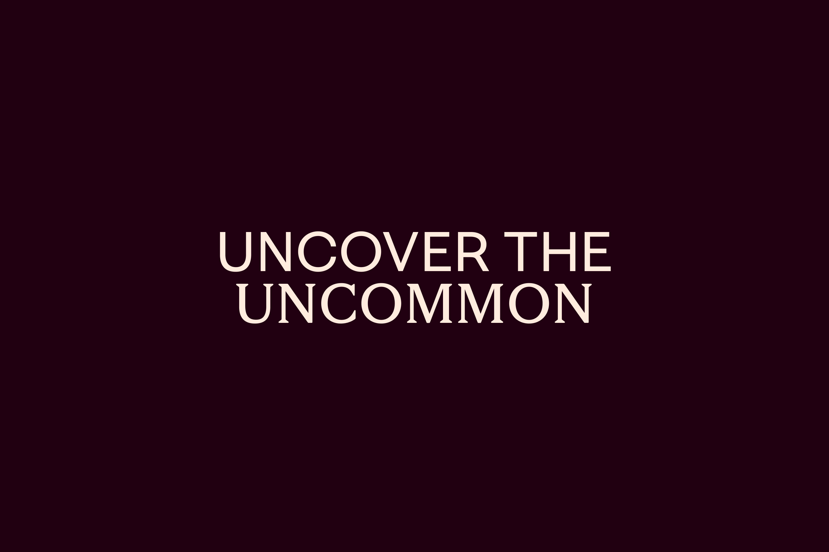
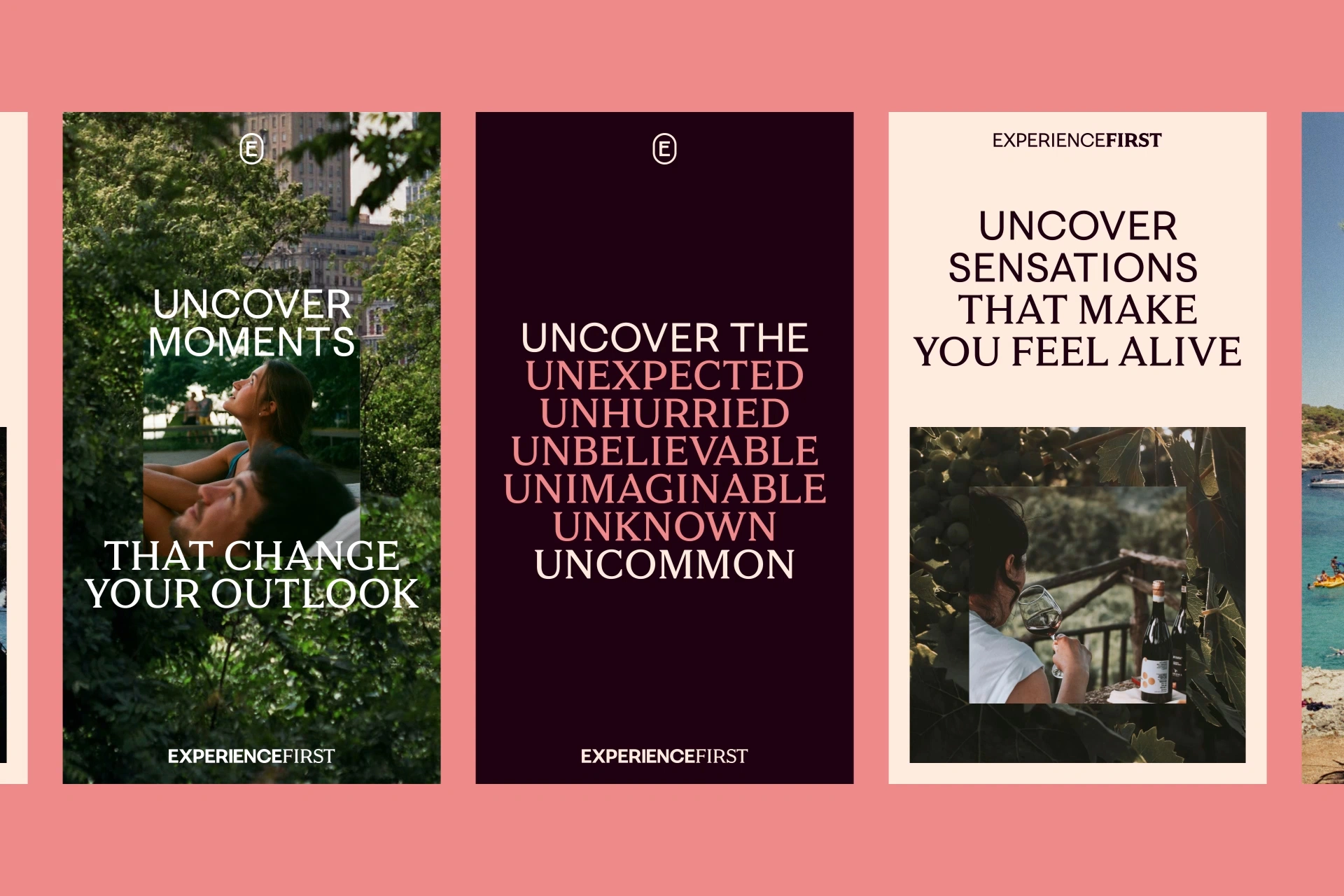
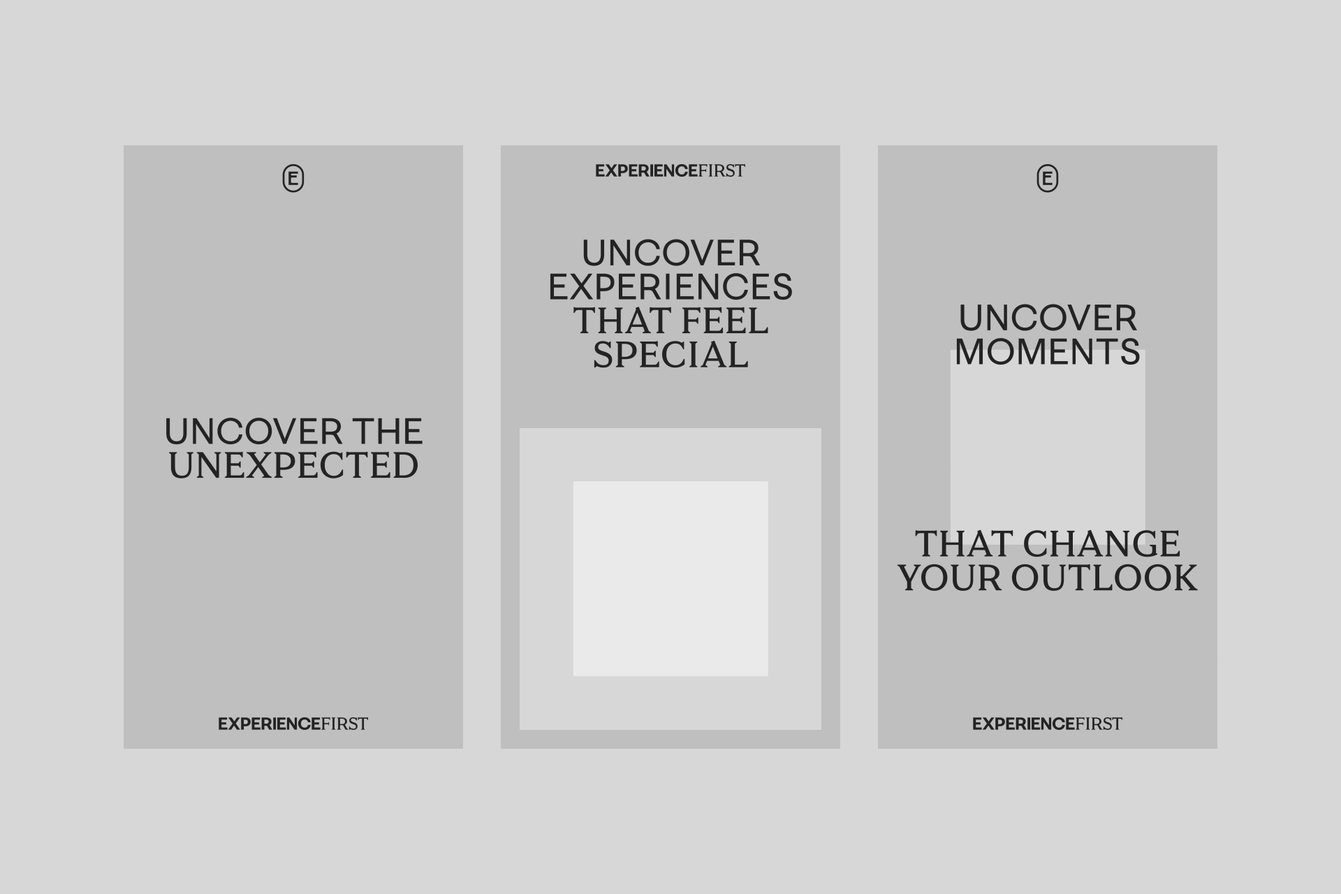
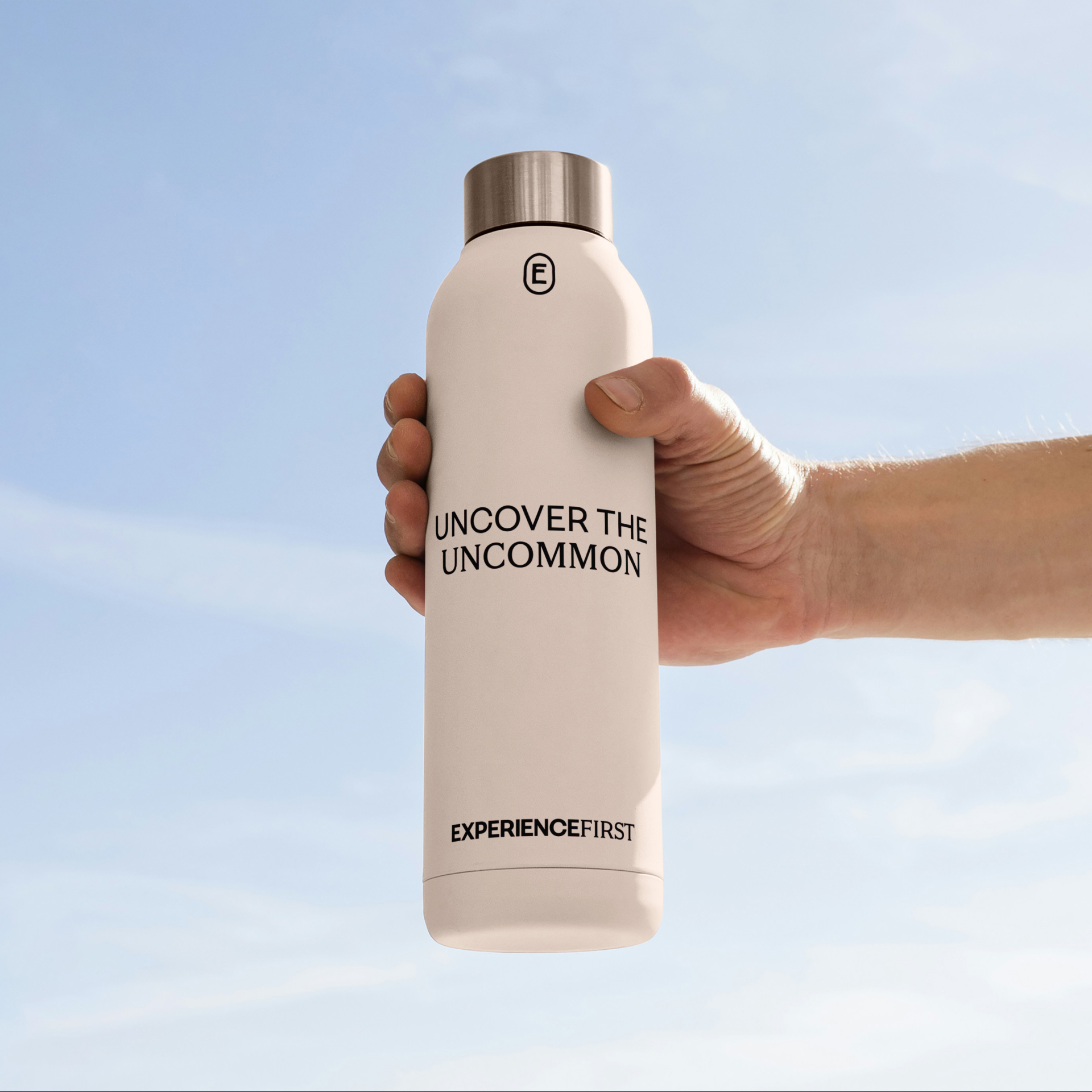
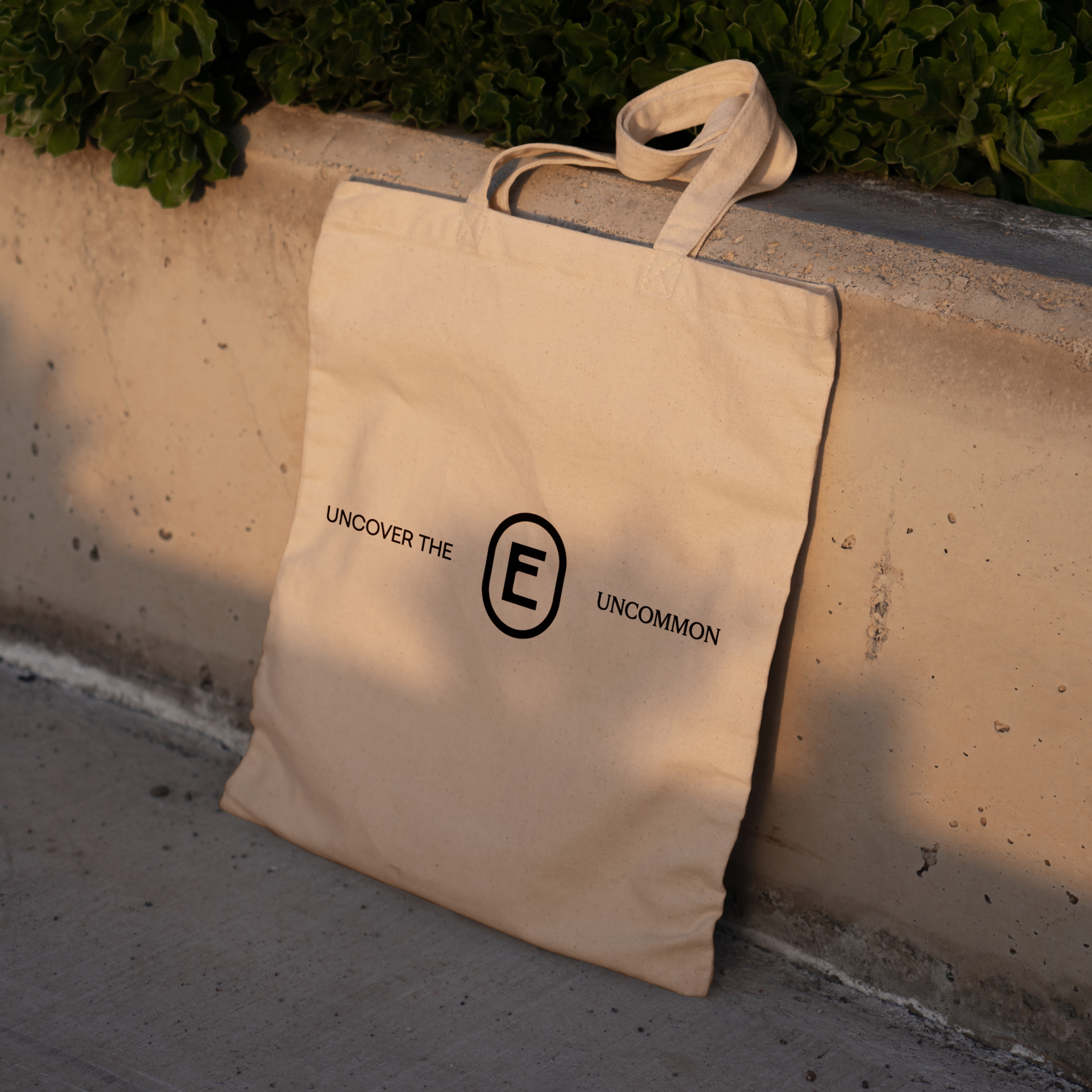
‘Uncover the Uncommon’ is the new ExperienceFirst brand promise. Three words, two of which are incredibly rich in meaning and painting a picture in the mind. In just those three words we tell the story of ExperienceFirst.
The big – and not so big – picture
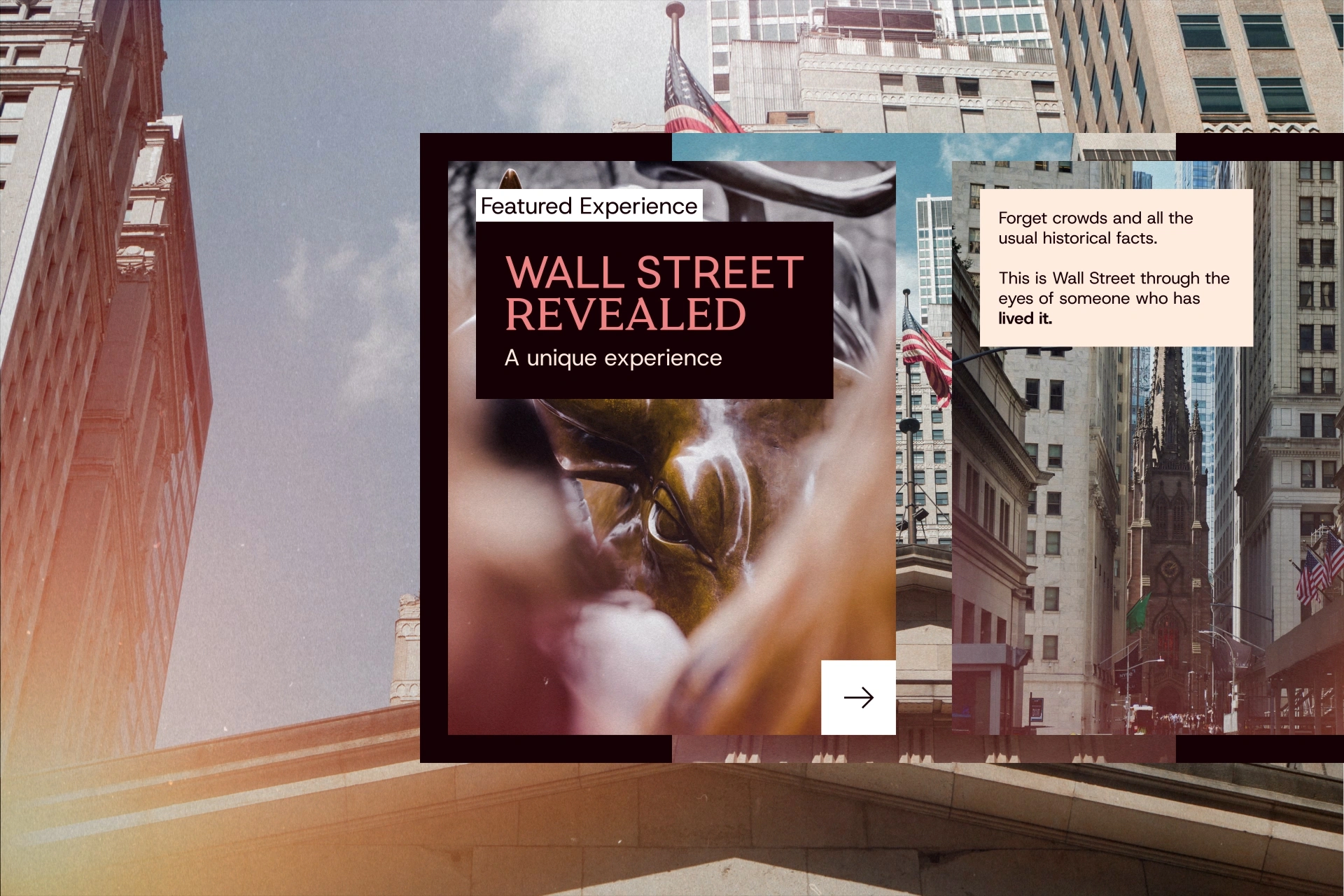
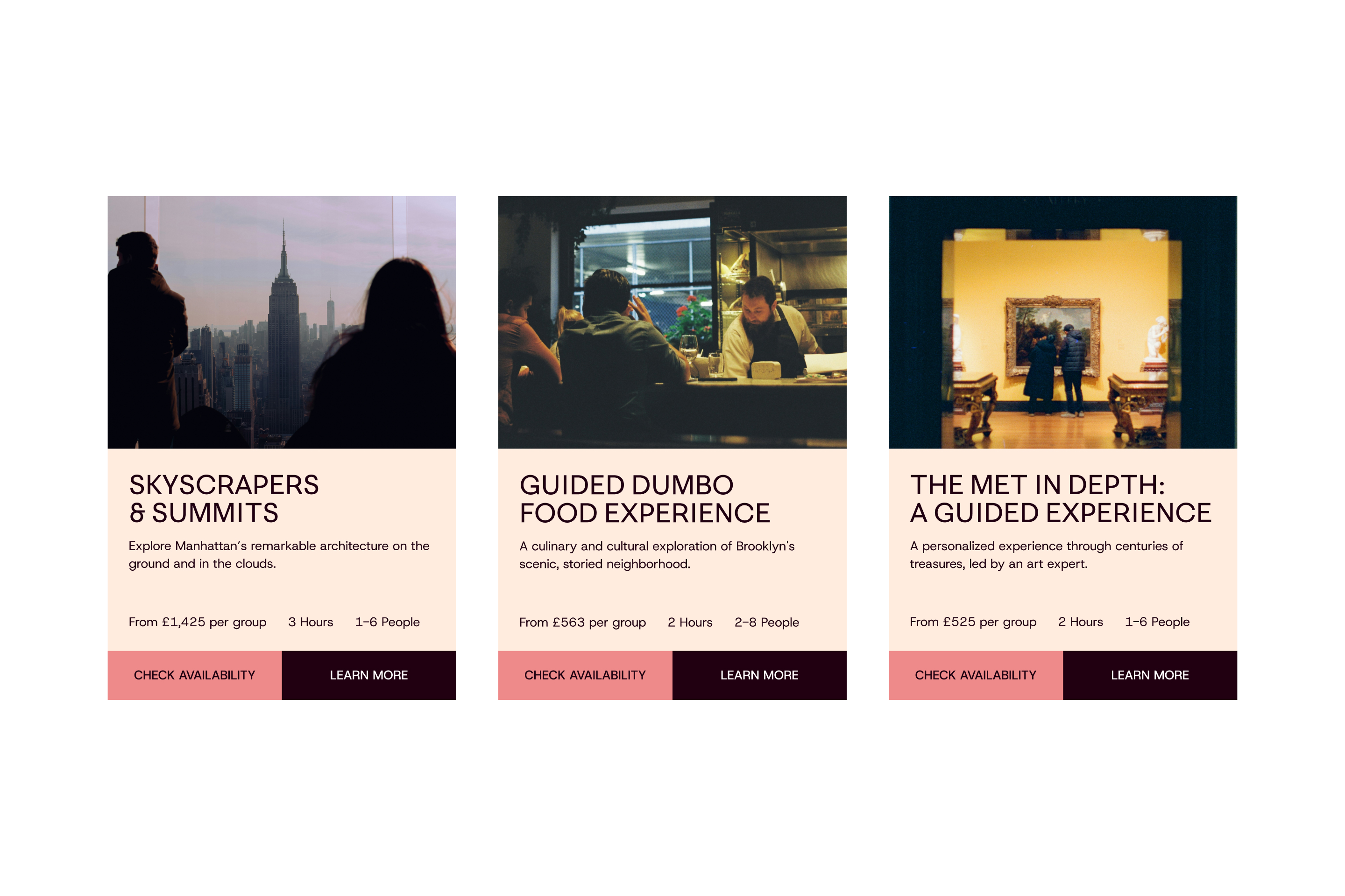
The main selling point for ExperienceFirst is their product: the tours and experiences they design, curate, host. Potential customers need to see and feel something in order to turn them into actual customers. Art direction would play a huge role.
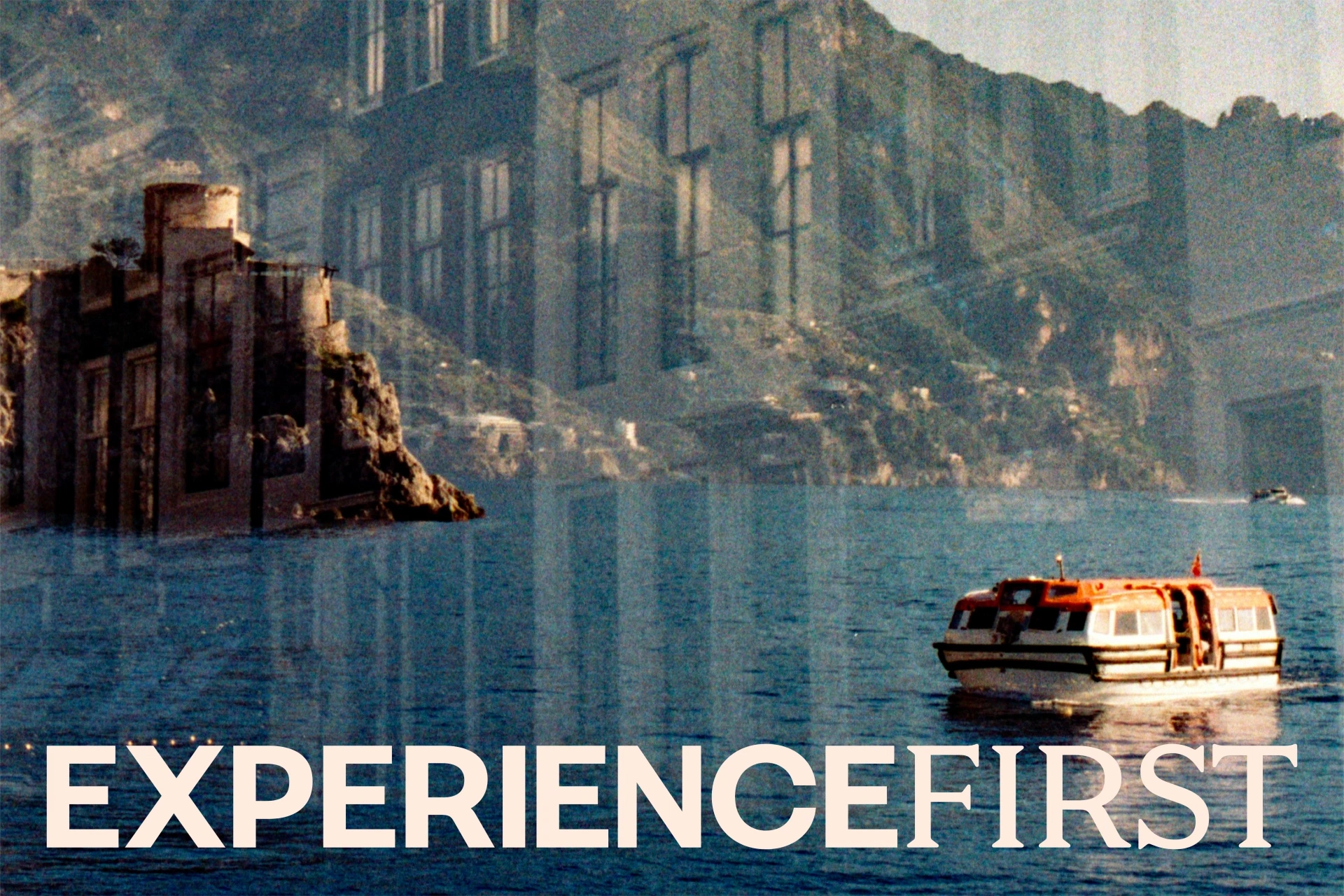
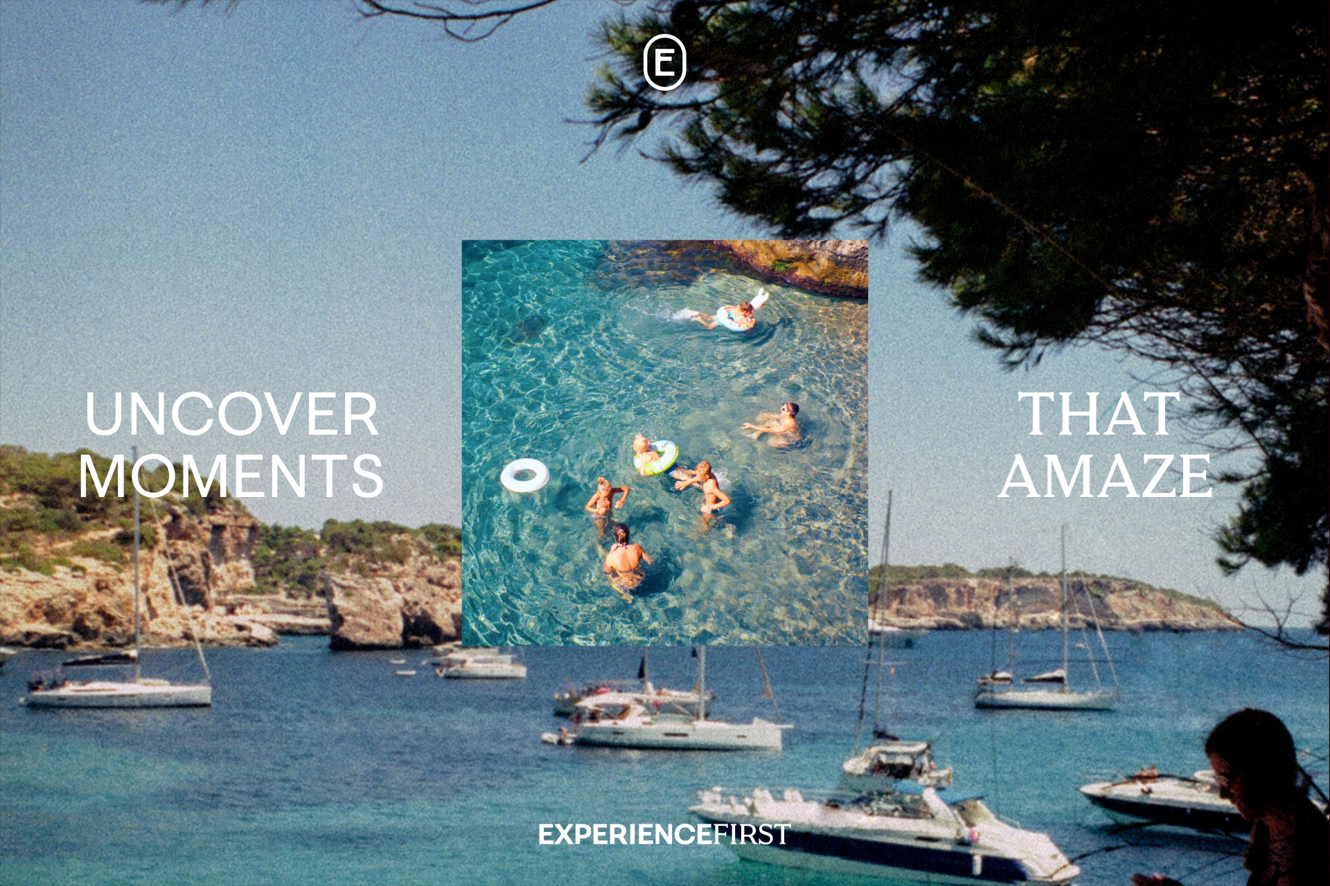
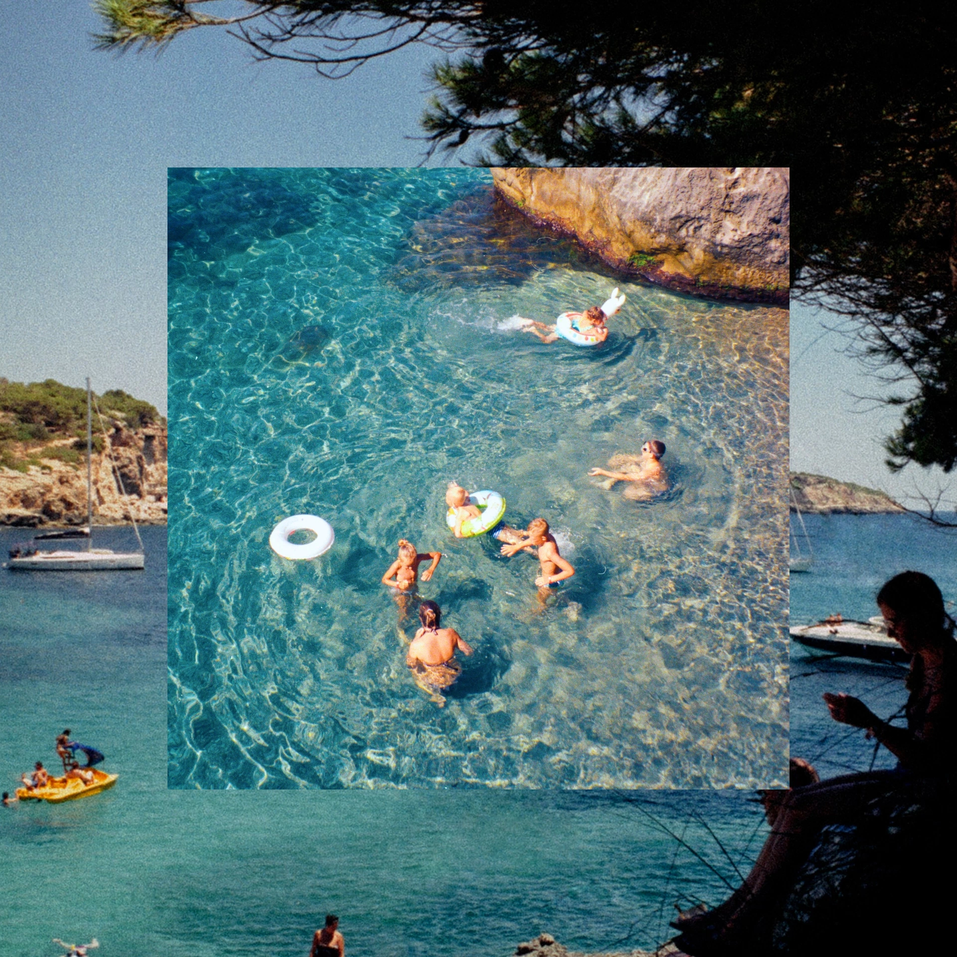
After experiencing an ExperienceFirst tour in Paris, we developed ‘The Art of Uncovery’ to devise a creative principle for photography based on two key elements of the customer experience. Firstly, the intimacy: the closeness they experience, the details they encounter, the smells, the touch, the authenticity and realness of these expertly curated tours. Additionally, the scale: focus in too much and you miss the grandeur around you. Paris, New York, Lisbon: guests mustn’t forget to look around and enjoy where they are in the world. These two contrasts – the micro and the macro – are the foundational elements of the visual identity. Shooting experiences closely, while contrasting them with larger zoomed out vistas. Much like ‘Uncover the Uncommon’, this was rich storytelling in such a simple way.
Keeping it simple
With such ambitious scaling plans we knew we had to ensure this was branding that could scale too. Every design element was to change. This was a complete overhaul, from top to bottom.
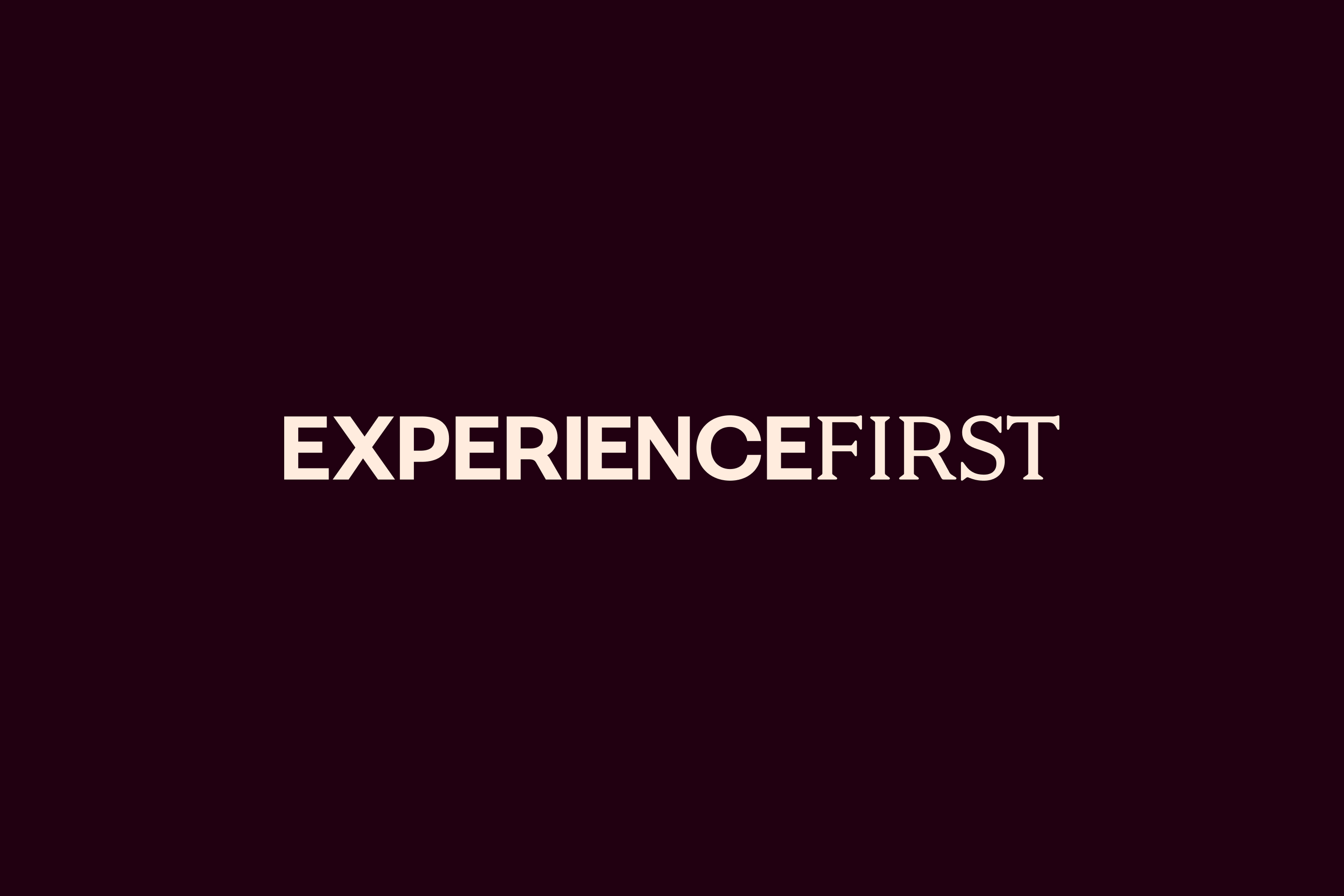
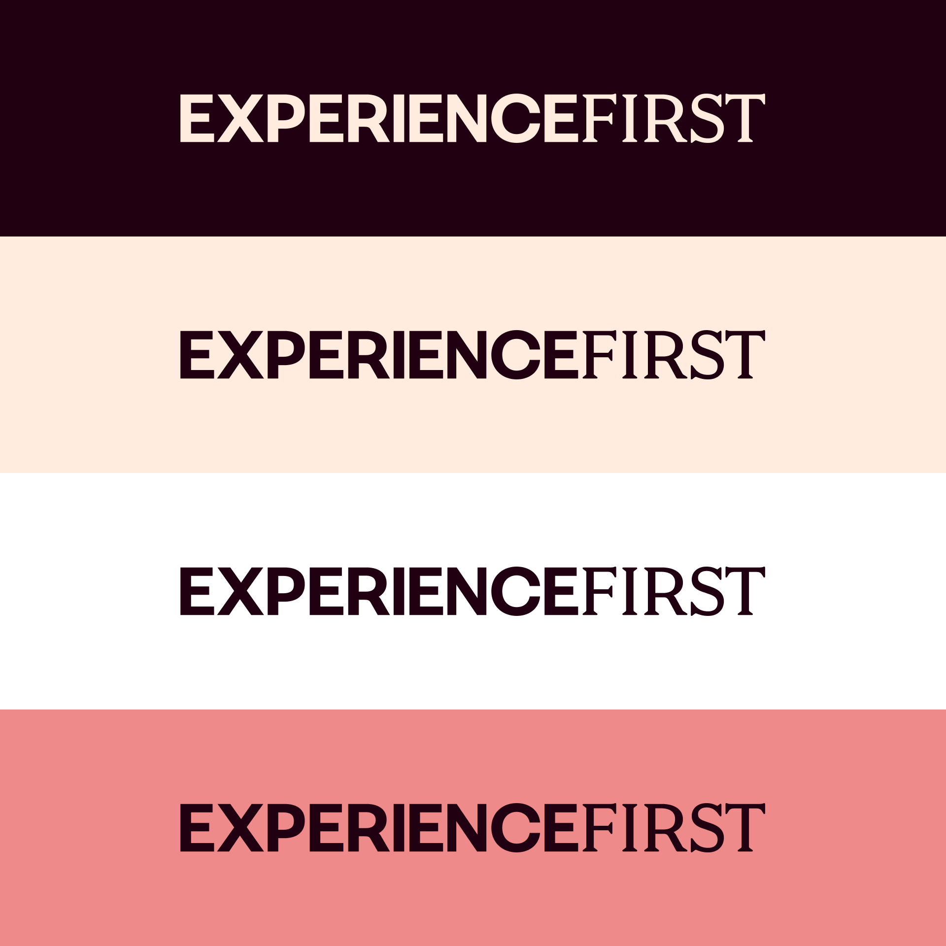
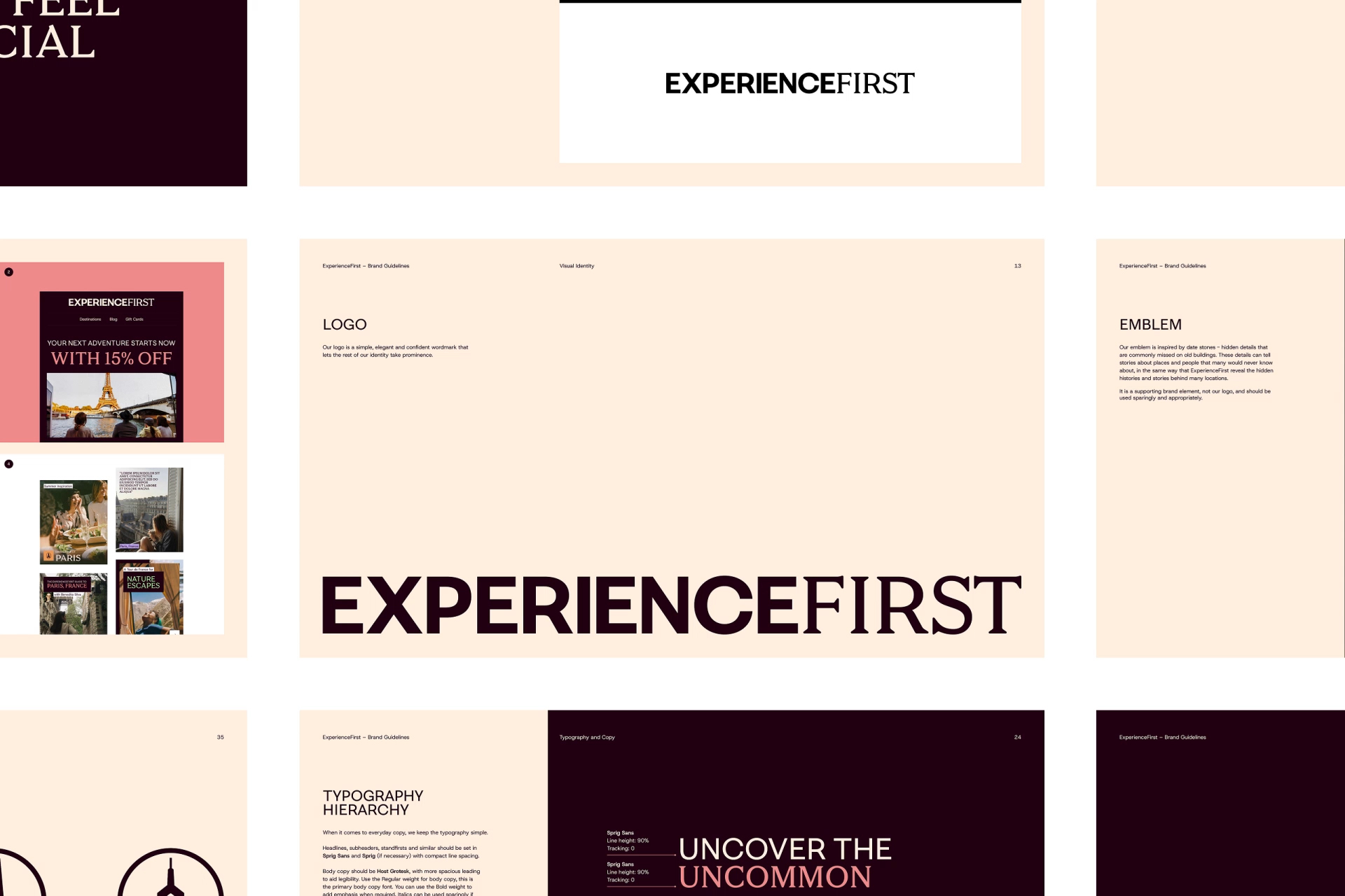
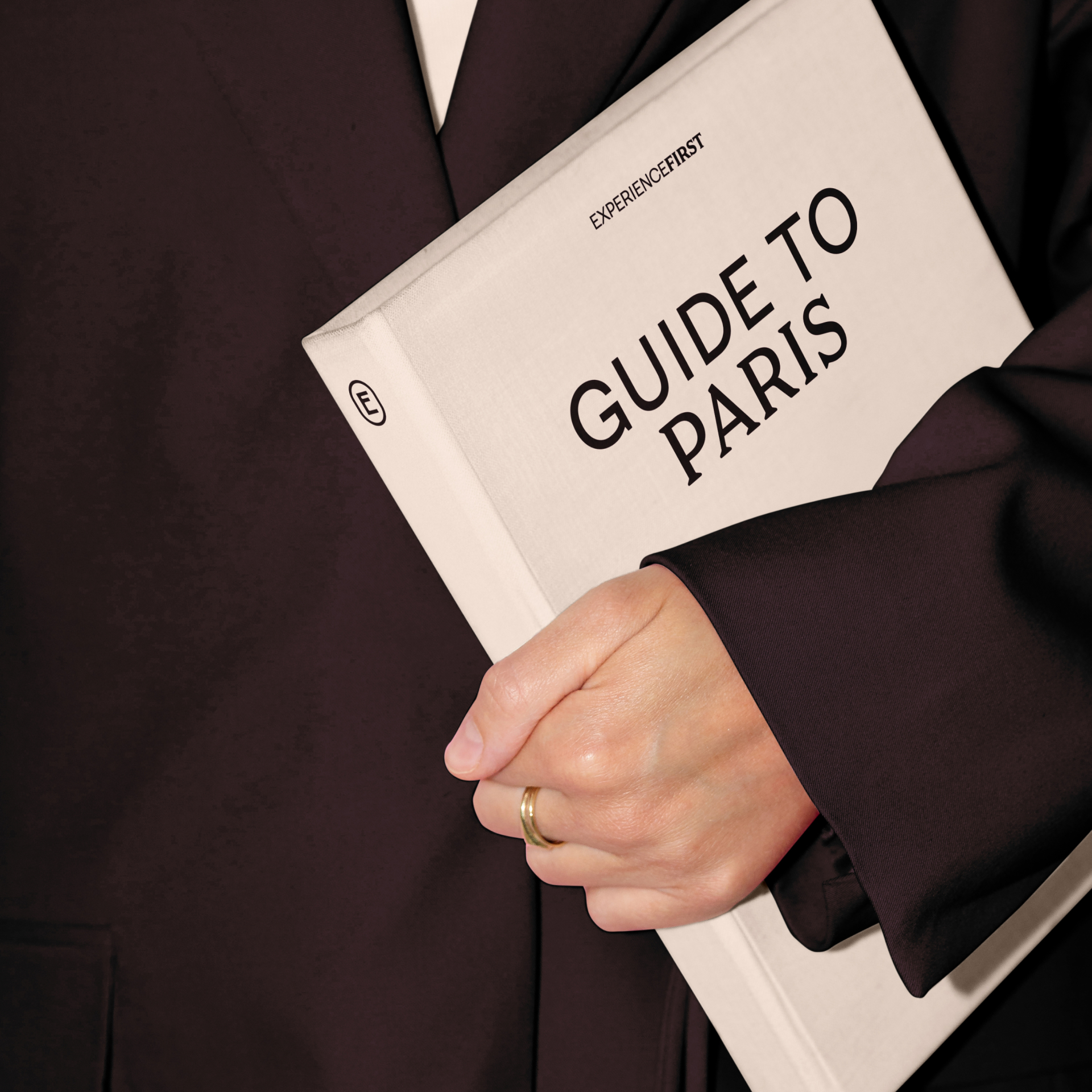
We knew the logo design could be a tricky element. ExperienceFirst is one word and should never be split, leaving us with a long 15-character name to work with. So it made sense to keep things simple.
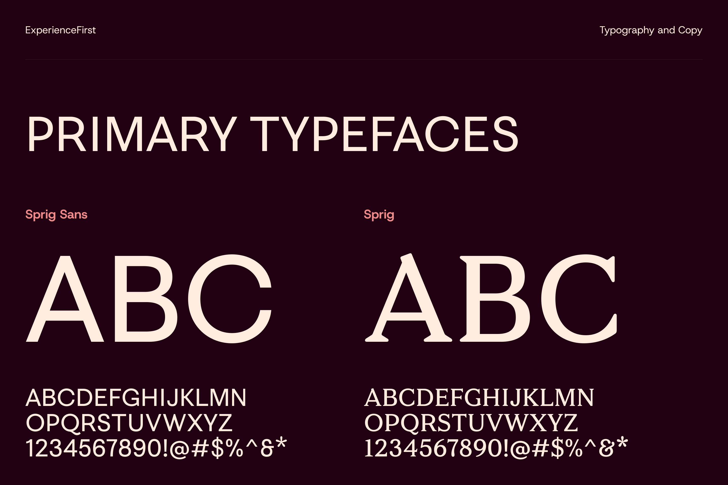
By pairing two fonts from the same family – one sans serif, one sans – each part of the name holds the same overall feel and architecture, with the serifs acting as a subtle differentiator.
When the overall visual identity is going to be rich in so many different ways (as it turned out) there is no need to overdo it with logo design.
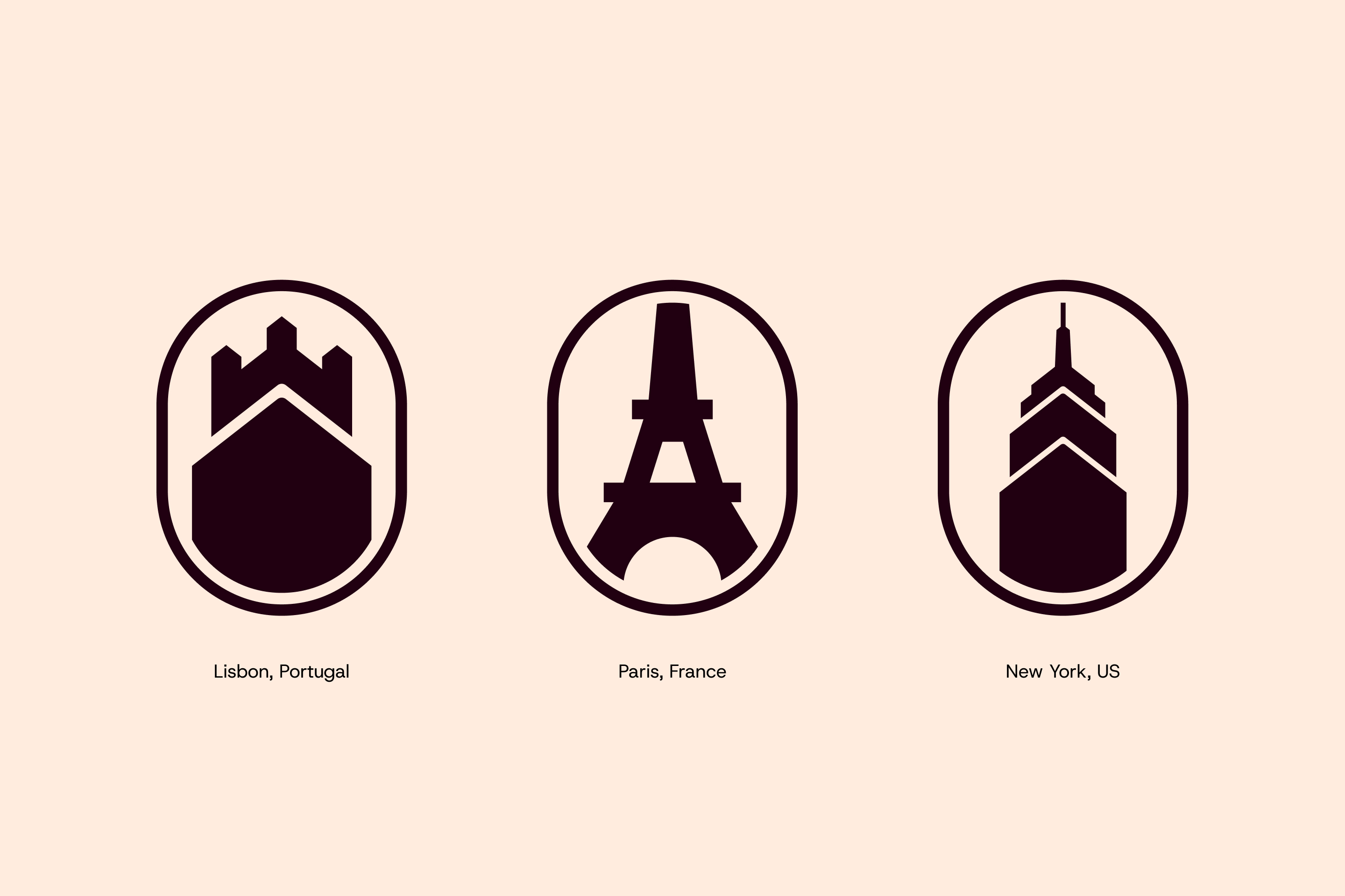
An icon among us
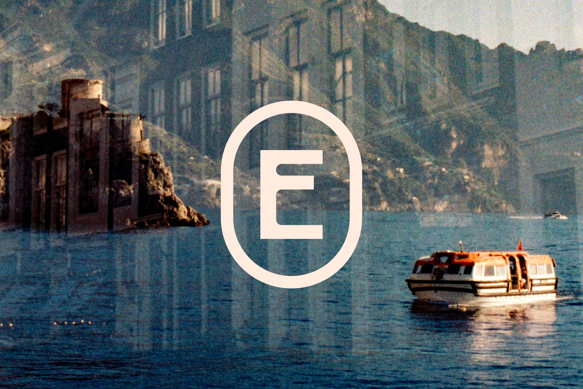
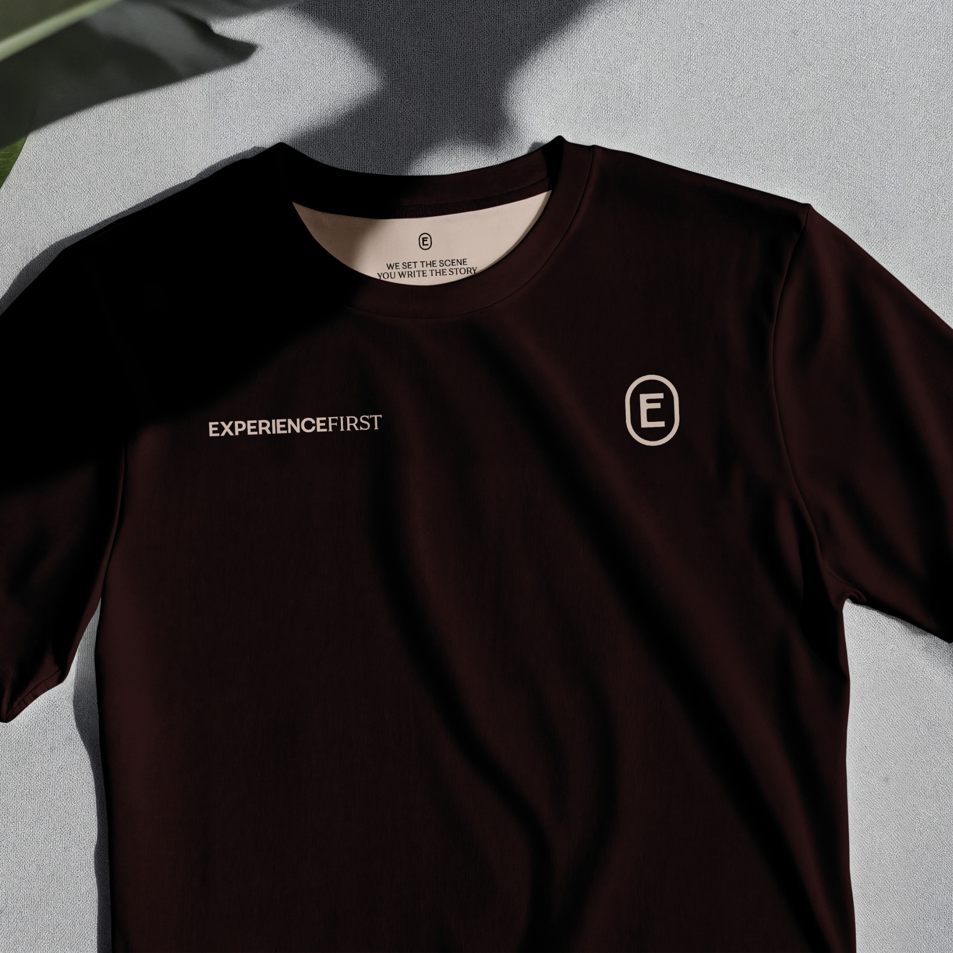
Most brands need a way of representing themselves in icon or avatar form, and ExperienceFirst are no different. Our ‘E’ mark was inspired by the many examples of idiosyncratic typographic engravings seen in all the great cities of the world. It has character, is unconventional, and cool. That felt apt for the brand.
Just the right type
Typography is always important. We needed choices made that reflected this new level that ExperienceFirst would be operating at, the sort of luxury codes their customers expect. While at the same time ensuring what – at times – can be a lot of information is clear and easy to digest.
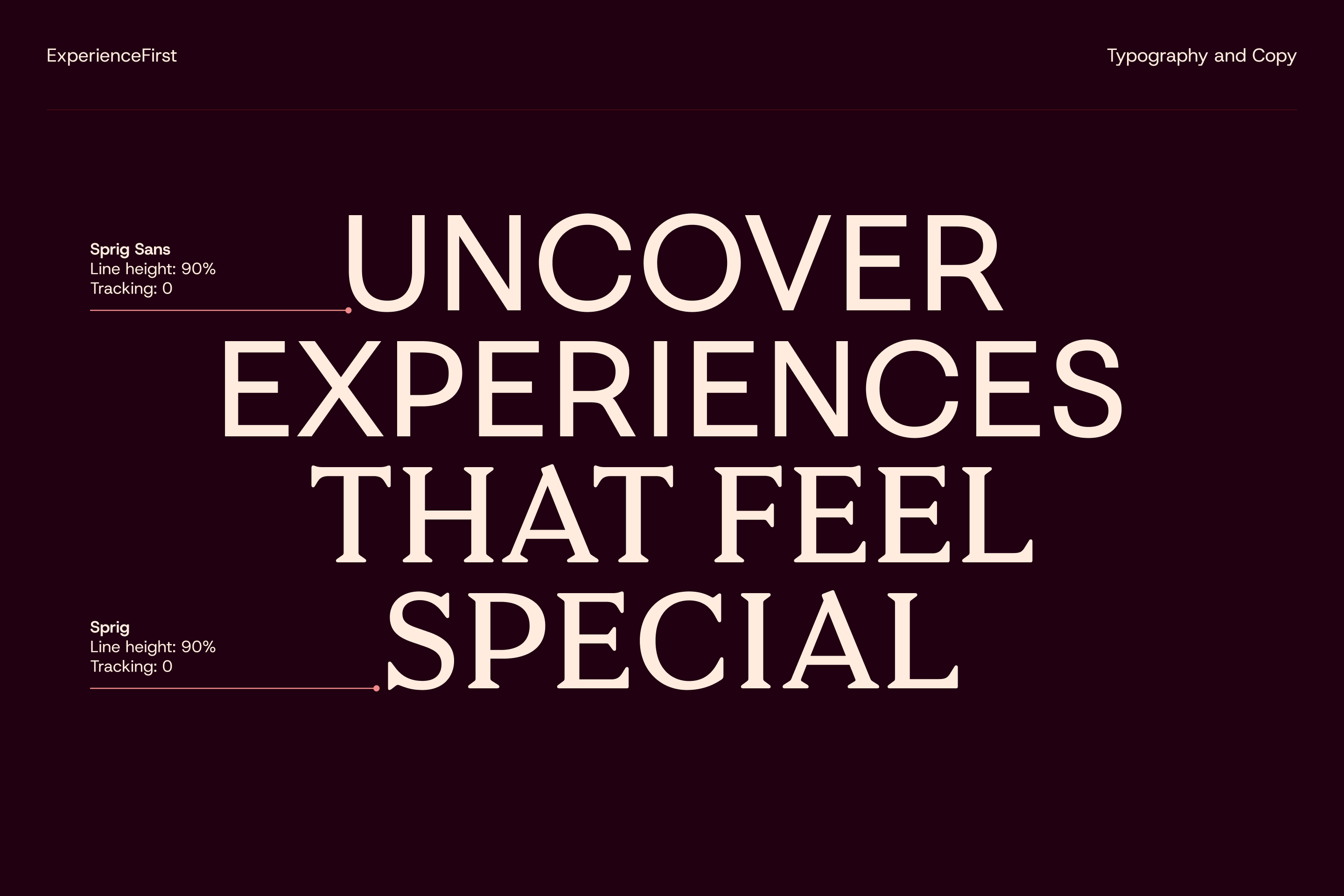
Sprig and Sprig Sans – the typefaces used in the logo – expand out across the visual identity on all large typographic features and headlines. The pairing of the sans serif with the sans cuts was a simple way of carrying the identity of the logo across everything.
Host Grotesk was then used to support in bodycopy and captions.

A restrained colour palette
With branding that will grow and flex over time making the right decisions on colour at this stage was crucial. Not just which colours to use, but also how many.
We wanted the palette to feel warm and inviting, so led with two key colours across everything: a soft, creamy off-white paired with a rich, dark burgundy. The contrast between the two meant we had two strong ends of the tone spectrum to work with.
We enhanced the colour palette with a pop of bright (but not too bright) red, a shade that had a softness to it that fitted perfectly with the over feel. This became the brand’s signature colour. One more colour – a violet that brought a touch more vibrancy – was the key CTA colour to direct users around the website.
With the brand and business set to expand in ways we can’t predict at this time, we kept the palette tight. We chose a few additional secondary colours should the in-house team need some variation for certain projects, but didn’t overwhelm the team with too much by giving each colour a role, that could end up messy and confused.
(All colour work is to AA accessibility standards.)
A flexible system, always
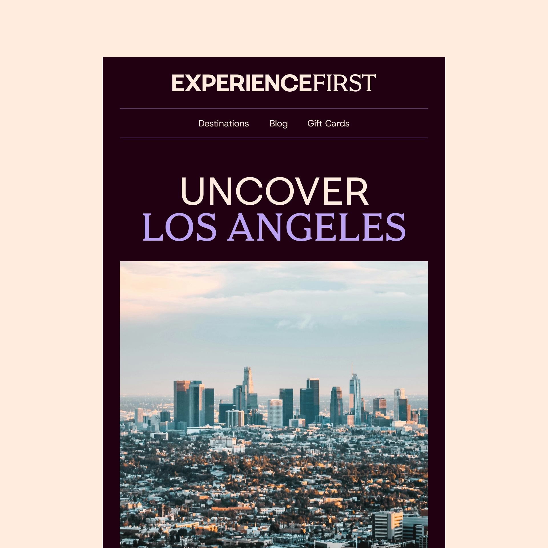
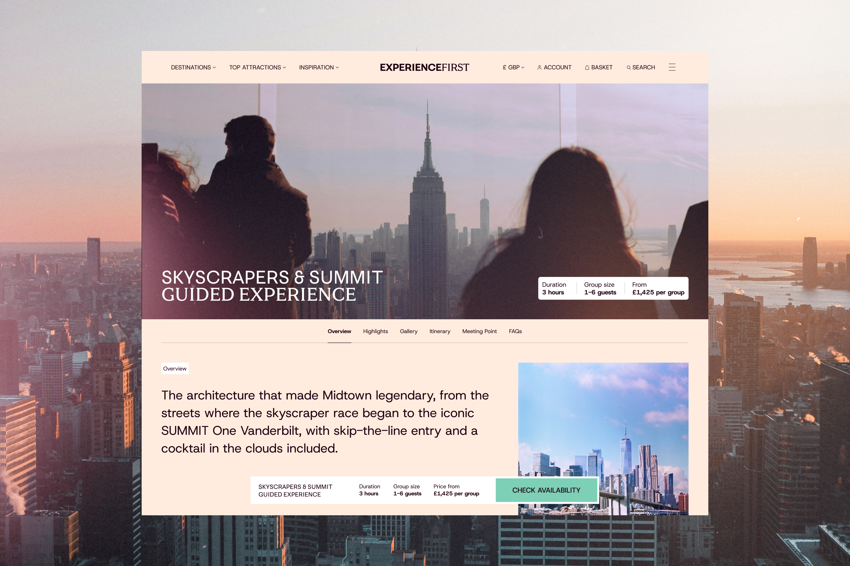
The overall design system itself took inspiration from the act of documenting travel and exploration, with layering of type, images, and textures reminiscent of scrapbooking and journaling, but in a clean, precise way that fits with what a luxury brand’s audience expects. Like all branding work we create, having the ability to keep things fresh and flexible is always a priority.
"I have worked with Imaginary Friends on several occasions, and I would jump at the opportunity to work with them again. What sets them apart is their ability to bring together business strategy, audience insight and creativity to deliver outstanding work. Not only are they highly reliable, but they are also great listeners who know how to challenge a brief, question assumptions and push beyond a client’s initial objectives to achieve the best possible outcome. Their project management is equally impressive: as a client, you always have a clear understanding of how time and budget are being allocated, making the collaboration seamless and reassuring. If I had to sum up the agency, its team and its work in three words, they would be: excellence, humanity and intelligence."
Sandra Rogat
Marketing Director
ExperienceFirst
Tech
Naru
Brand
Travel
First Bus
Motion
Non-profit
Playlist for Life
Brand
Education
ICS Learn
Tech
Venues
SEC Glasgow
Campaign
Manufacturing
Calfurn
Brand
Travel
Uber Boat
Campaign
Travel
Air New Zealand
Campaign
Travel
Royal Caribbean
Digital