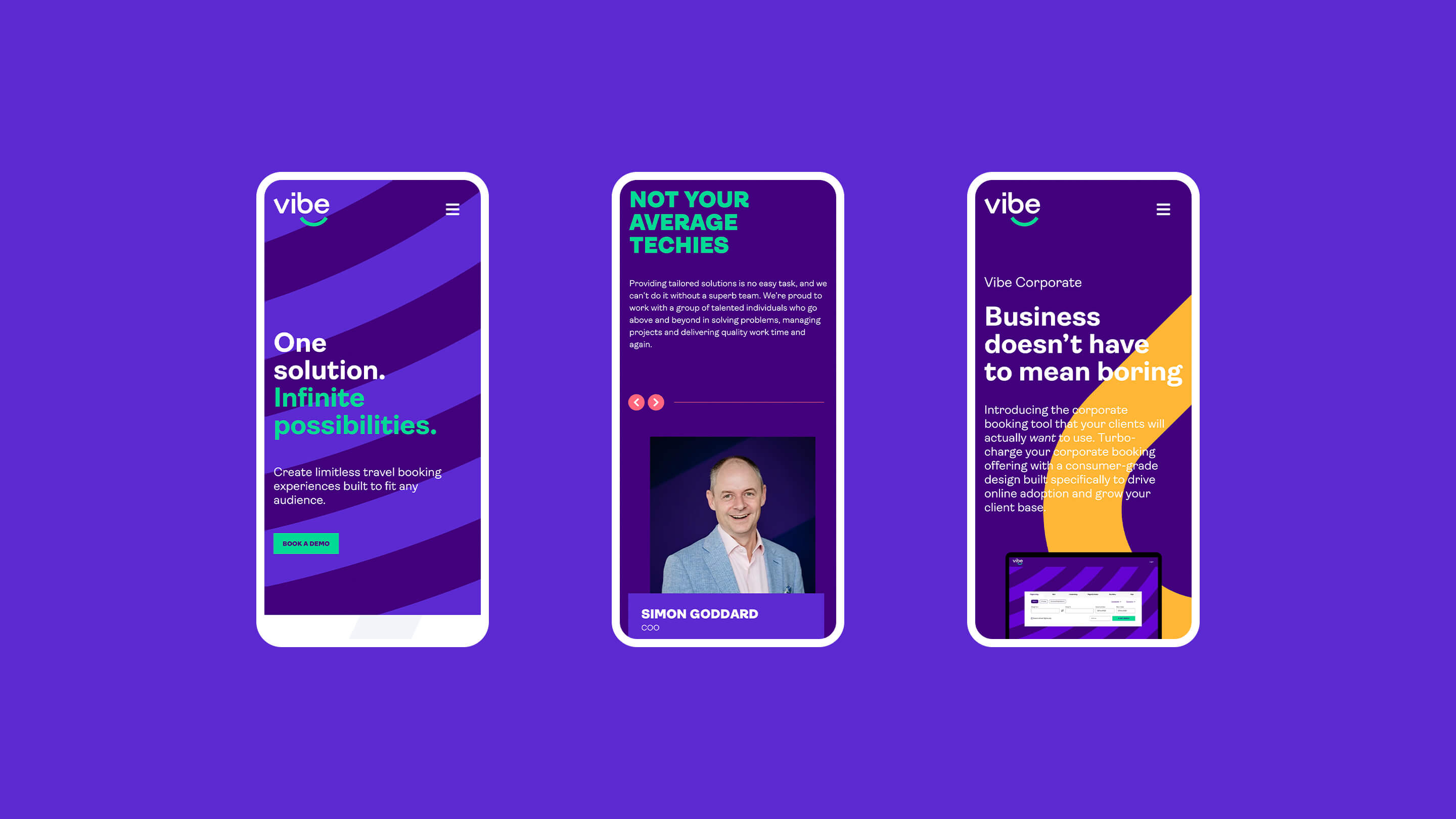
Our smart thinking transformed a tech company
Vibe
- Research and workshops
- Brand positioning statement
- Logo design
- Visual identity (including roll-out)
- Creation of tone of voice
- Copy samples
- Key messaging
- Brand guidelines
- Digital templates
- Motion design and behaviours
- Social media campaign
Innovators at heart, Vibe believed there was a need for a better travel booking platform, so in 2007 they went right ahead and built it. What they created was easy-to-use tech that was so flexible and adaptable it was suitable for any audience. There were, however, some challenges. There was no doubt that customers loved their product, but it was complex and explaining it in an engaging and concise way was proving tricky. And while their customers also loved working with them, what made them so great to work with wasn’t being translated through their branding. It wasn’t going to be easy, but nothing great is ever easy, right?
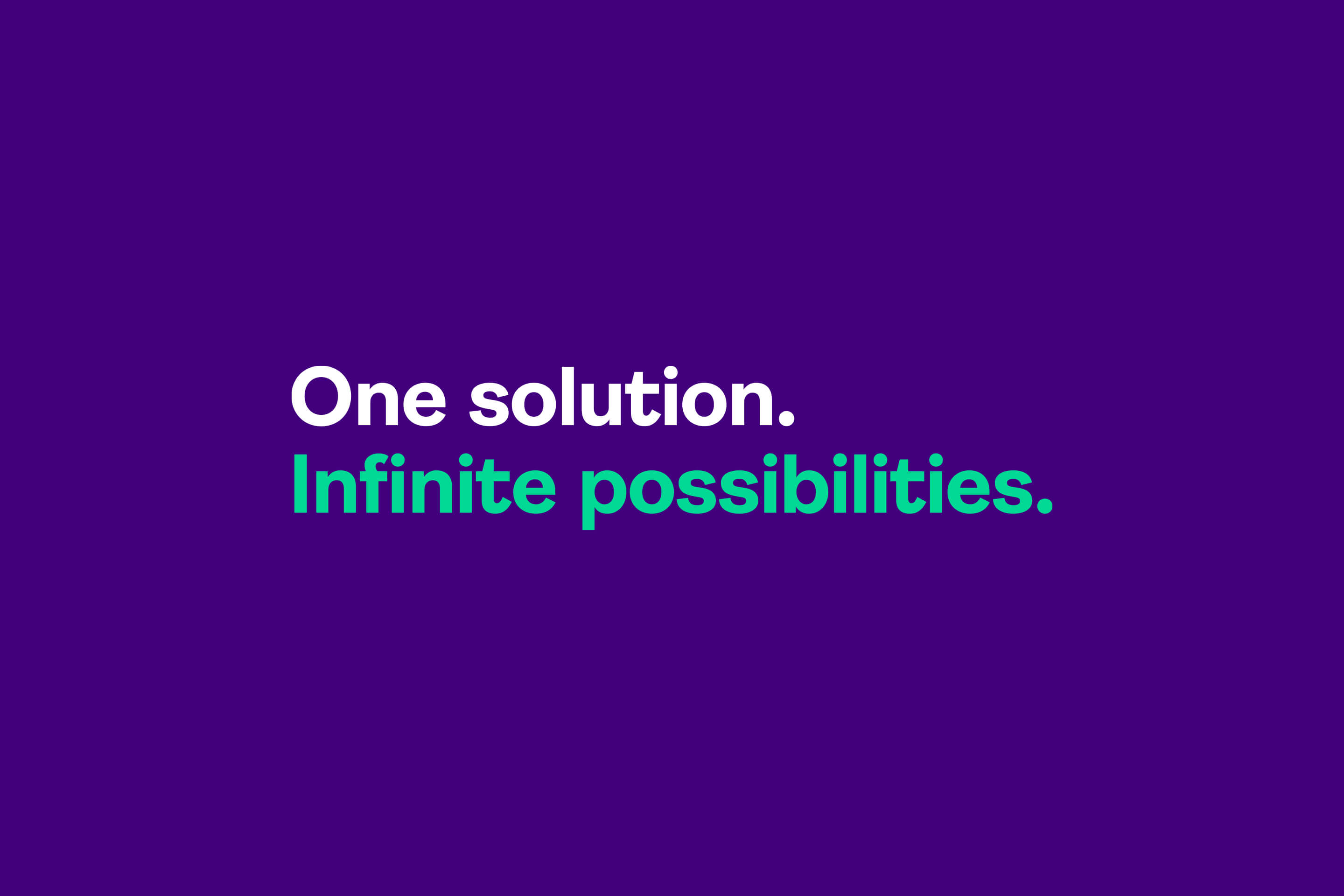
Built on big ideas
The purpose of our rebrand was to position Vibe both internally and externally as the innovative, forward-thinking travel tech company they were. Even the briefest competitor analysis showed that they were in a great position to leave their competitors behind in a branding sense – if they were brave enough to see through the change that was needed. And as it turned out, they were. People expect an incredibly high standard from tech branding and we felt Vibe should be no different. They also needed to tell their story in an engaging, vibrant, and straightforward way. As well as attracting new business, it was also important to reassure existing customers that everything they loved about the company would remain the same.

Authenticity at its heart
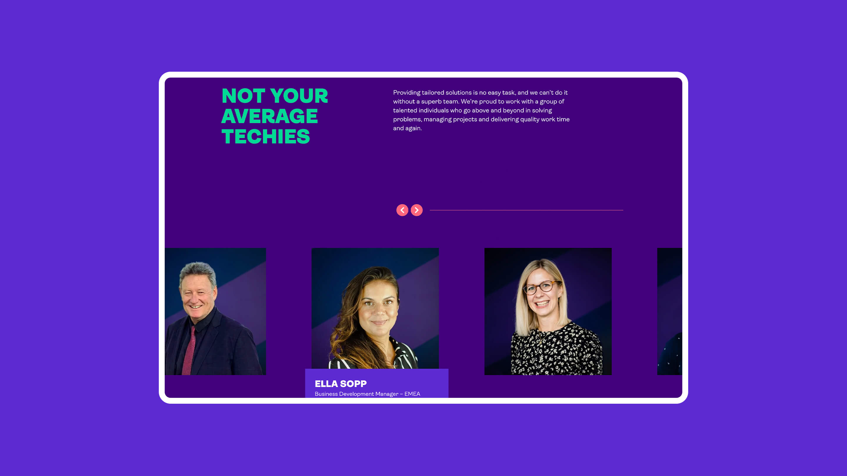
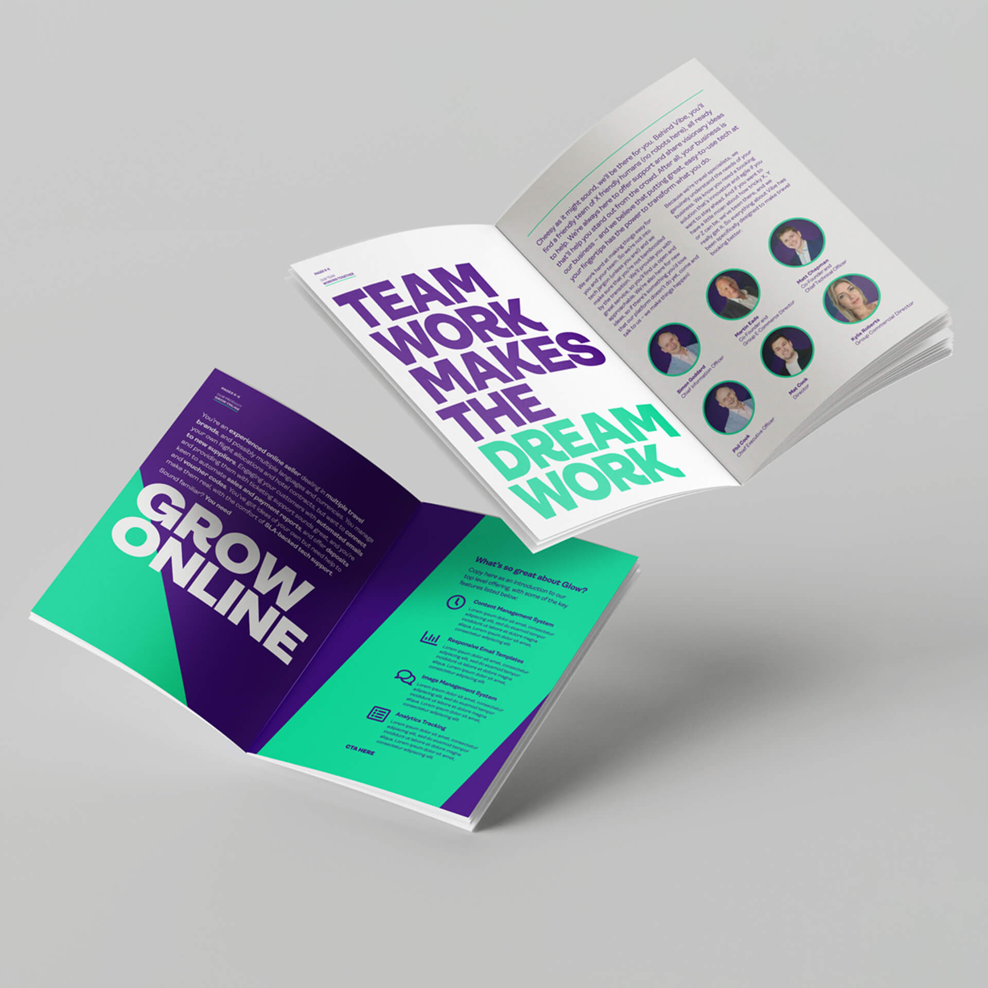
Customers loved working with Vibe. But research showed that they each had a strong relationship with their one point of contact rather than with the business as a whole. We identified the need for the brand to emulate and reflect these personal aspects that clients loved: friendly, positive, knowledgeable, and expert. It was cutting edge technical expertise with a warm, fun personality that won new clients and kept them.
Design for success
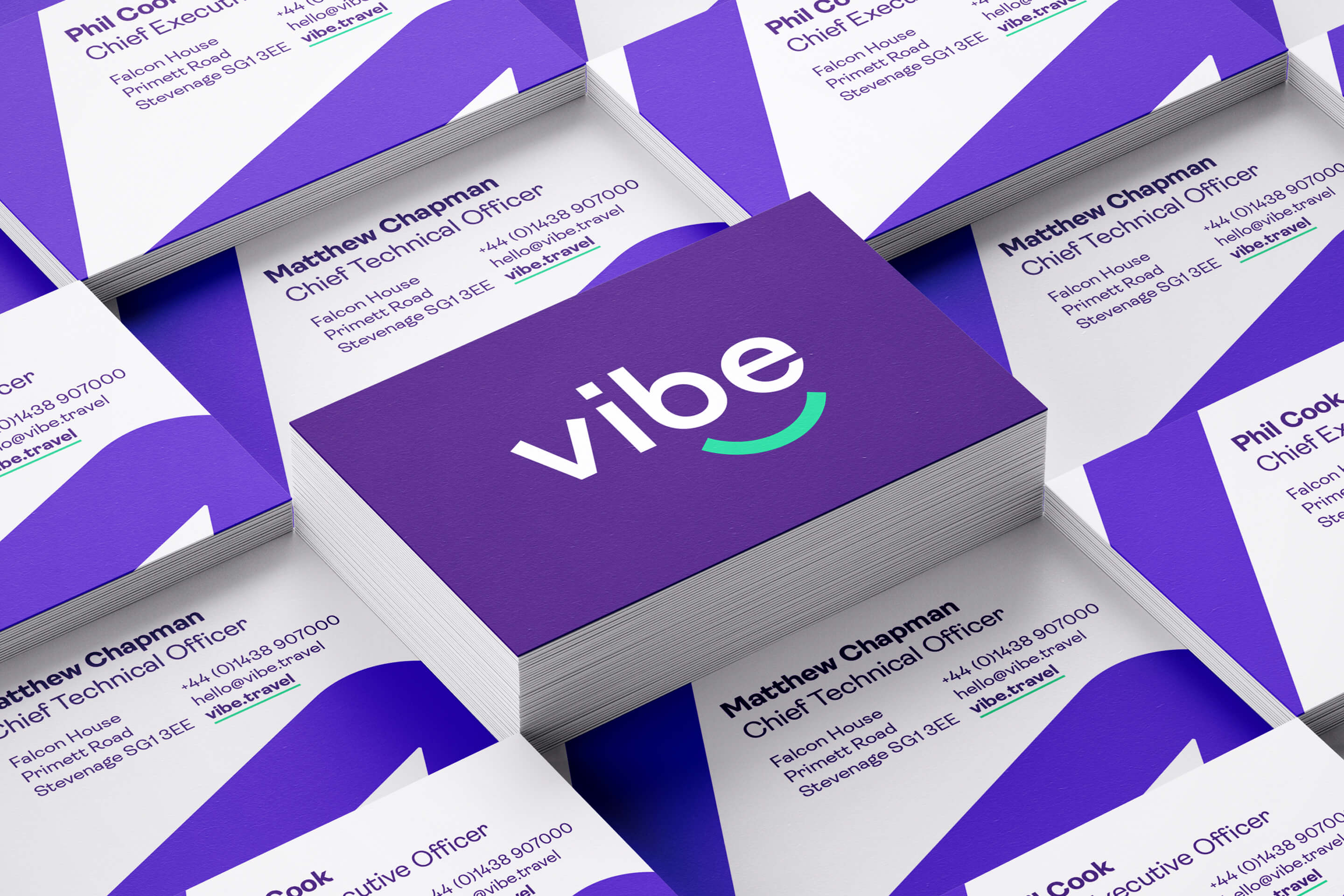
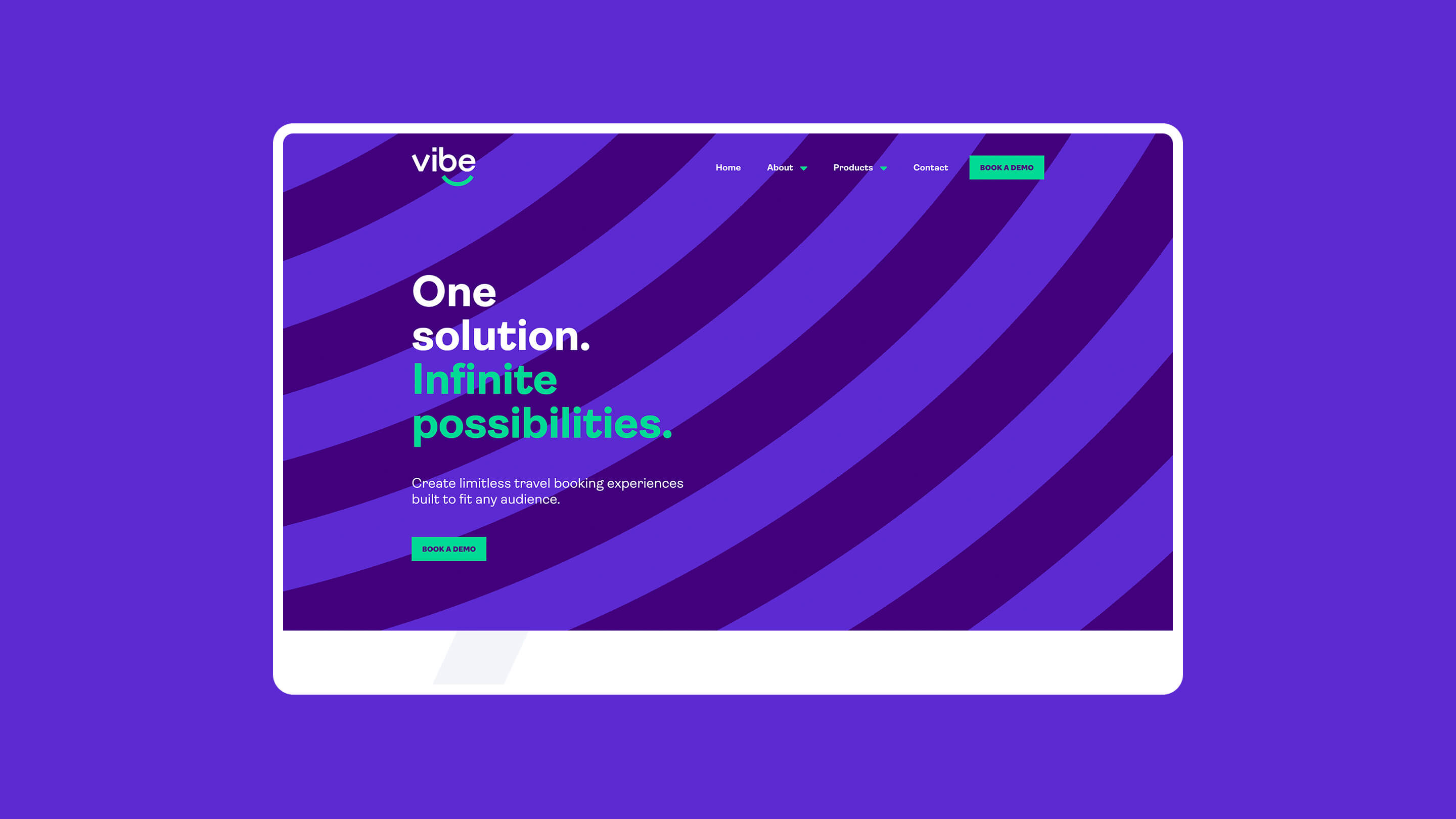
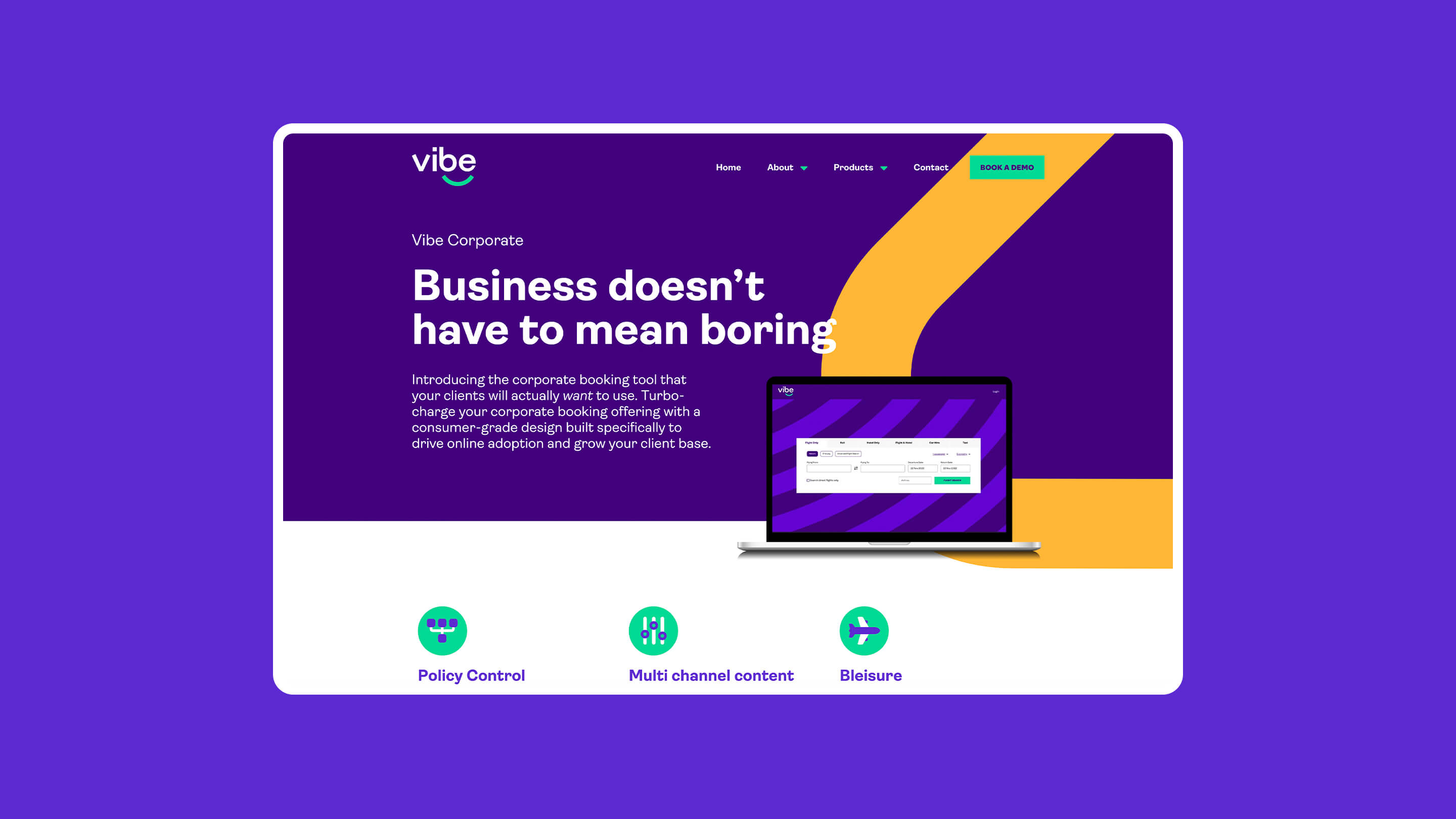
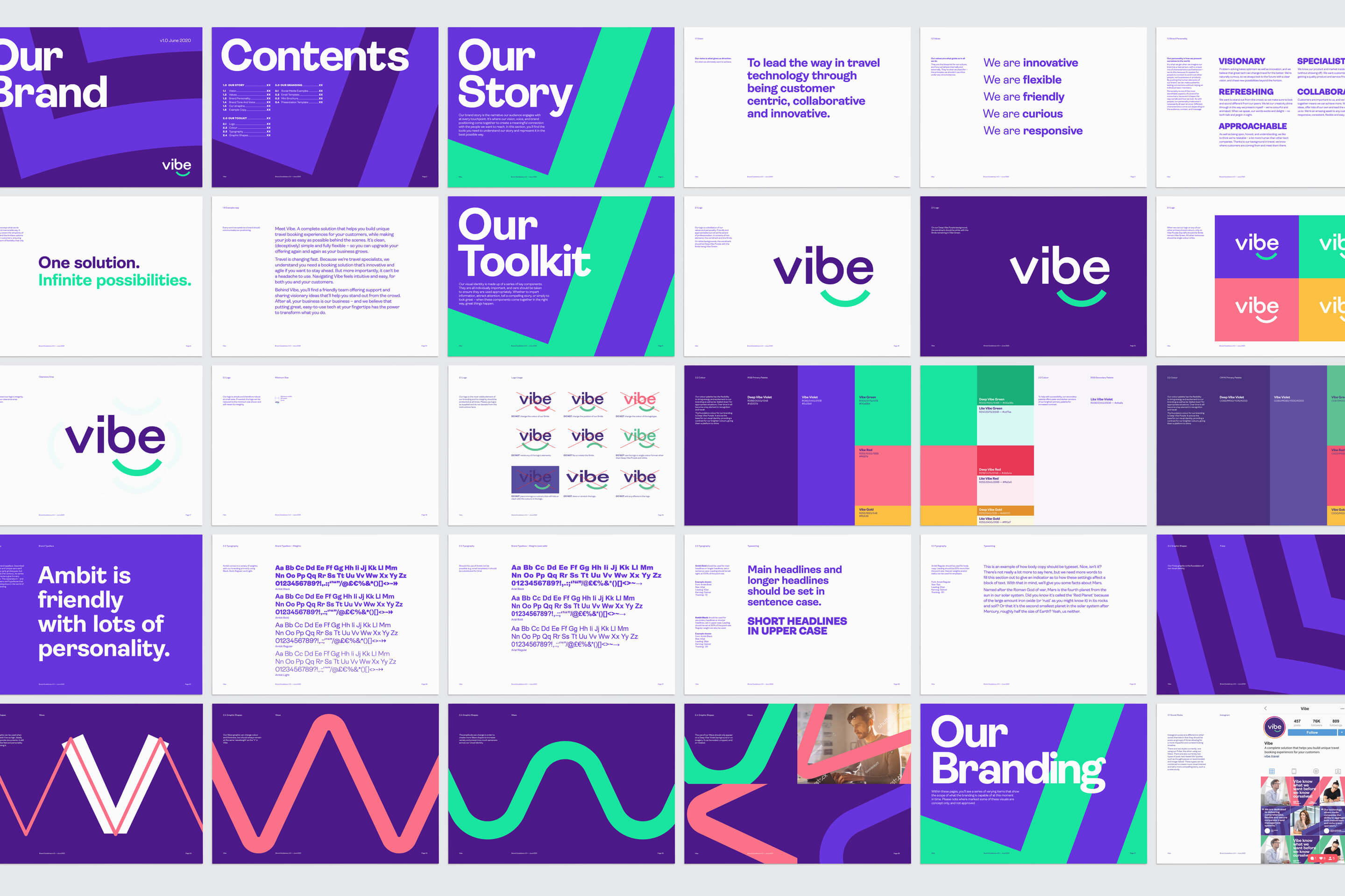
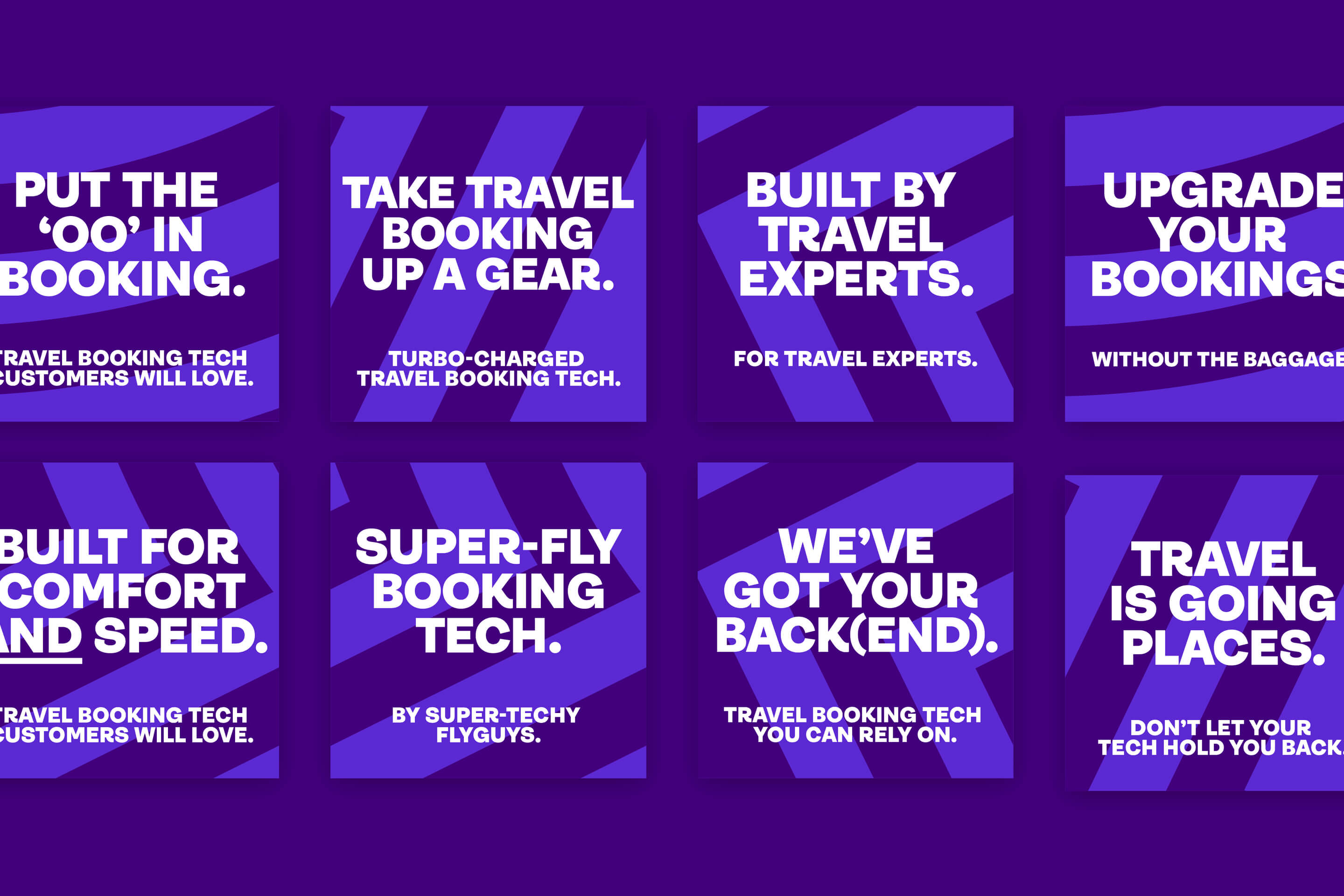
We designed a vibrant and punchy visual identity, inspired by Vibe’s values and lively personality. We knew that whatever we created for Vibe had to be as flexible as they are. To achieve this, we created a series of graphic forms and patterns based on either waves or pulses – influenced by the brand name – that can scale, rotate, and crop differently, as well as change colour, animate, and change form, for all manner of uses now and in the future. This ensured branding that will remain fresh and flexible for years to come.
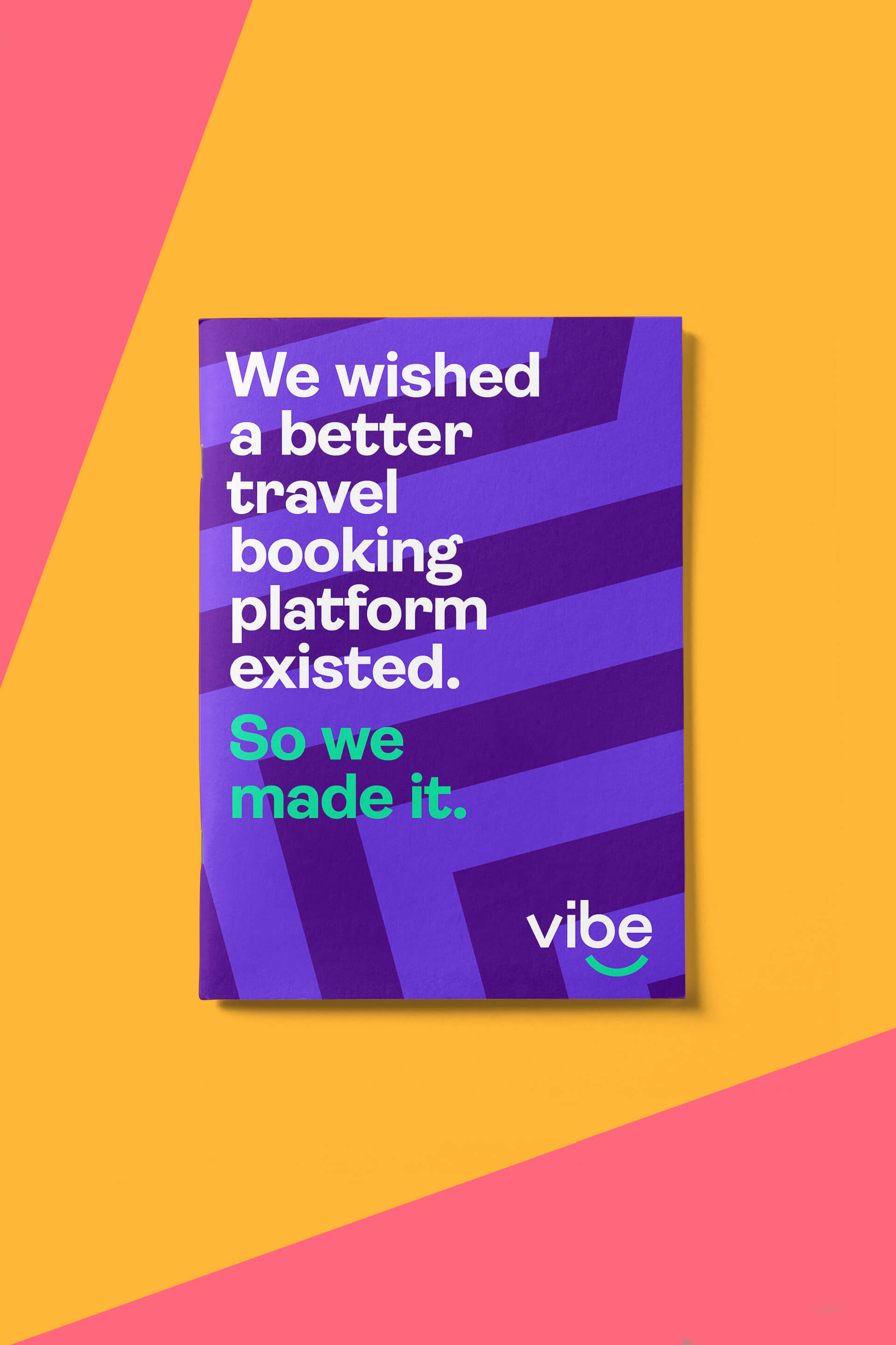
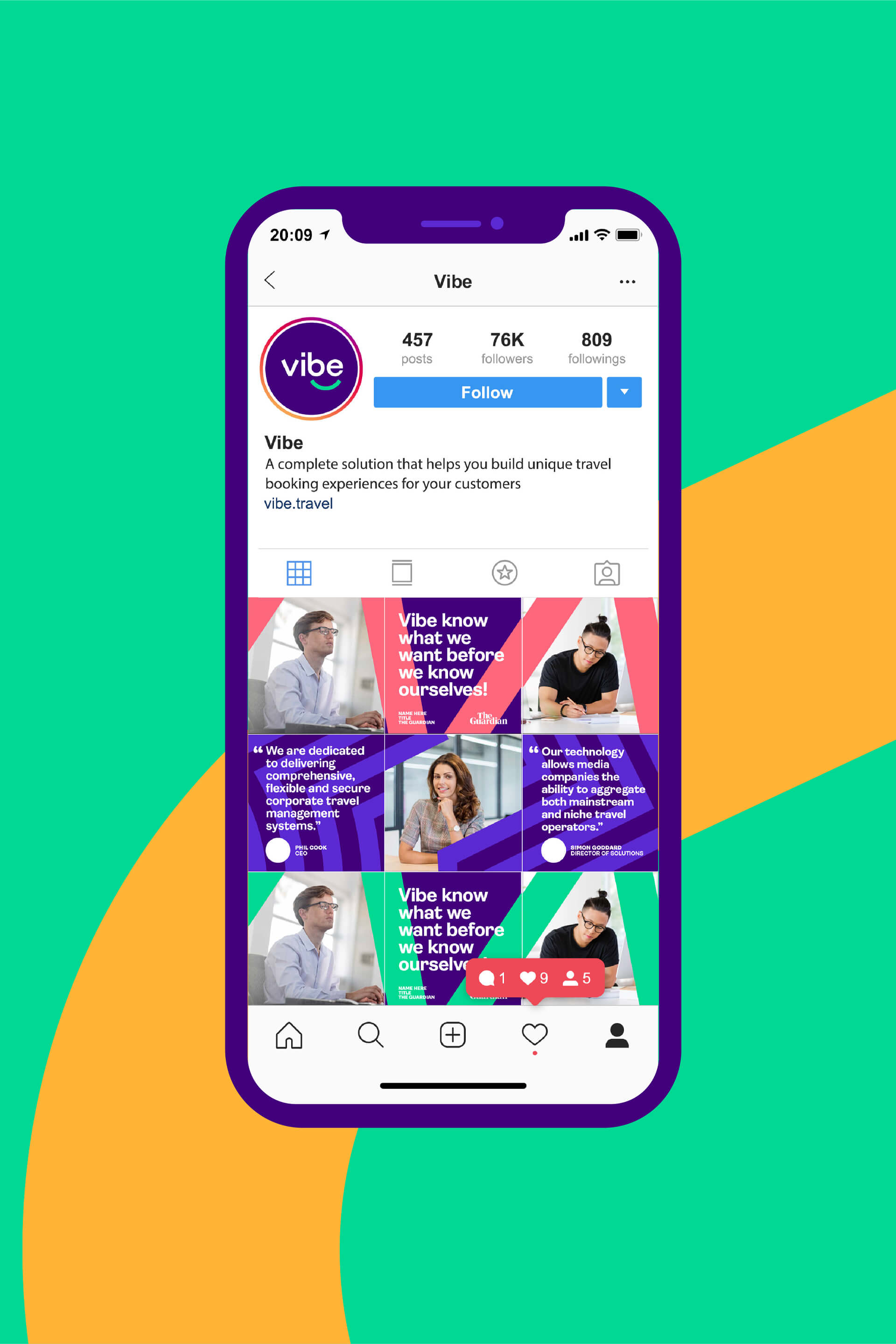
Based on the foundation of a striking colour palette and a bold, friendly typeface, in a sector where almost all their competitors used dark blue, we created an identity with serious impact, giving Vibe the look and feel of a cool, contemporary tech company with heart and soul. Their personality was further expressed with a tone of voice that was confident but enjoyed a nod and wink at the same time. From an initial brief where they were wary about change, Vibe truly embraced our process, and as a result, have completely transformed their business – as well as their boardroom, which now has their signature purple striped wall.
