Back
Case study
Branding with simplicity and personality
CDS

what we did
- Brand strategy
- Logo design
- Visual identity
- Copywriting
- Illustration
- Motion design
- Digital strategy
- Website design
- Website build
Chauffeur Drive Systems – or CDS, as they’re commonly referred to by customers and partners alike – is a boutique, independent B2B technology firm based in Stirling, Scotland designing and building software for the private hire and luxury ground transportation industry.
After steadily building their business for eight years, they’d reached the point where they realised their brand wasn’t at the standard needed to take them where they wanted to go. They approached us to reimagine how they look, sound, and how they articulate what they offer to customers all over the globe.

Setting the direction of travel
Getting to know the client and their business is always the first step. The strongest first impression that came across loud and clear is that while CDS may be a small team, they are brilliant at what they do and incredibly ambitious.
What really set them apart from their competitors was their human side. They didn’t look ‘tech’, nor act or sound it. This was something we really wanted to hold on to.

Believing and achieving
That ambition manifested itself in unwavering confidence, the belief that their product is world-leading, the best there is. Not just in its current form but more excitingly in where it can develop and scale in the future. This is a product designed and built for the world of chauffeur travel, but could easily work for a fleet of any kind: even helicopters! The near limitless possibilities pointed to an exciting future for CDS.
An opportunity to stand out
In digging into the competitive landscape what became clear was none of their competitors had a clear position, a distinctive voice, or an ownable identity. CDS were surrounded by successful businesses who were functional, corporate, and – put simply – boring. Against that backdrop, with CDS’ belief in remaining small, there was a real opportunity to set themselves apart.
A journey of positivity
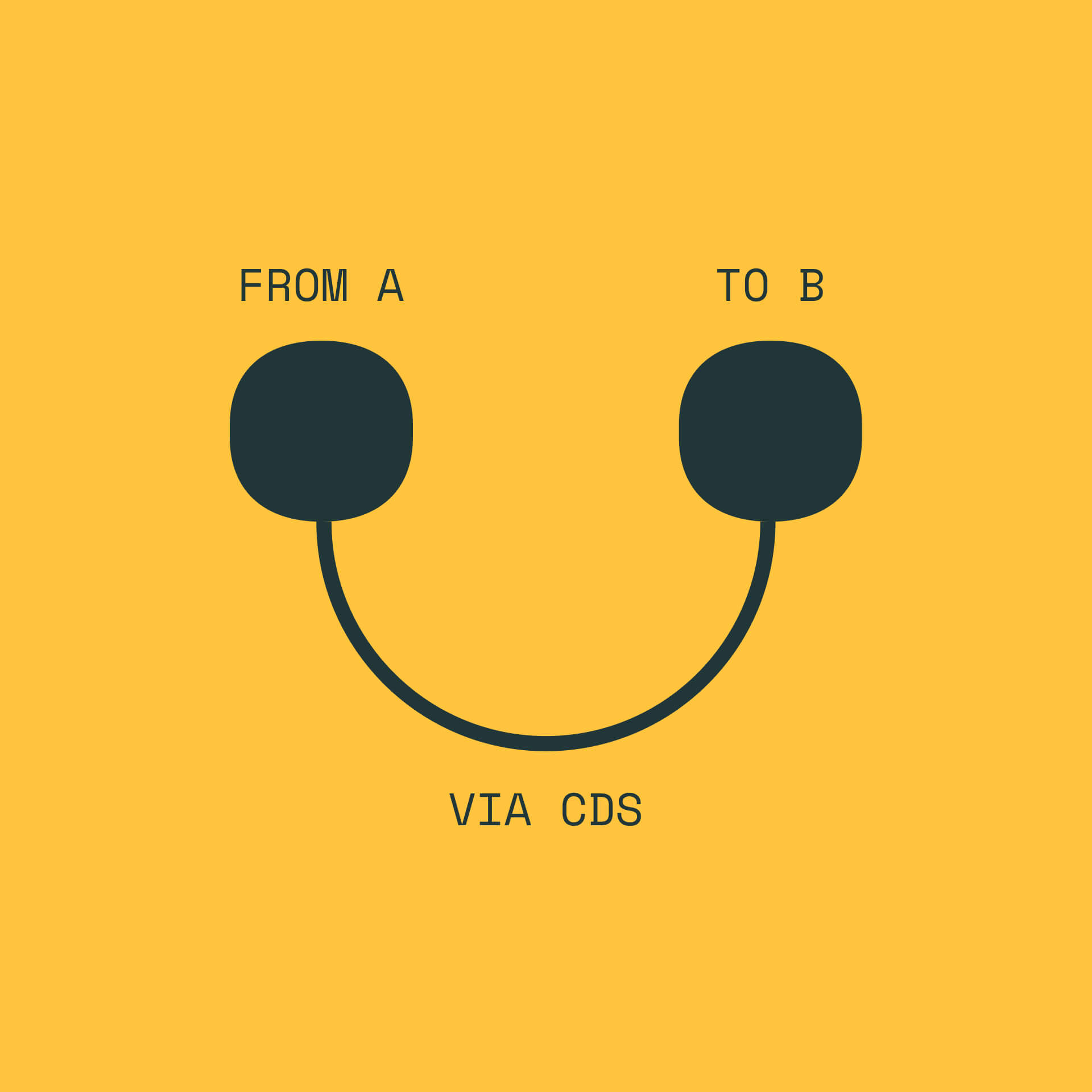
Getting to work, we set the tone for this project with a new brand idea: from A to B via CDS. For CDS, the journey is everything, from the journey of its customers using its platform, to their customers’ journeys in the limos. Our brand idea is that getting from one point to the other should be enjoyable: the platform itself, smooth, seamless, and scalable.
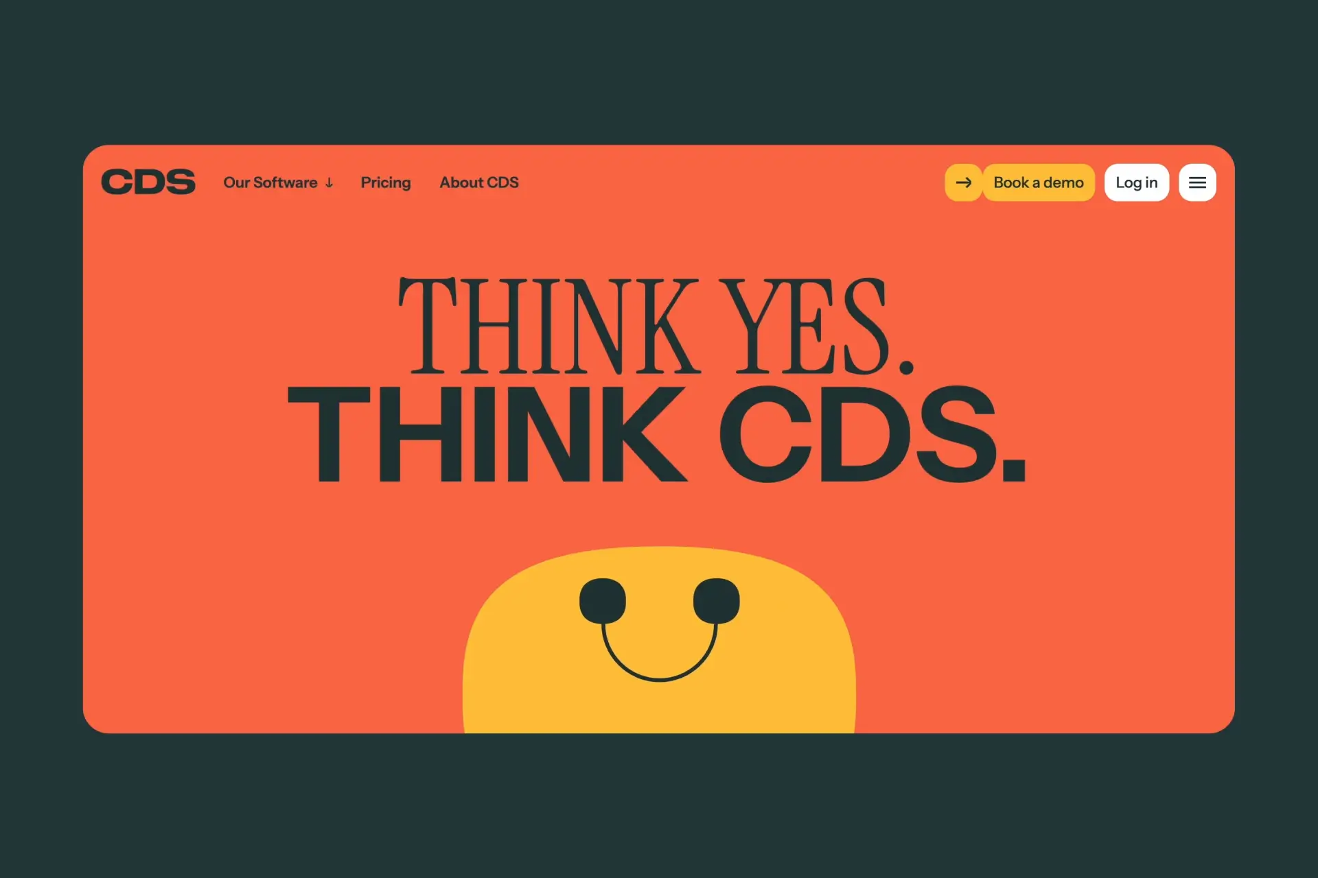
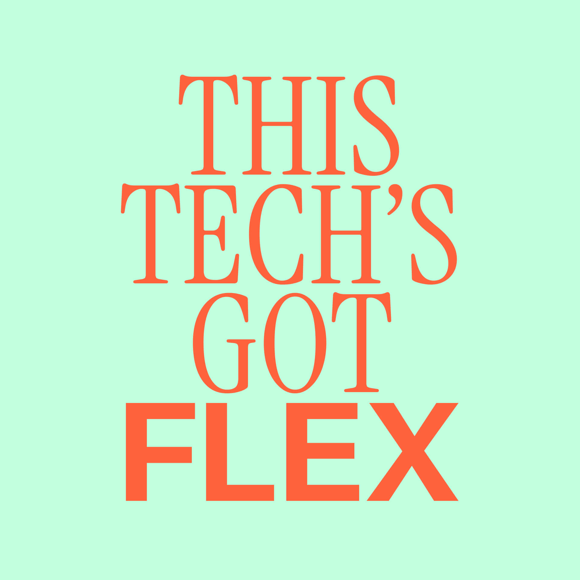
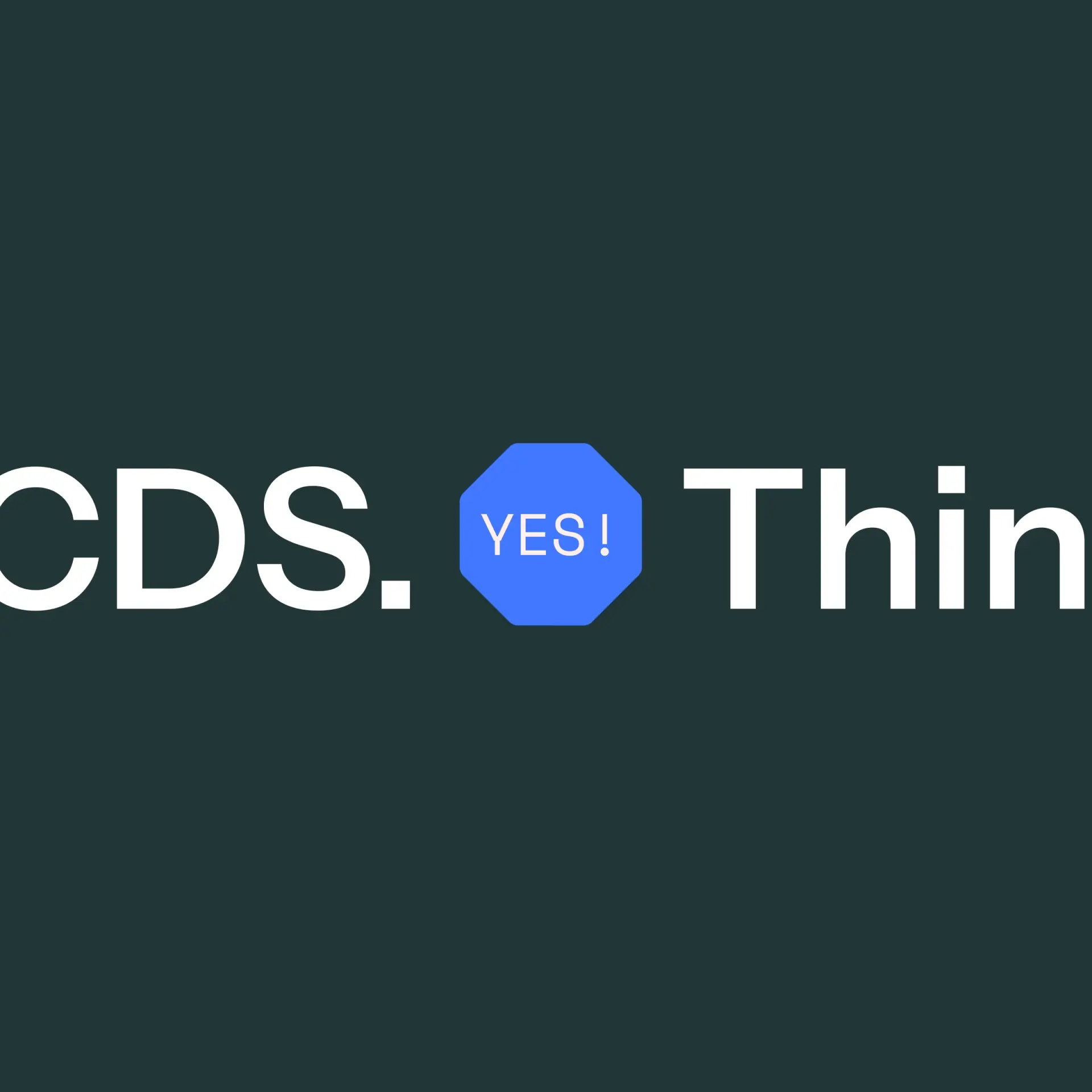
We then articulated this through the brand promise: ‘Think Yes. Think CDS.’ With technology that can adapt, flex, and scale to meet the needs of its users, no matter their size, we wanted to capture a sense of possibility, underlining that nothing is impossible. That the sound ‘yes’ is audible when you say ‘CDS’ (‘SeeDeeYes’) was a subtle added bonus.
A tech company like no other
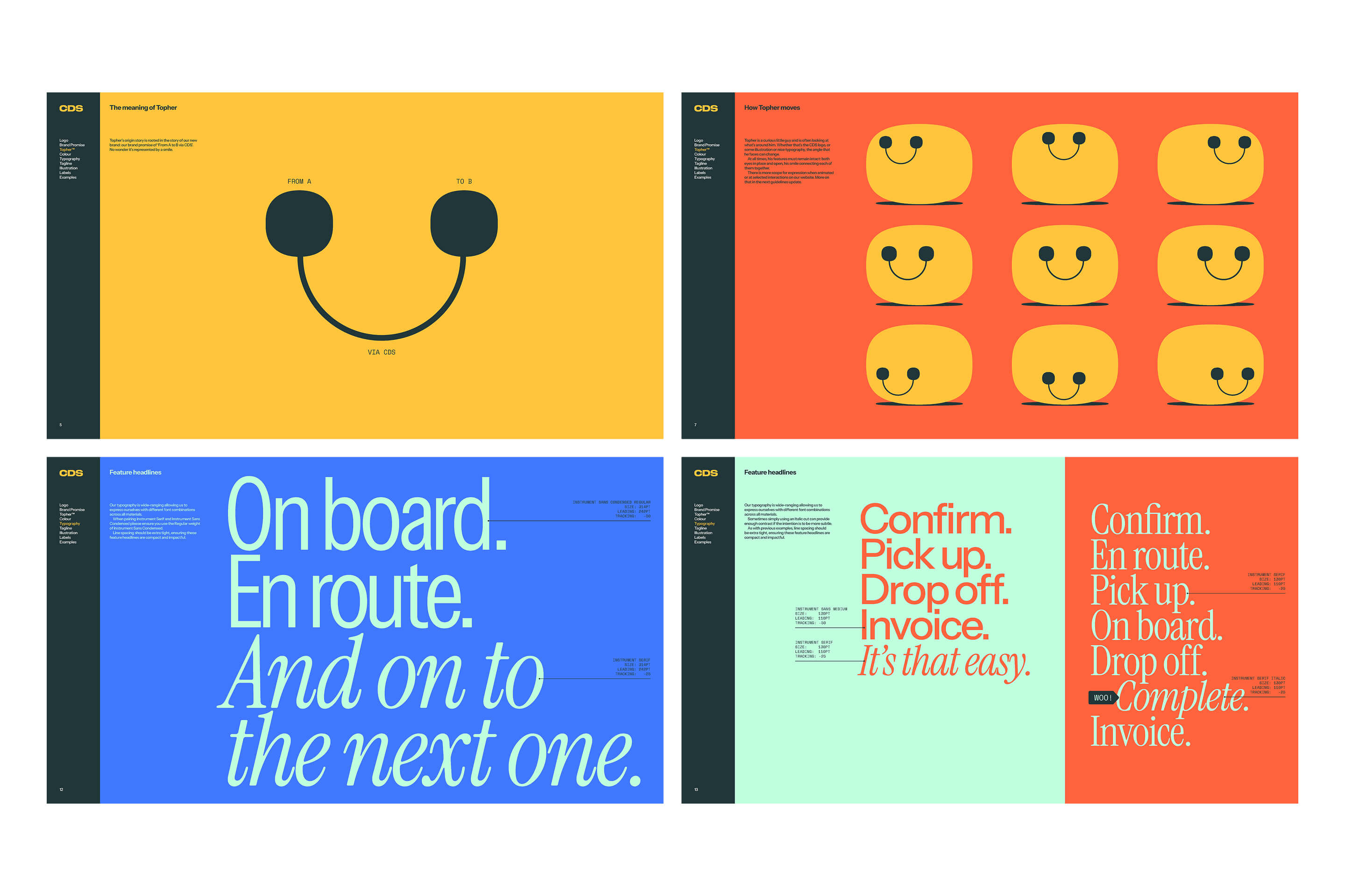
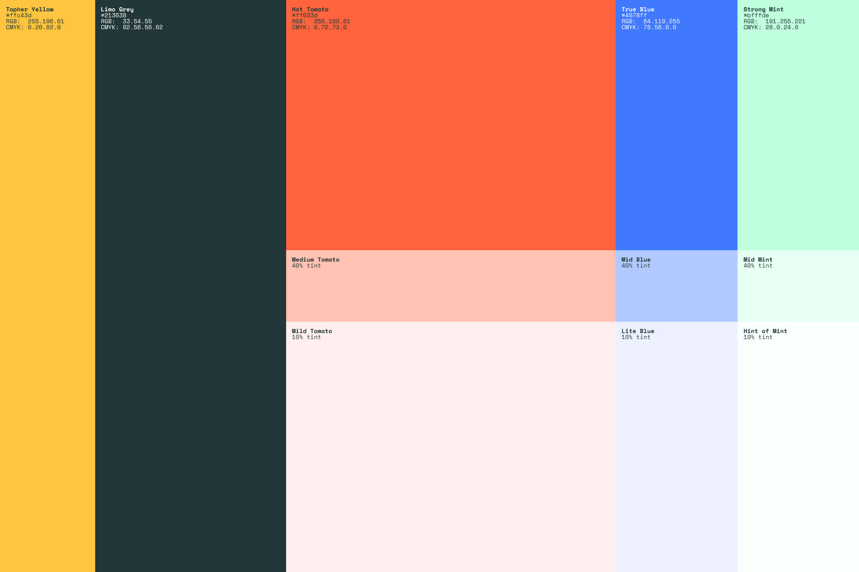
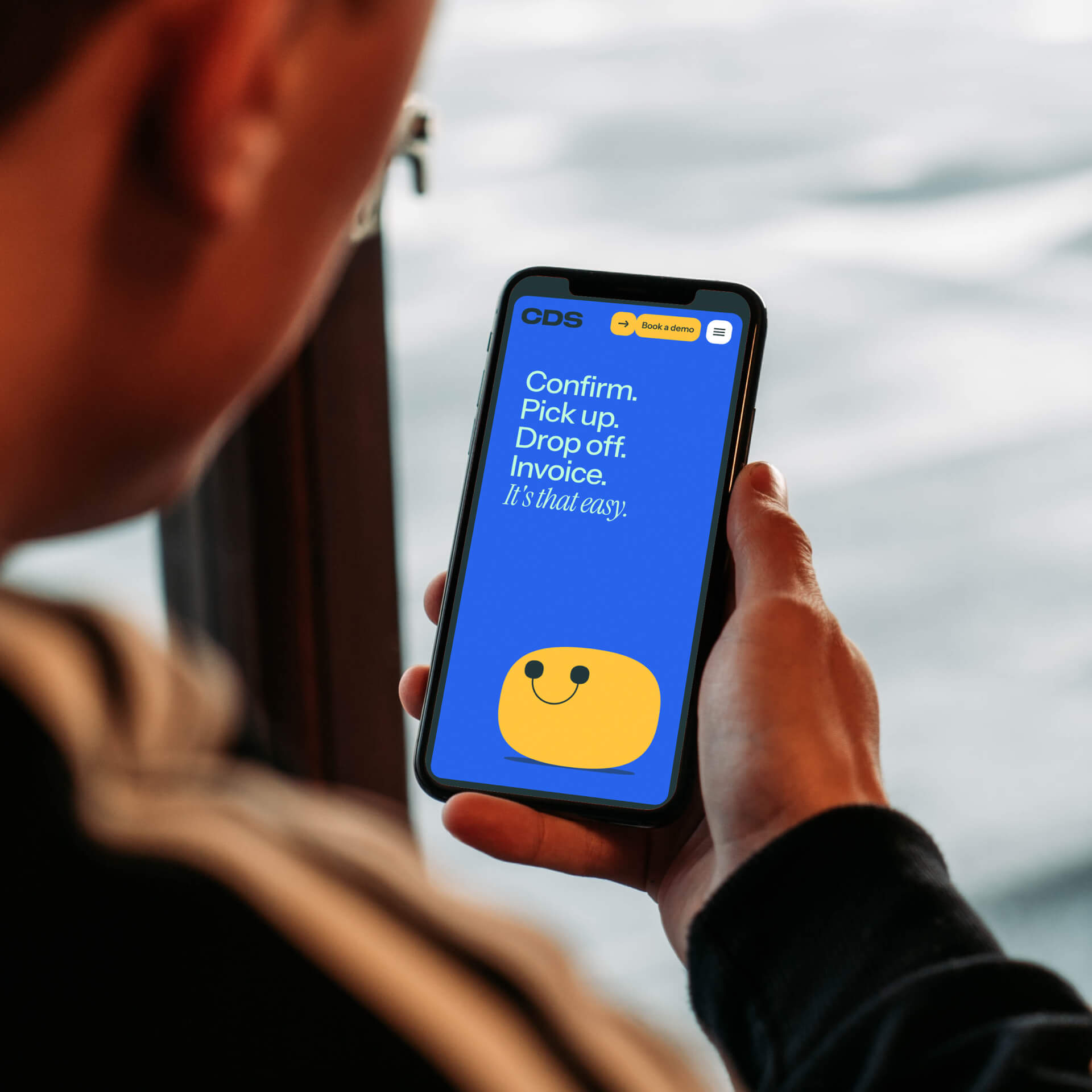
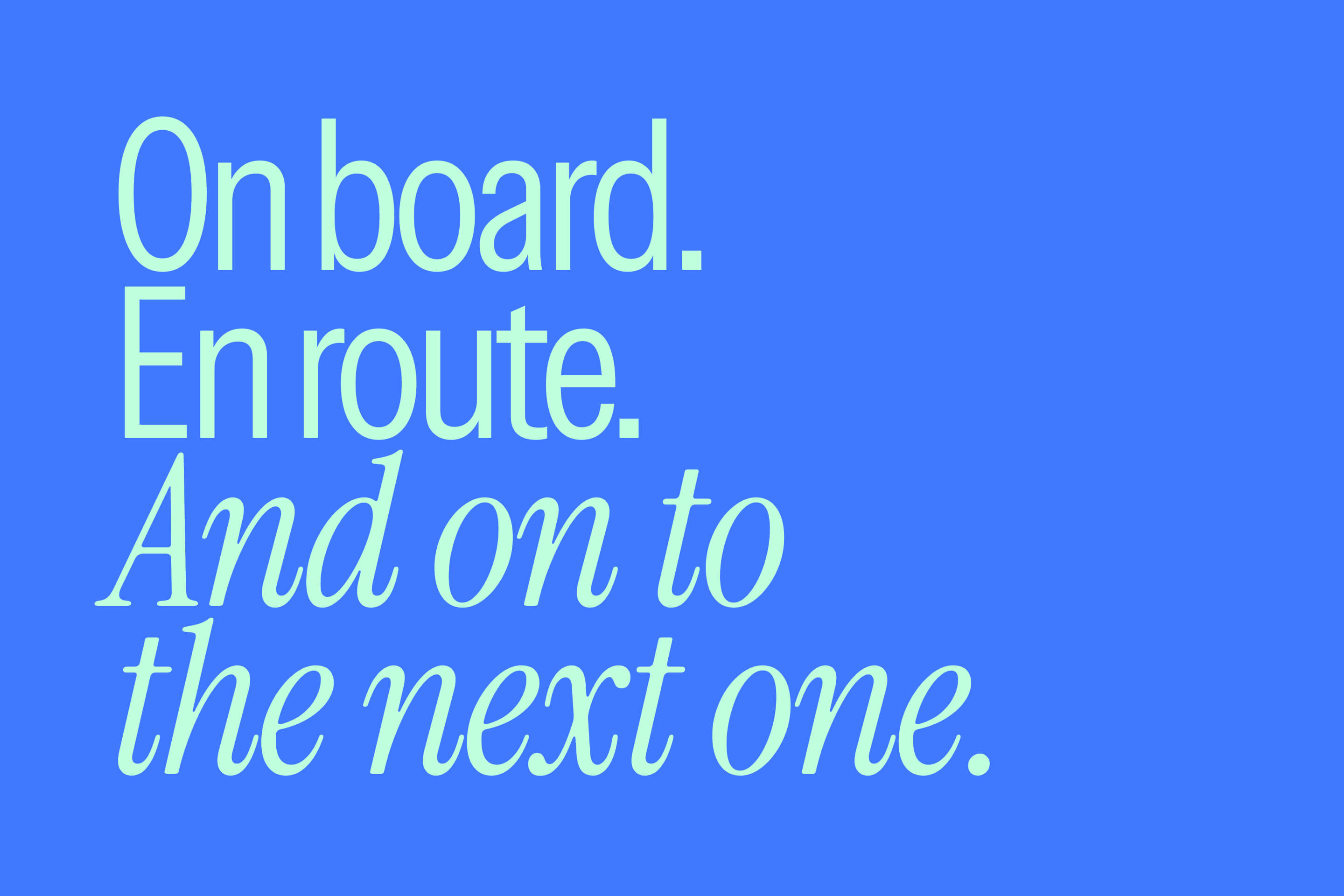
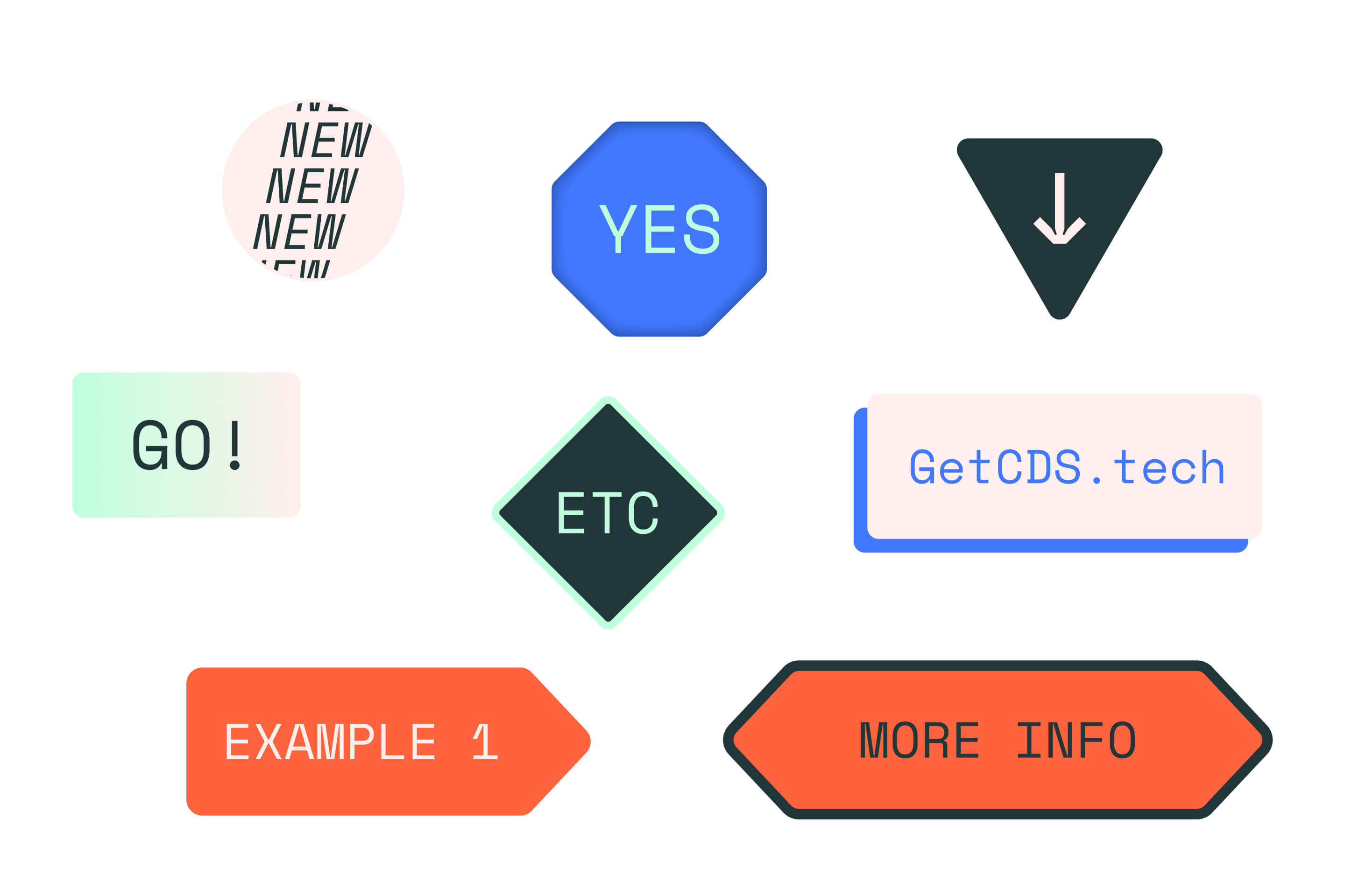
When it came to bringing everything to life through design, we leaned on the main facets of what we learned from the founders: they were confident, experts in what they do, had bags of personality, and didn’t want to look or sound like the corporate competitive landscape they were surrounded by. So we gave them a bold and bright colour palette, and expressive and flexible typography. But more than just that, we gave them their own mascot.

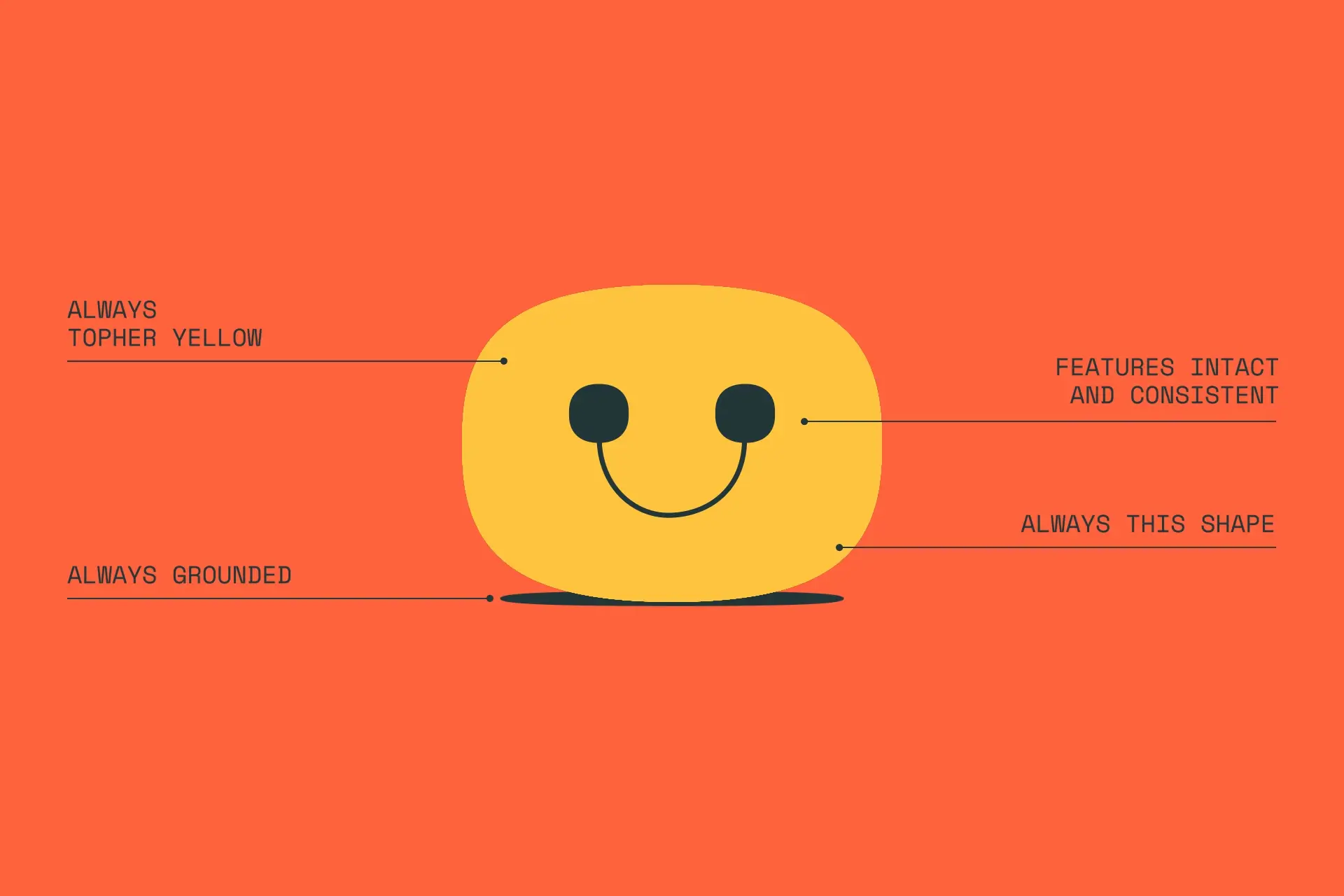
Meet Topher
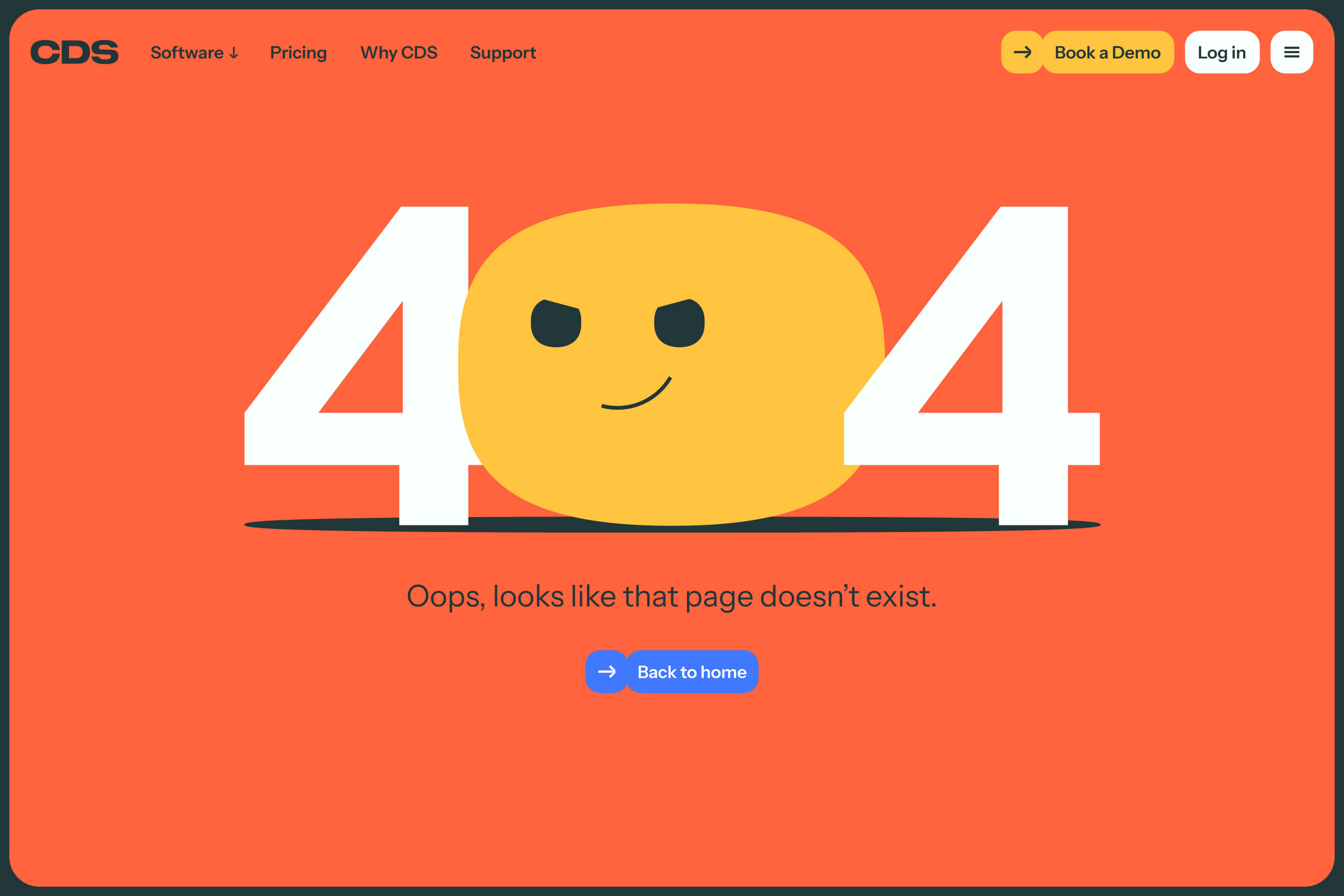
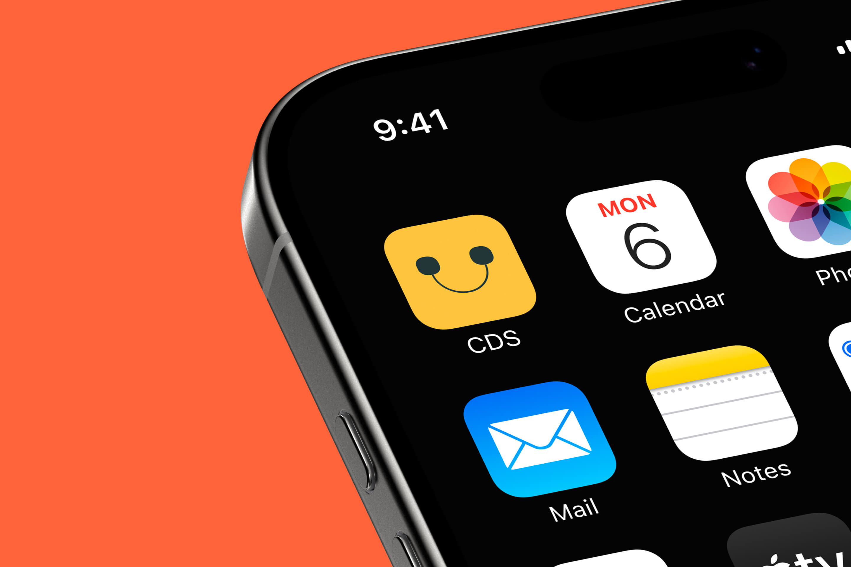
The new CDS brand is spearheaded by Topher – full name, Christopher D. Steerwell – who immediately shows that CDS are not like their competitors. Whether he’s nestled in the logo lockup, guiding users through the website, having his own fun in motion, or any number of future executions to come, he brings a burst of personality that echoes that of the founders. With facial features that are the visual representation of ‘from A to B via CDS’ he is connected directly to the brand idea. He’s got character and meaning. Exactly what the best brand mascots should have.
(That Topher rhymes with chauffeur is purely a coincidence, honest.)
Making the complex, simple
The trickiest part of branding such complex technology is making it easy to understand. We set about doing that in two ways.
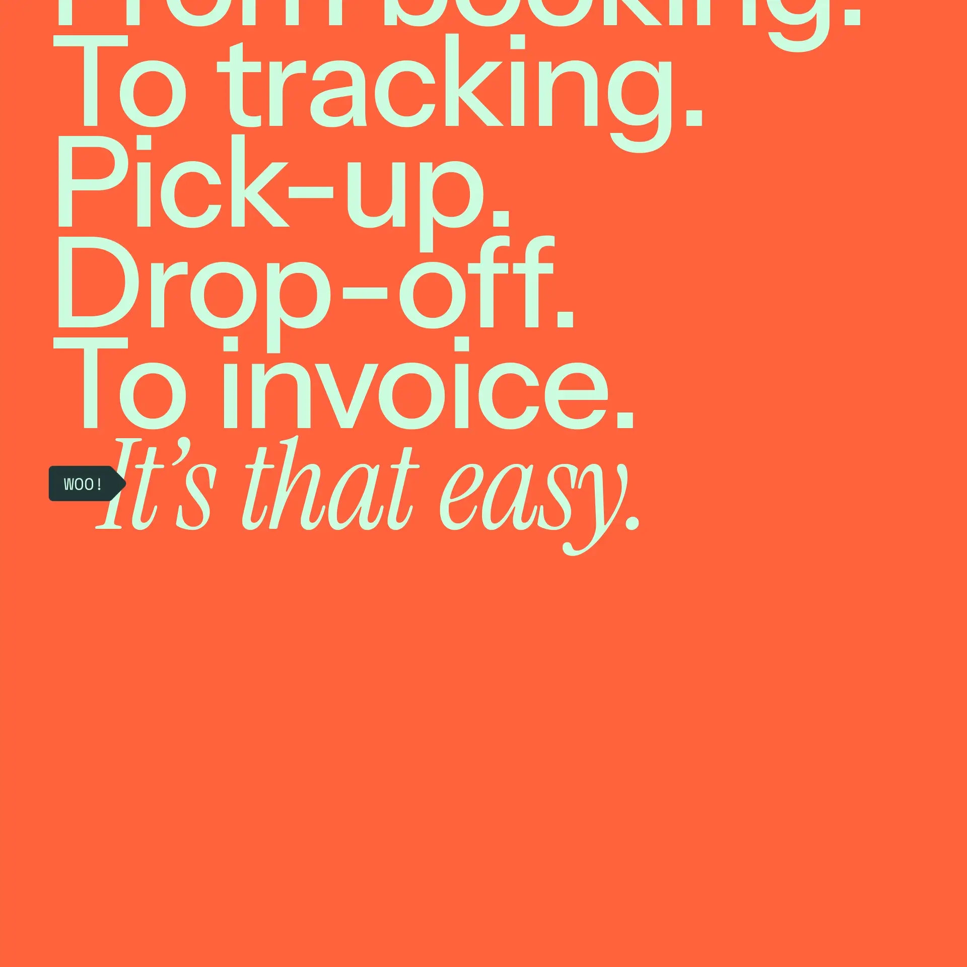
Firstly, through simple language, breaking down each key feature, benefit, and more into easy to understand, digestible language. One of the largest remits of this project was to distill down what was previously bloated and verbose content on the website where overexplaining had taken hold.
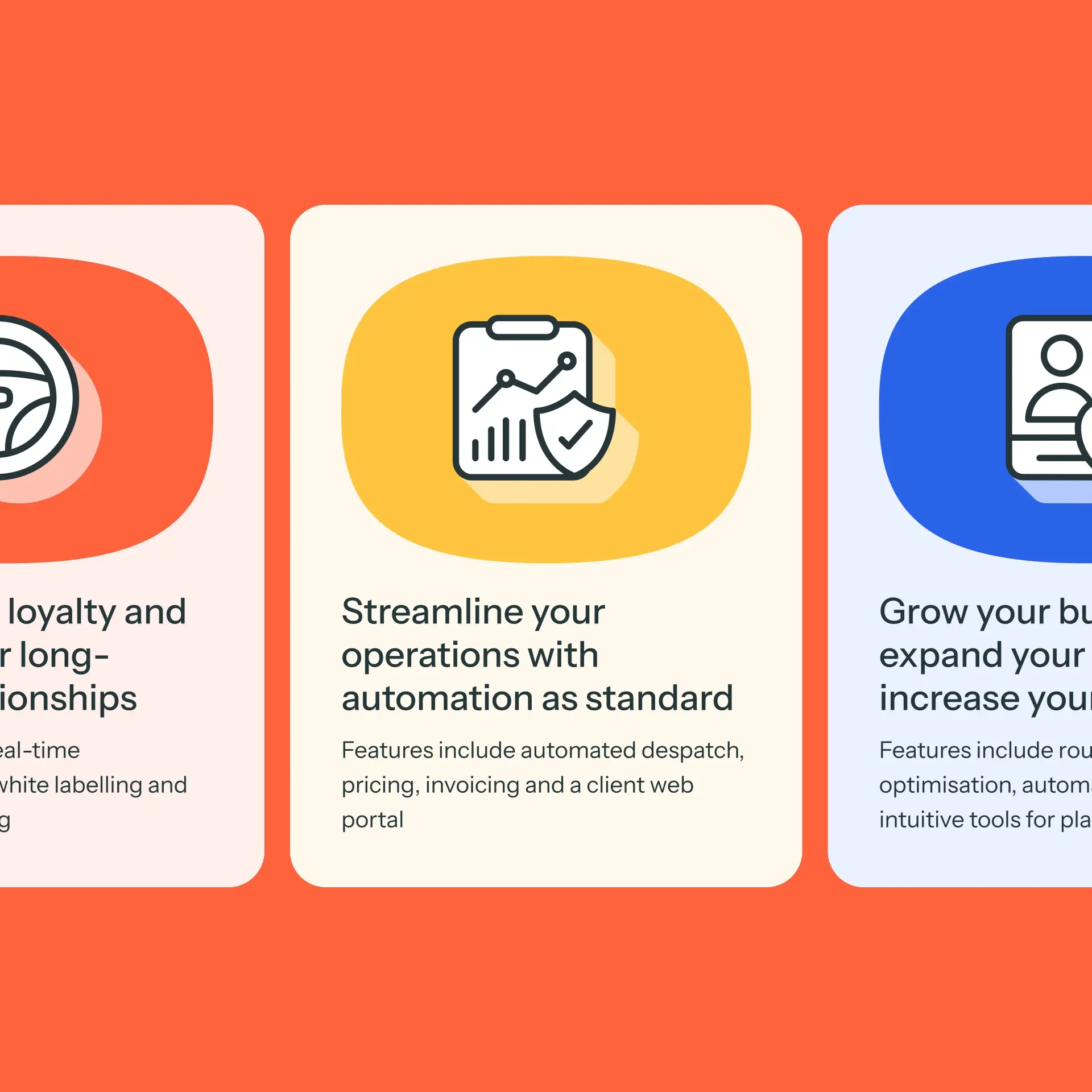
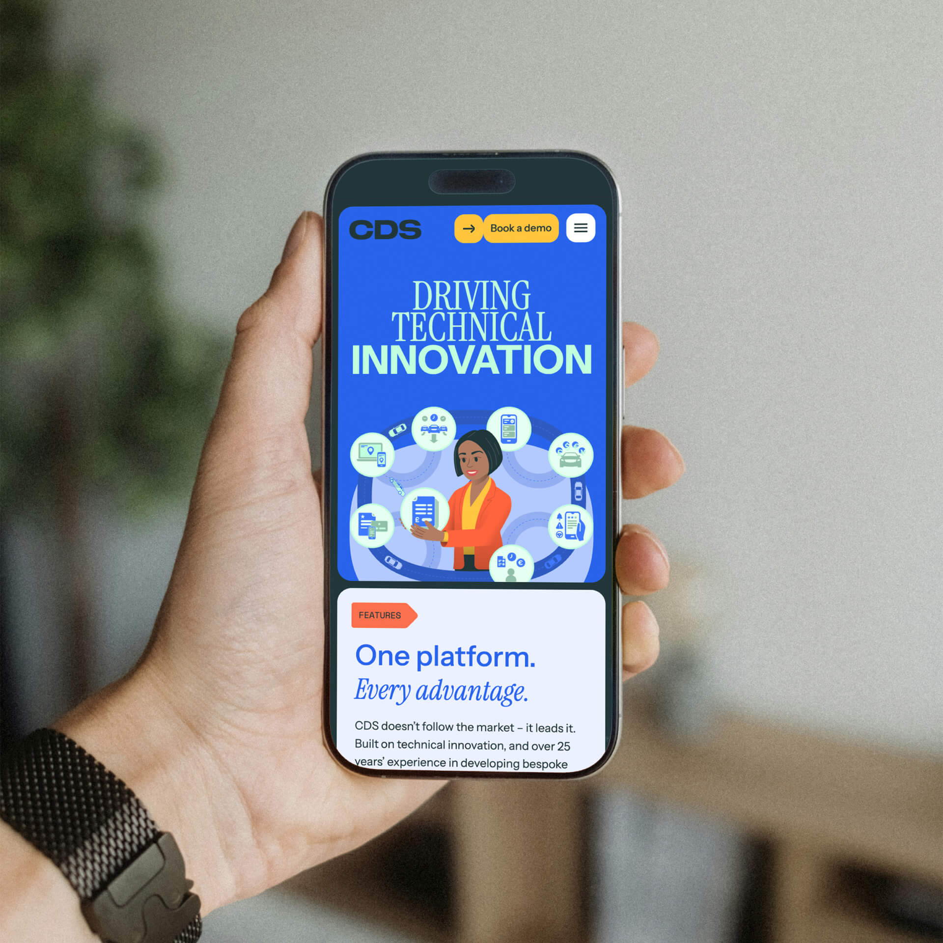
Secondly, through illustration. Created in-house, we visualised each key benefit to demonstrate clearly and quickly their power and potential, putting a user at the heart of each. Additionally, we created an extensive suite of icons covering each key feature, bringing more visual interest and adaptability to the branding as a whole, and the website in particular.
A new website built from scratch
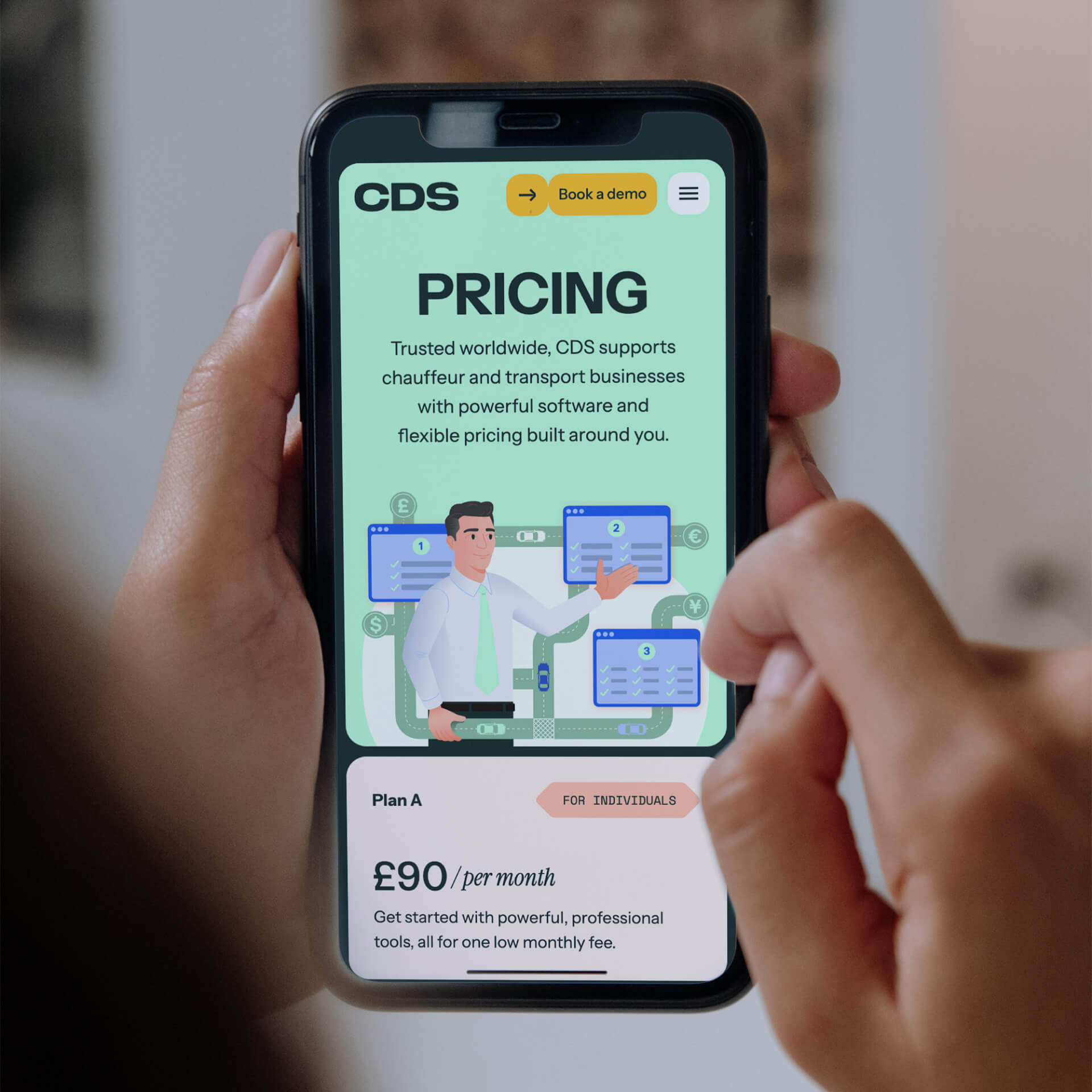
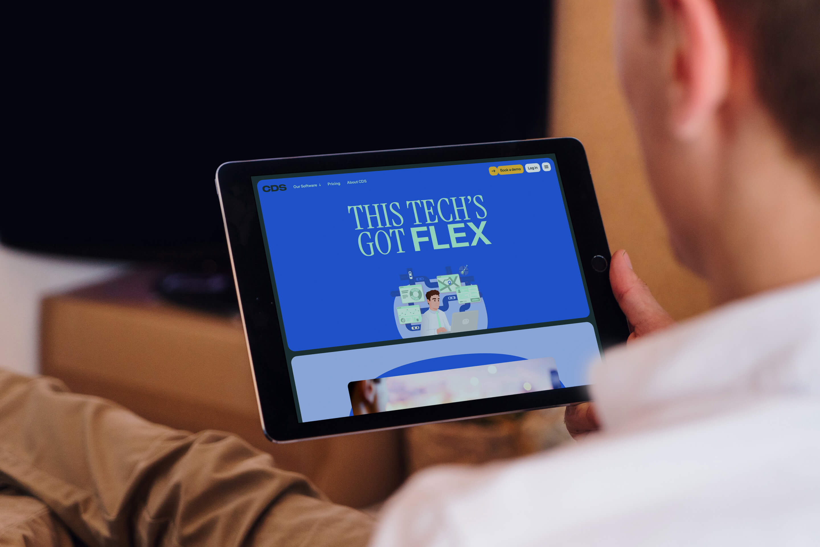
By far the largest manifestation of the new CDS is their new website, designed and built in Umbraco. We worked with the founders to streamline the site plan, cut down content, and make the user journey easier and more intuitive.
Travel
Royal Caribbean
Digital
Travel
ExperienceFirst
Brand
Manufacturing
Calfurn
Brand
Venues
SEC Glasgow
Campaign
Travel
Level Up
Brand
Travel
Audley Travel
Brand
Non-profit
Playlist for Life
Brand
Travel
Barrhead Travel
Campaigns
Education
ICS Learn
Tech