Back
Case study
Upping the game for UK travel professionals
Royal Caribbean

what we did
- Logo design
- Brand naming
- Visual identity
- Website design and build
Royal Caribbean's International Sales Transformation Team equips team members around the world with training in sales, presentation skills, and communication, while ensuring a consistent approach to sales training across the organisation.
We partnered with global travel brand Royal Caribbean to create a new brand identity for the team’s online training offering, including naming, logo design, visual identity, and website design and development.
Moving on up
Our objectives were first and foremost to create a modern brand identity with energy and personality, ensuring it’s aligned with the Royal Caribbean brand, while also remaining distinct. Then, to bring it all to life, we were to design and develop a new website including a host of integrations, enabling users and managers to track learning and achievements in one place.
The name game
Everything started with the name. We facilitated a series of naming workshops to develop names which reflected key themes of progress, confidence, and personal development. The foundation of the platform is to support people building their skills and moving forward in their careers – and after input from the teams involved, Level Up was the overwhelming favourite.

The only way is up
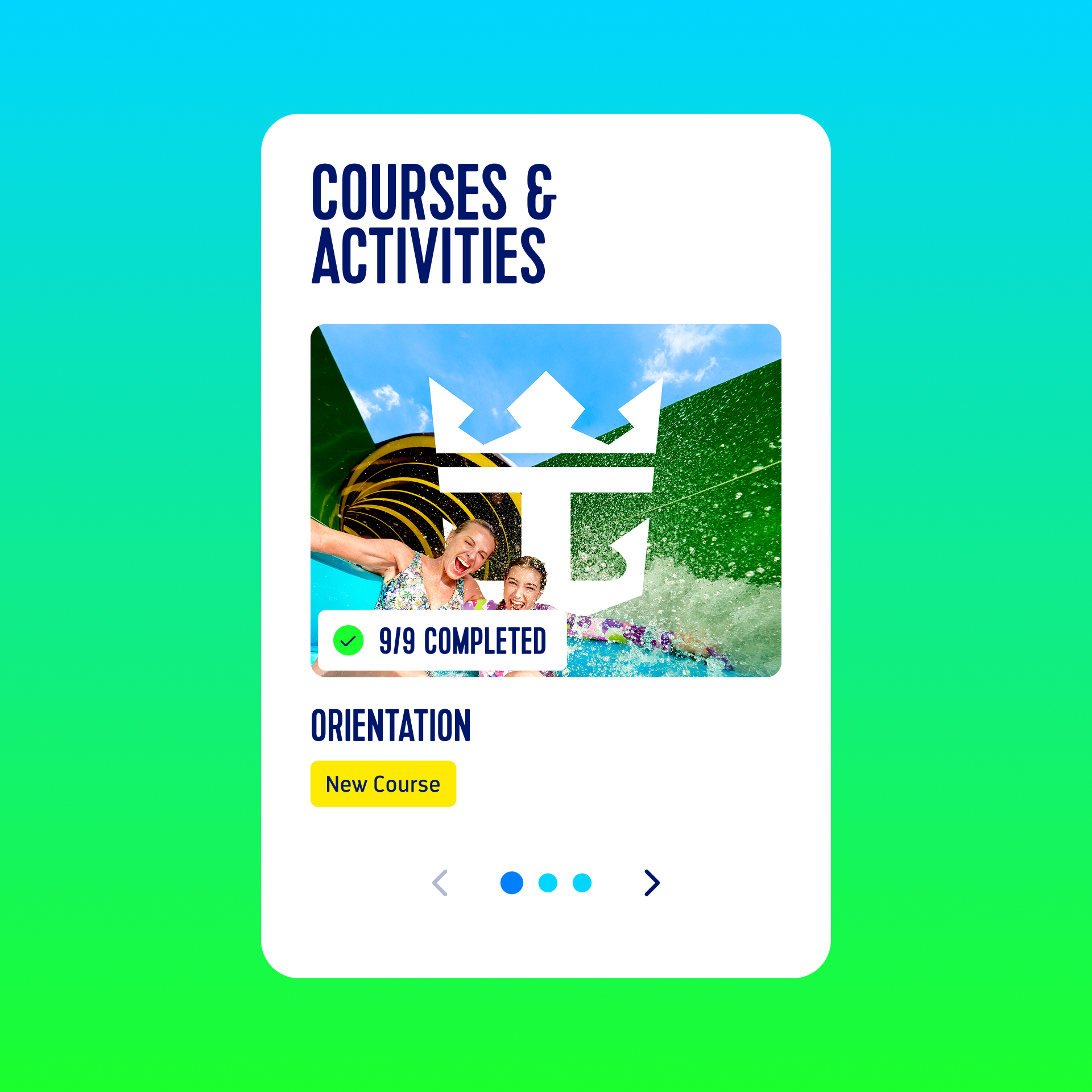
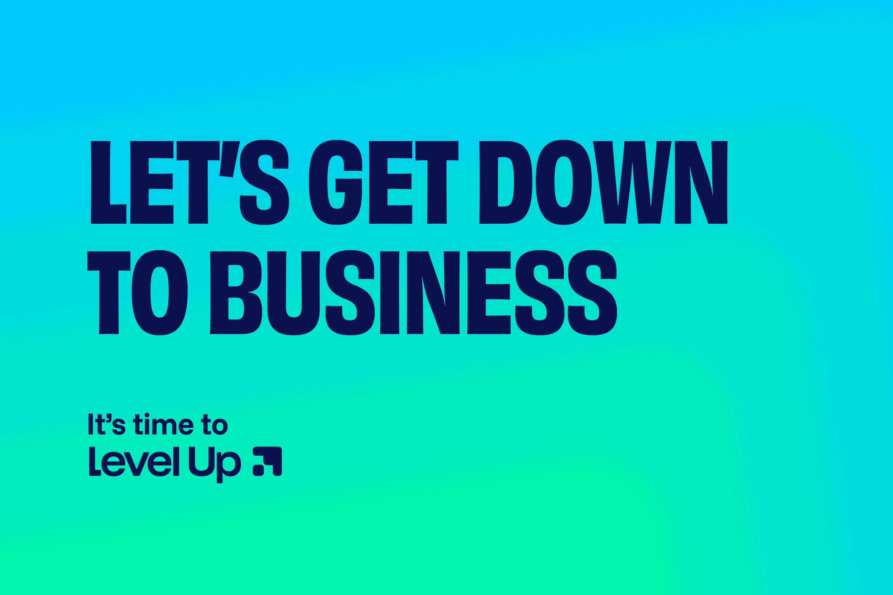
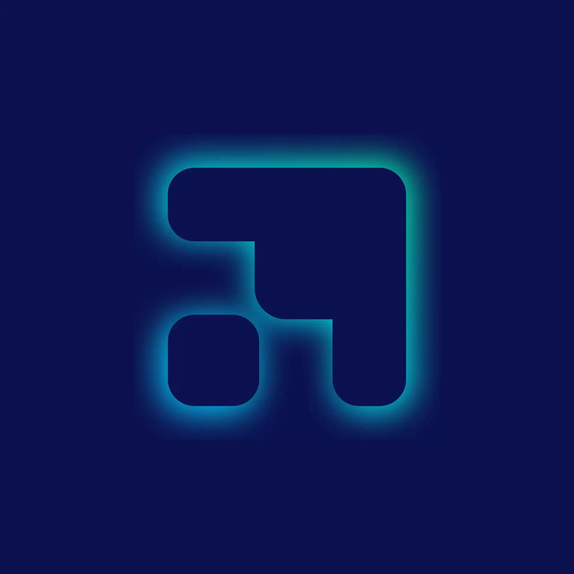
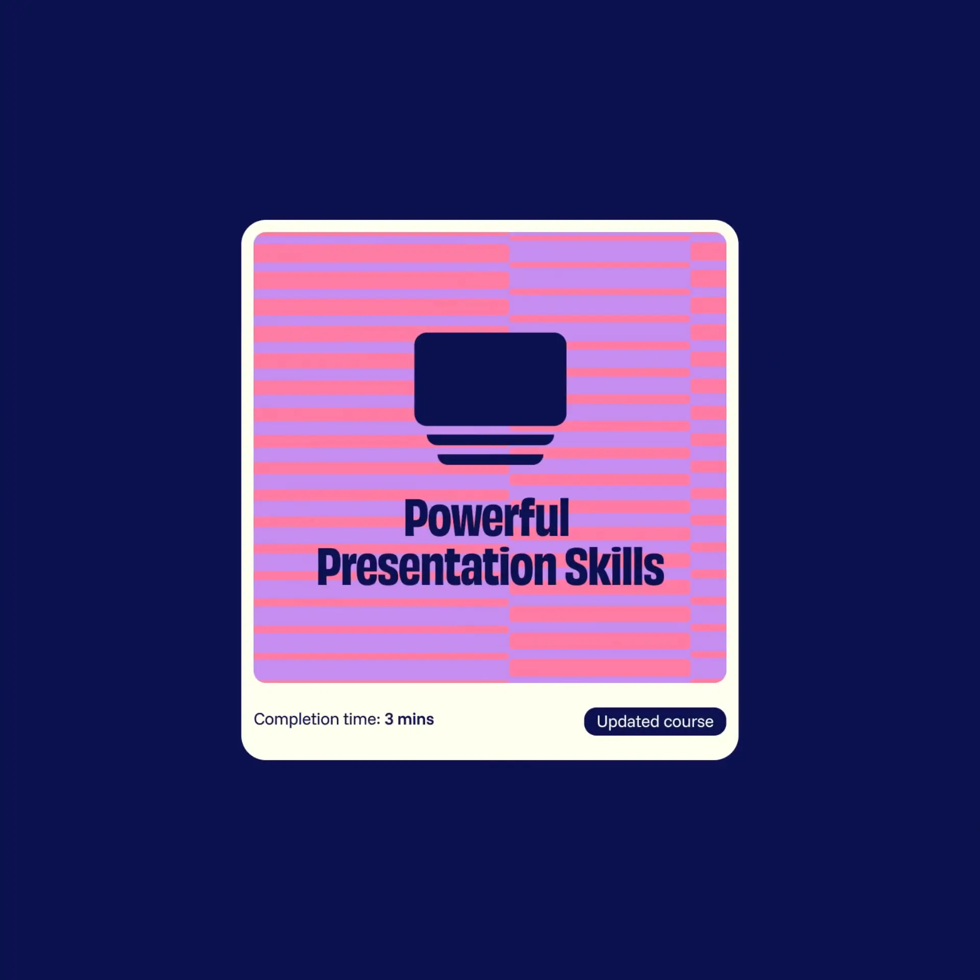
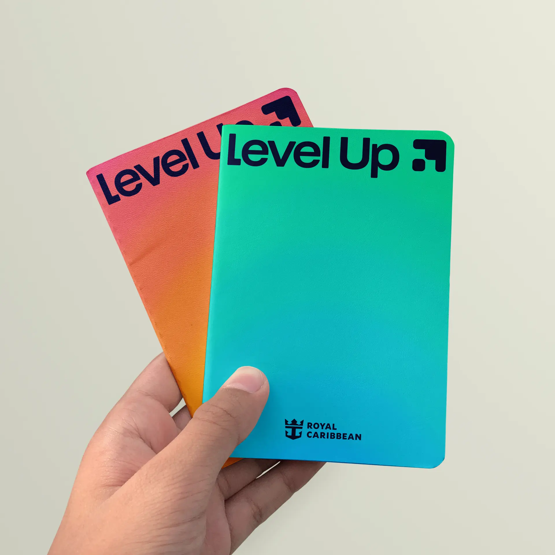
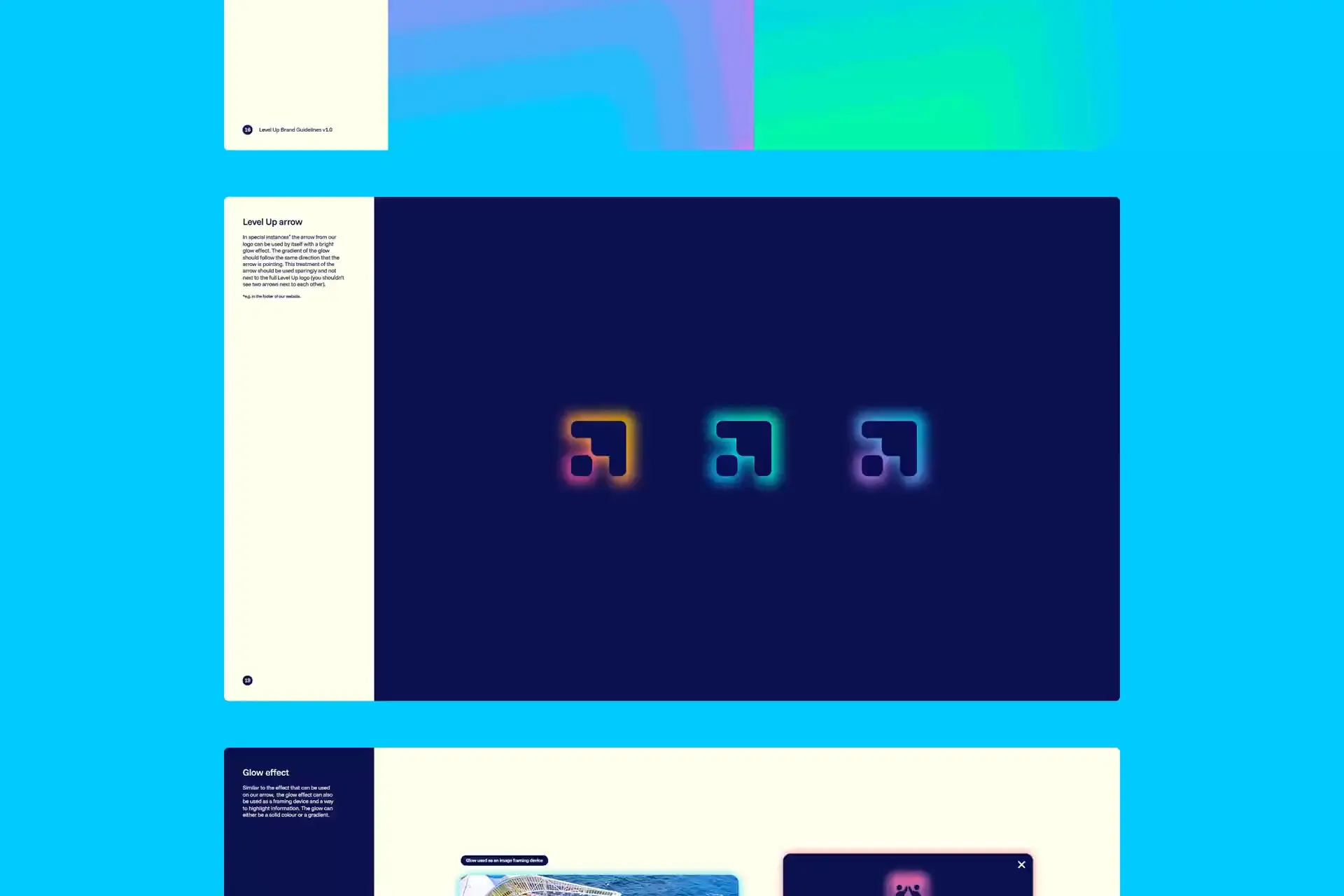
The new name and the feeling of progress and momentum were key when it came to the design. The logo features a chunky, rounded arrow – pointing up and to the right – to clearly signify an upwards trajectory. Anchoring the whole identity are a series of rich, soft, vibrant gradient backgrounds and patterns that subtly do the same. Additional textural, multi-coloured patterns add further variety to the toolkit.
The choice of typeface, Obviously, was selected for its friendly non-corporate-but-not-unserious appearance, and chunky, rounded form. A typeface that feels very in keeping with the main Royal Caribbean branding.
Copy tone of voice also played its part, with the tagline of ‘Let’s Get Down to Business’ a playful nod to the purpose of the platform while countering the platform name’s ‘Up’ with ‘Down’.
The brand in action
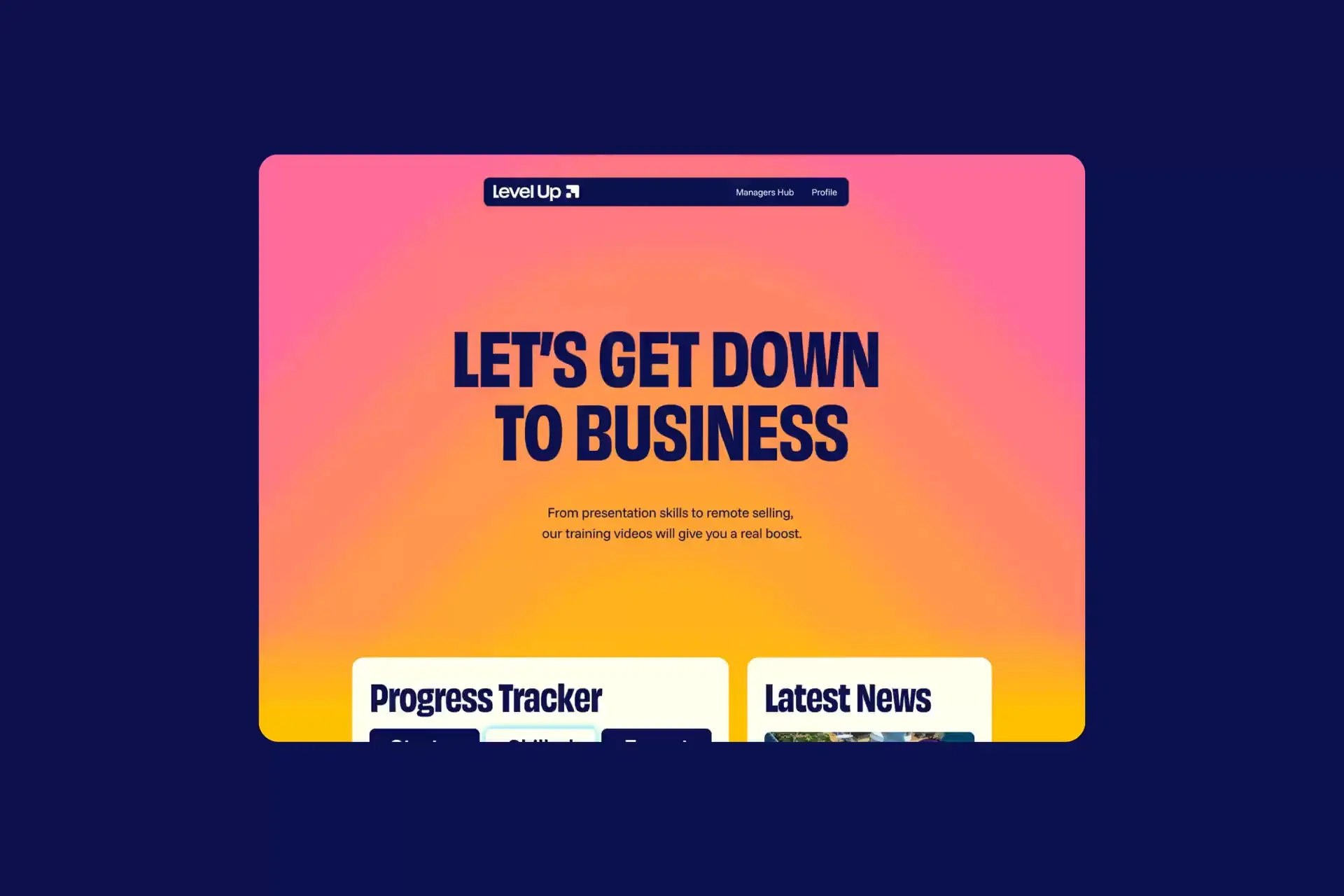
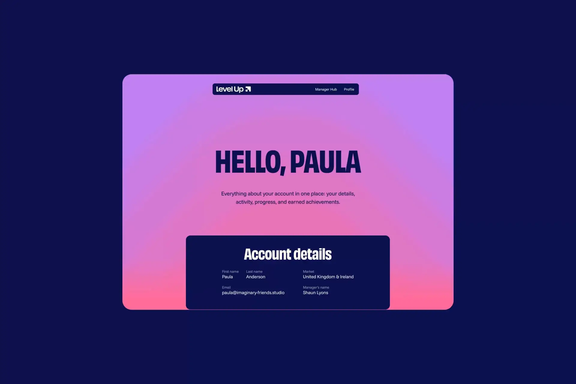
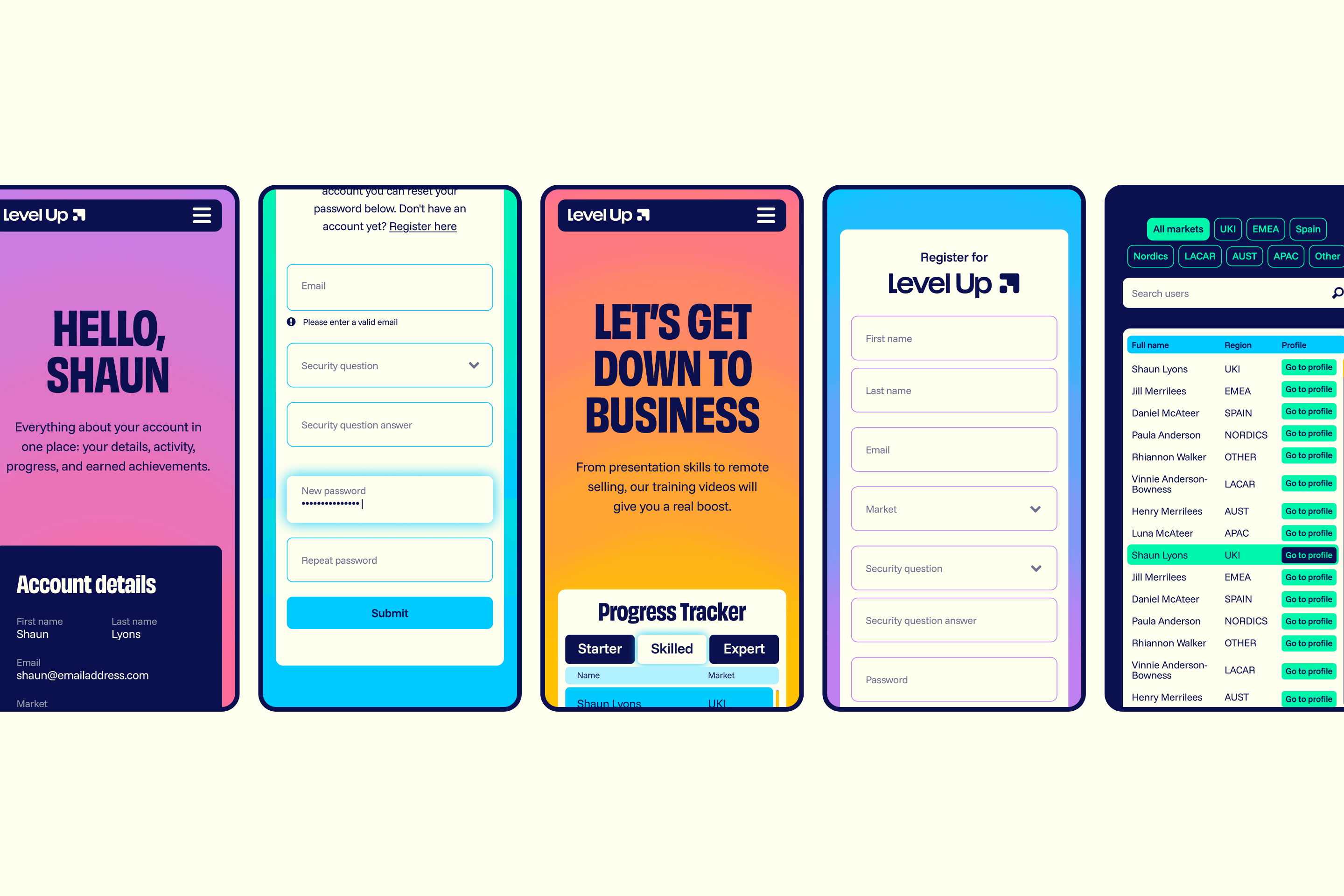
We designed and developed a WCAG AA-compliant platform with a clean UX and intuitive interface. Initial scoping sessions allowed us to plan for a site that feels simple, but that has a more complex architecture sitting behind it.
Behind the scenes, the digital platform integrates data from multiple systems, creating a single source of truth for learner progress, reporting and manager dashboards. Managers can now track their team’s engagement in various training programmes in one place; with detailed reporting to show individual performances.
A job well done
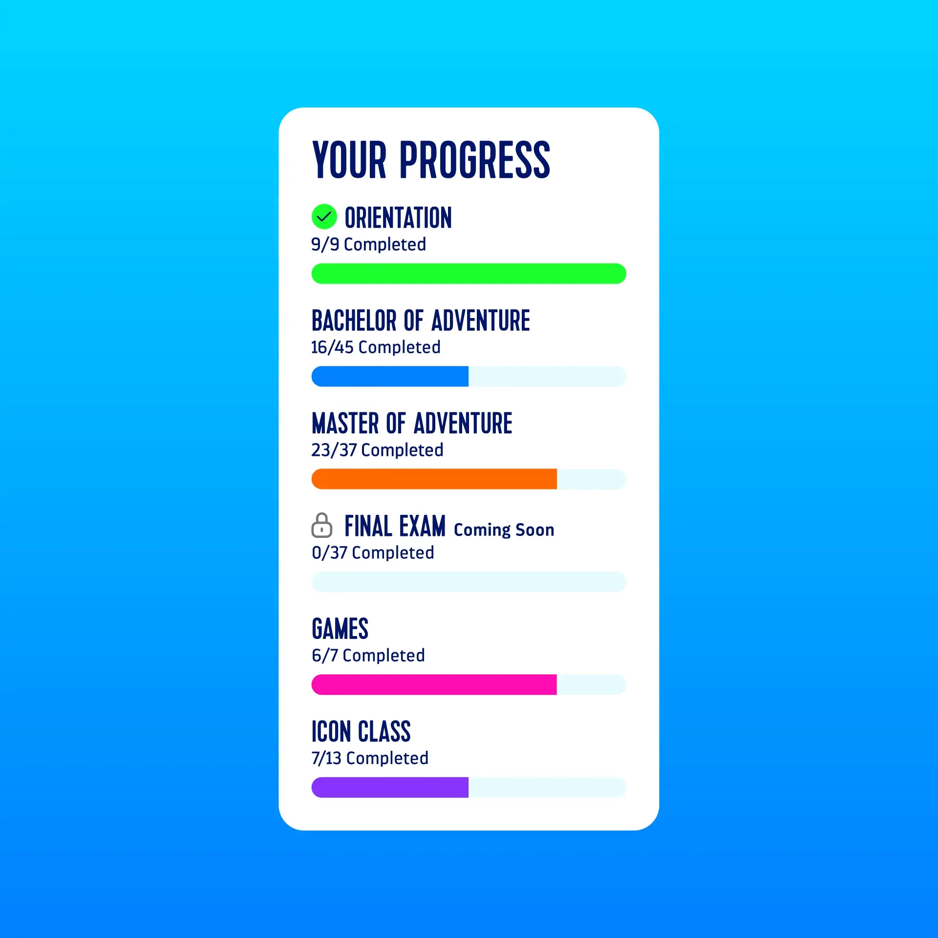
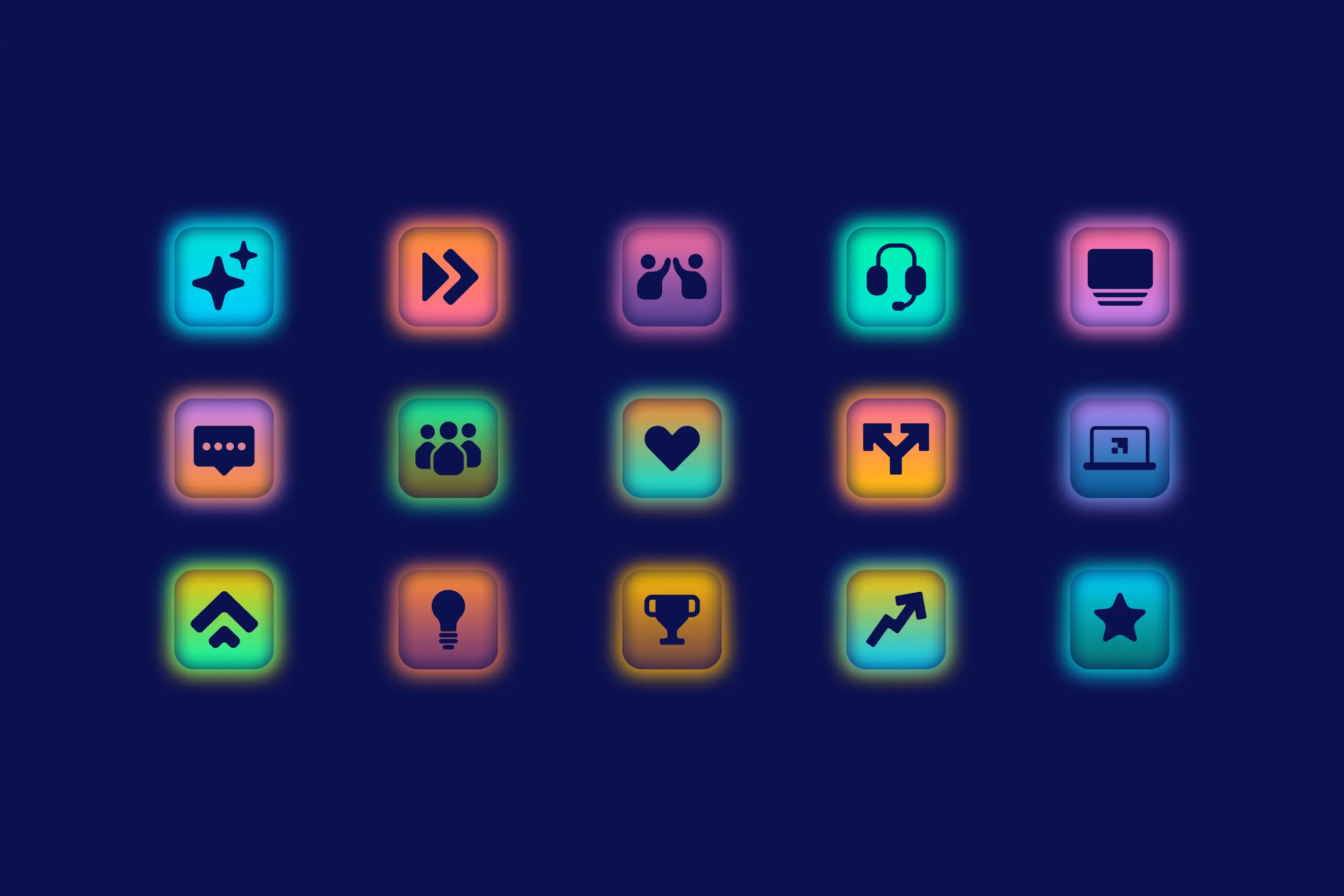
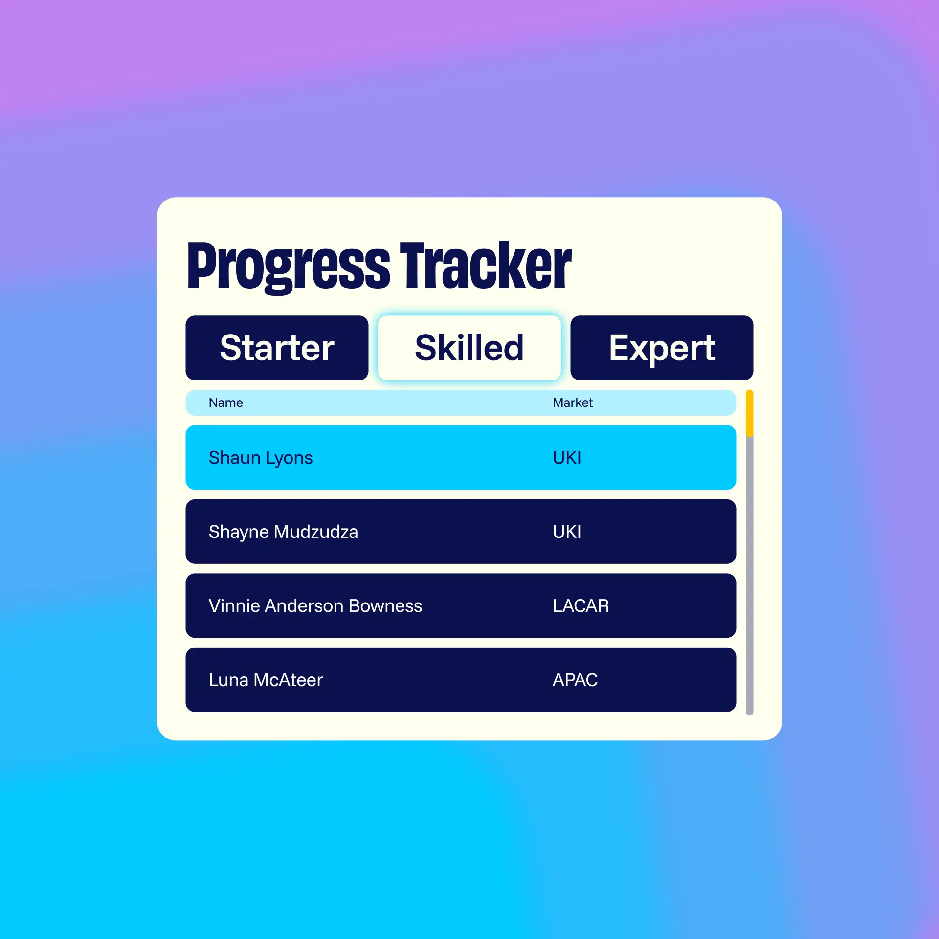
We designed an extensive suite of achievement badges for users to collect as they complete courses. The homepage features a progress tracker which allows users to see their progress move from ‘starter’ to ‘skilled’ to ‘expert’ as they earn more badges. The focus is very much on self-improvement rather than competition with other users.
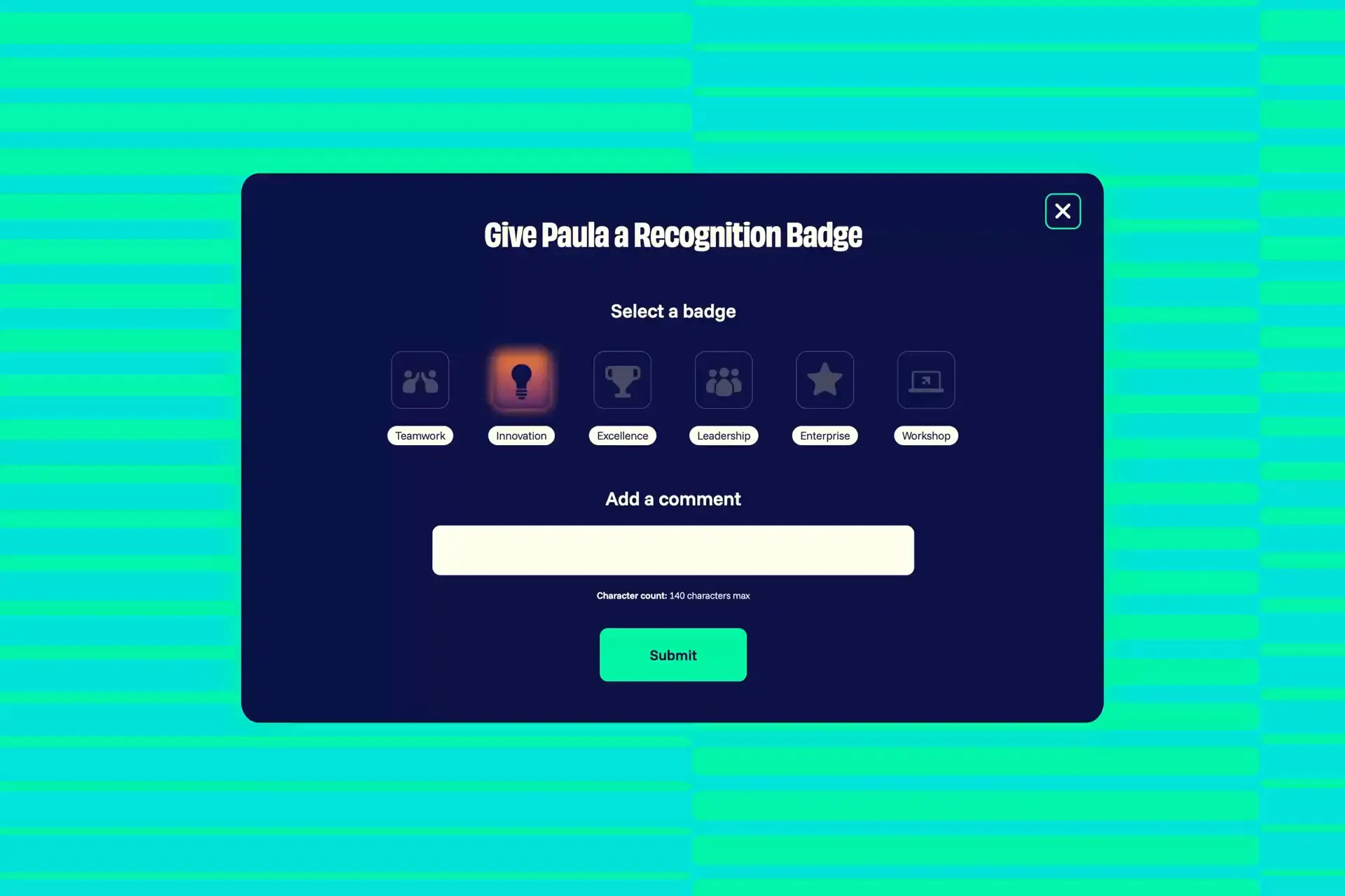
Training is only one part of the journey: applying that training within the job role is what it’s all about. Our platform enables managers to award individual recognition badges to team members who go the extra mile and showcase their learning in their role.
Teamwork makes the dream work
We always enjoy continuing our partnership with Royal Caribbean, and creating a brand that will be seen by colleagues around the world made this a particularly rewarding project.
“Imaginary Friends didn't just build us a website; they helped us create an entirely new identity for our International sales learning programme. Their creativity, partnership, and ability to bring our vision to life exceeded every expectation. Level Up is something we're incredibly proud of, and Imaginary Friends played a huge part in making that happen.”
Shaun Lyons
Sr. Manager, International Sales Transformation
Royal Caribbean
Education
ICS Learn
Tech
Venues
SEC Glasgow
Campaign
Non-profit
Playlist for Life
Brand
Travel
First Bus
Motion
Non-profit
MCR Pathways
Digital
Travel
ExperienceFirst
Brand
Travel
Royal Caribbean
Digital
Manufacturing
Calfurn
Brand
Non-profit
Queen's Nursing
Digital