Back
Case study
A website to support nurses and midwives
The Queen's Nursing Institute Scotland
what we did
- Mobile-friendly & accessible website
- Website design and build
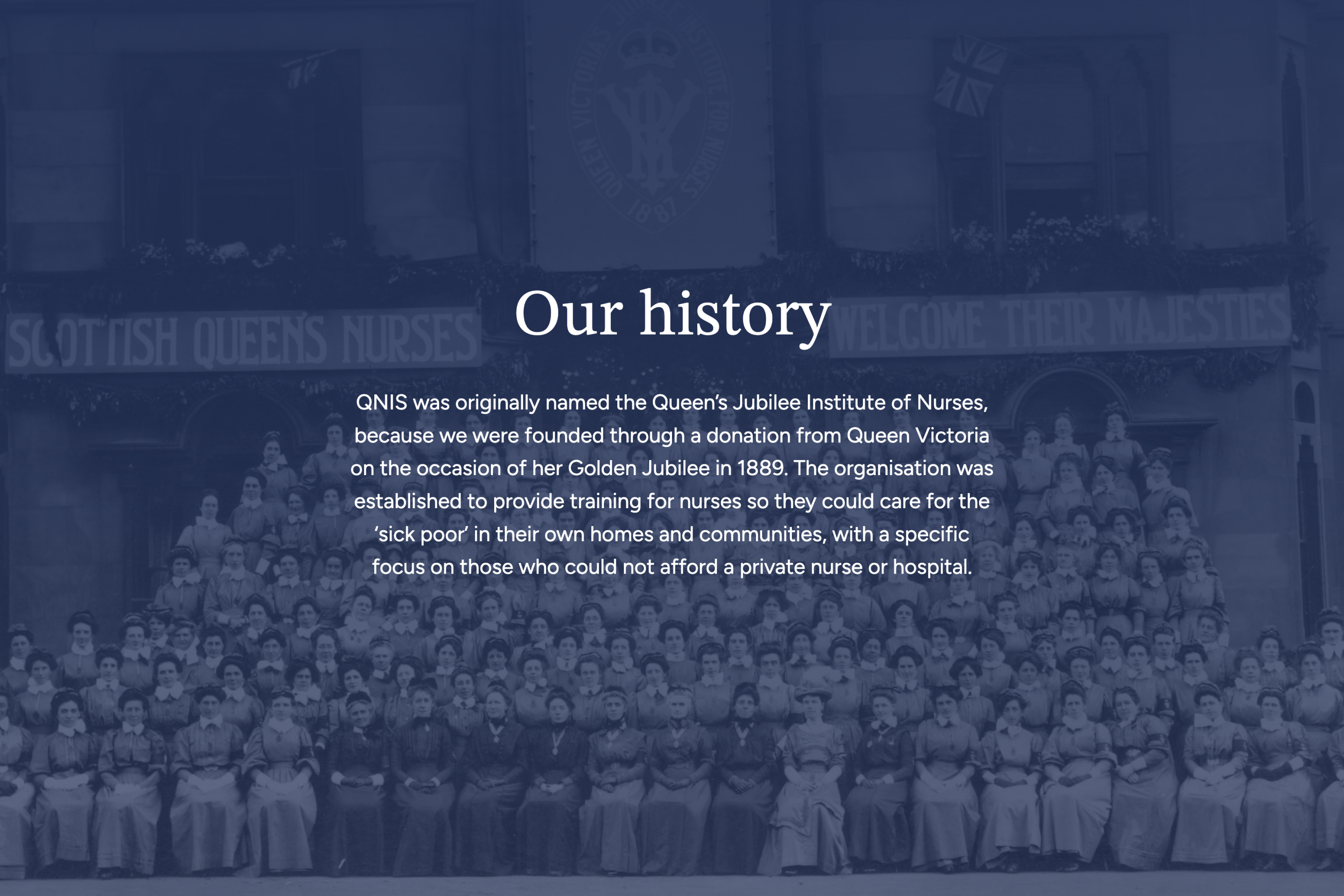
The Queen’s Nursing Institute Scotland (QNIS) has been a cornerstone of community healthcare since 1889. As a charity dedicated to supporting nurses and midwives, they champion the professional growth and wellbeing of those caring for individuals, families, and communities across Scotland. Their mission today remains as vital as ever – working to reduce health inequalities and strengthen Scotland’s healthcare.
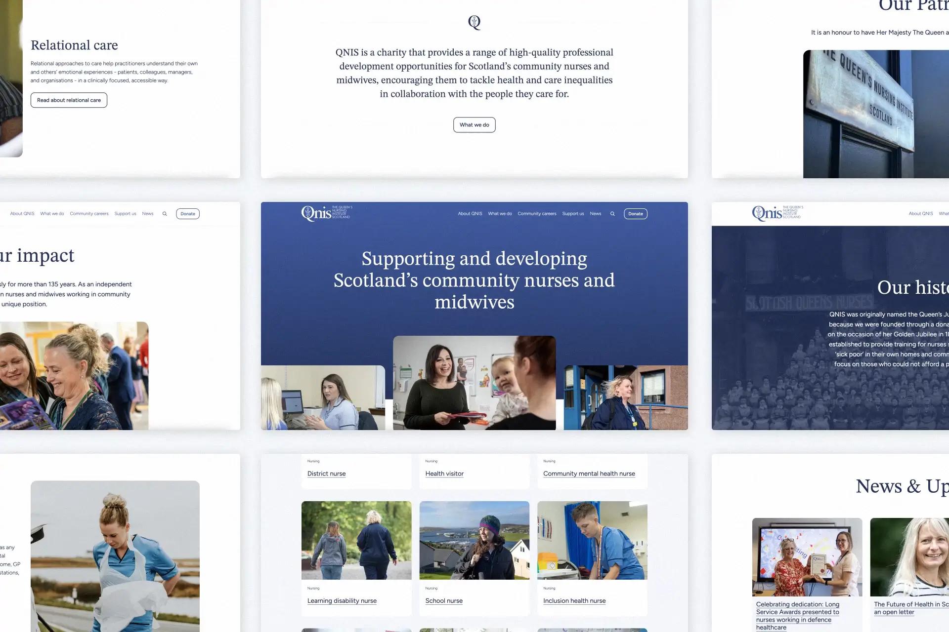
A Trusted Partnership
When QNIS decided it was time to refresh their website, they sought more than just a facelift – they wanted a reliable digital partner who could support them long-term. After exploring several agency options, we were thrilled they chose to work with us. Our main priorities were to enhance site security and create a more intuitive user experience. This included clearer signposting and streamlined user journeys to help visitors find exactly what they needed, quickly and easily.
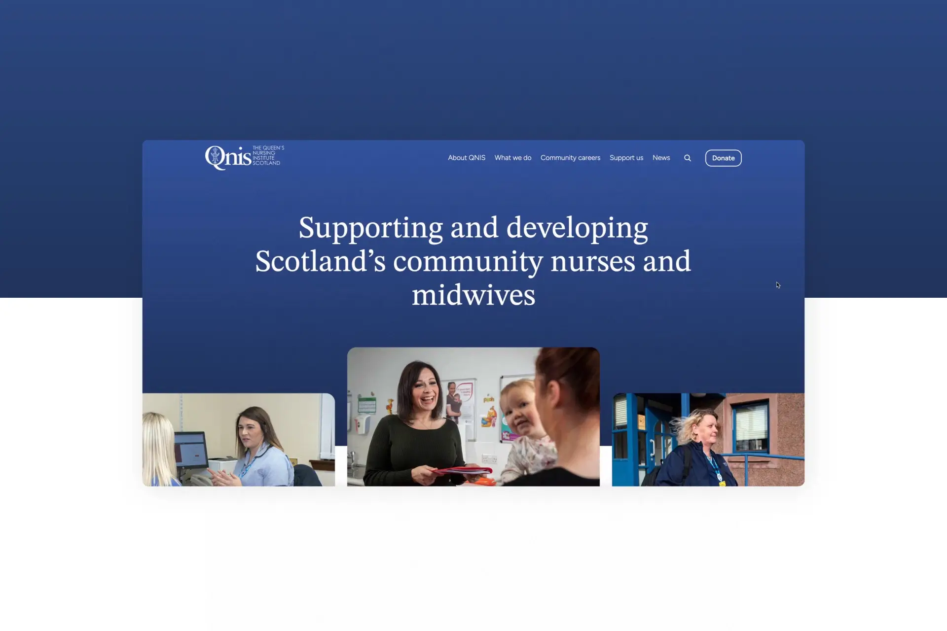
Designing with Care
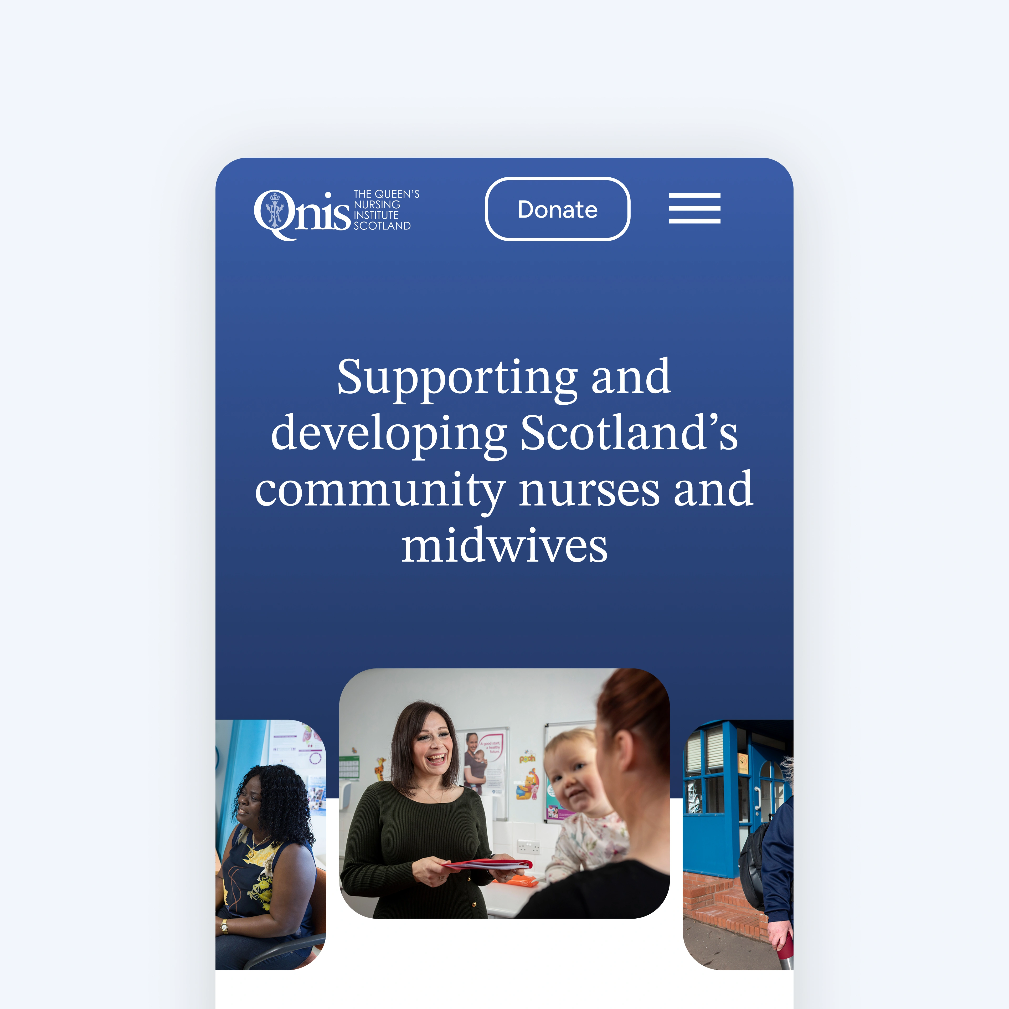
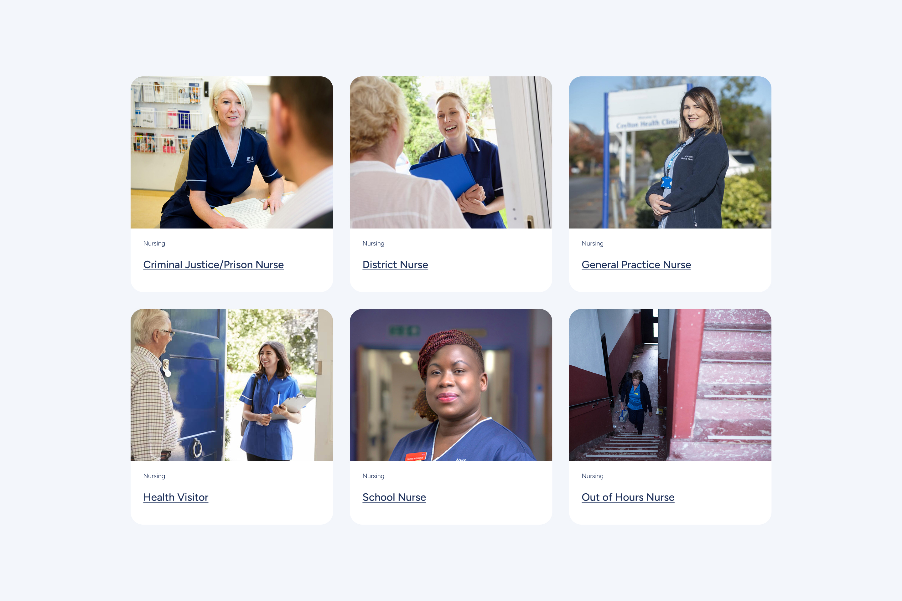
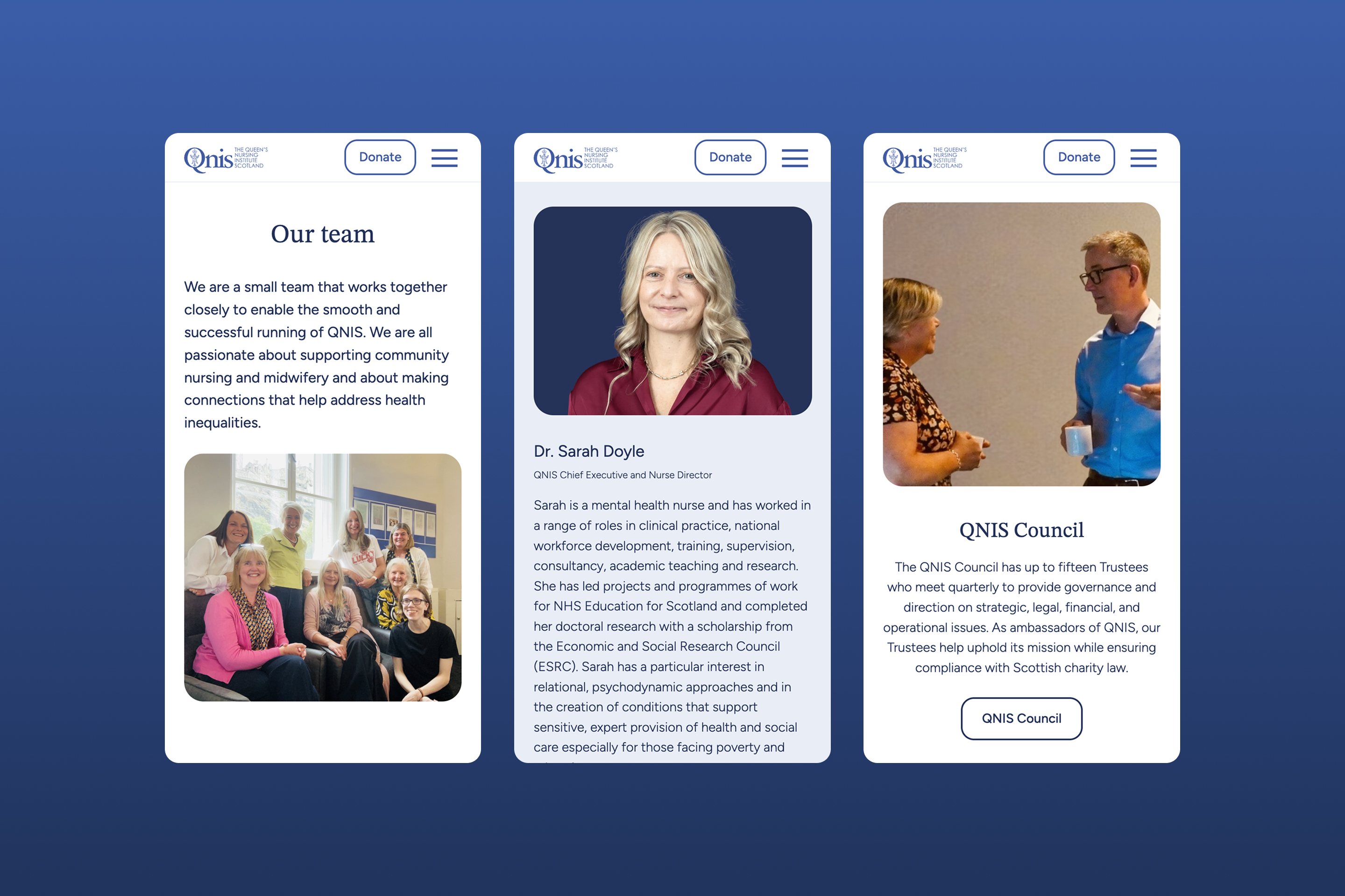
QNIS already had an established brand identity, which we integrated thoughtfully into the new design. We focused on creating a website that felt welcoming and easy to navigate for a wide range of users, whether they were newly qualified nurses seeking career advice, retired nurses staying connected, or policymakers looking for information.
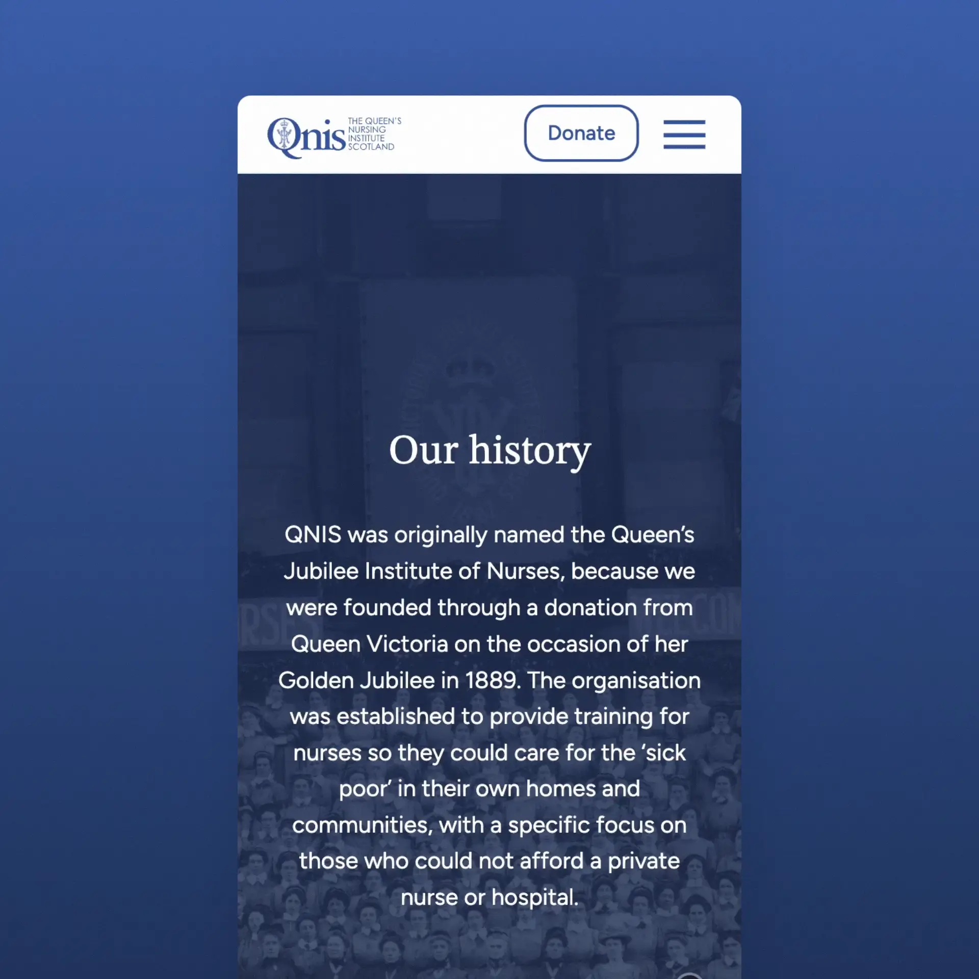
Simpler and more intuitive
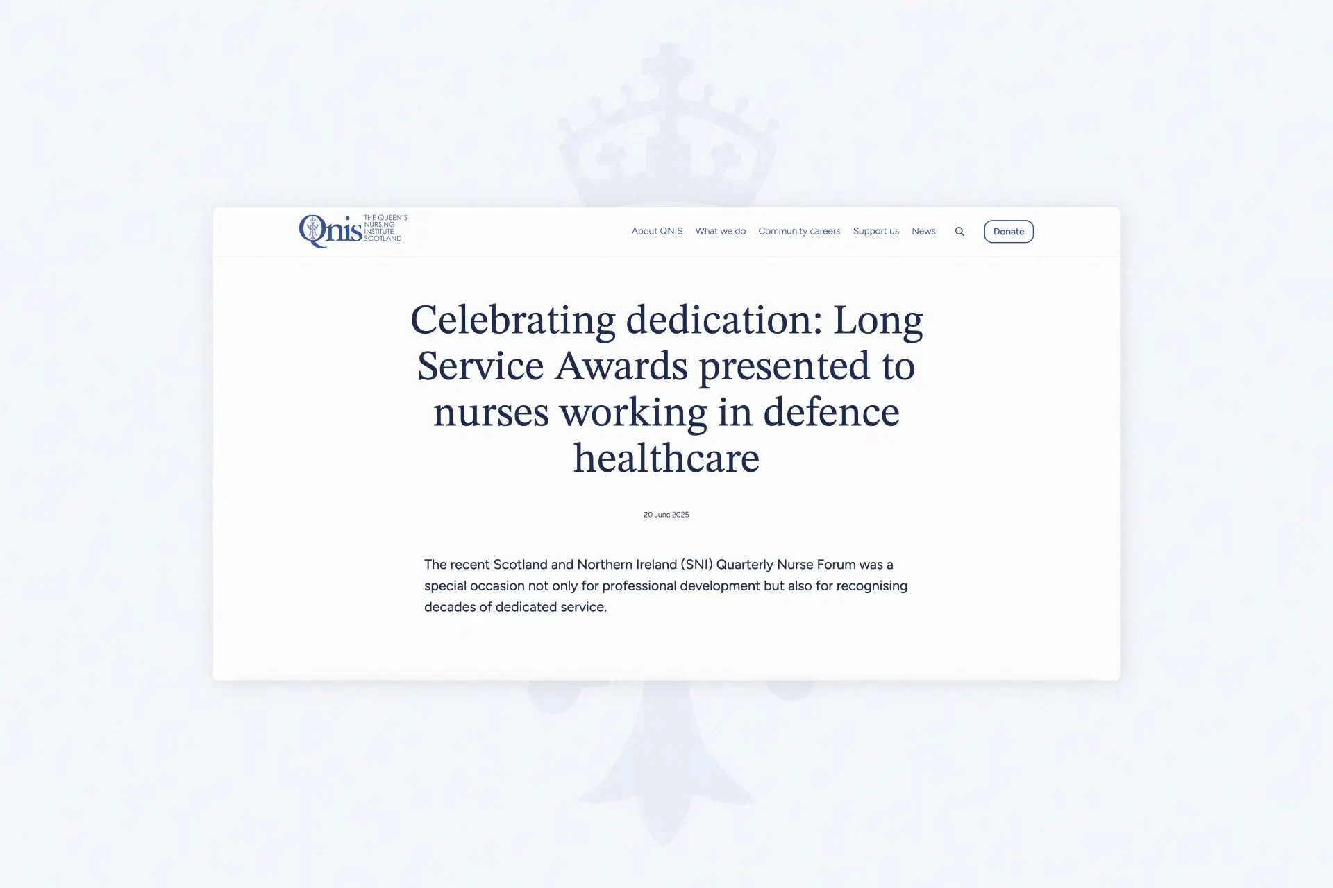
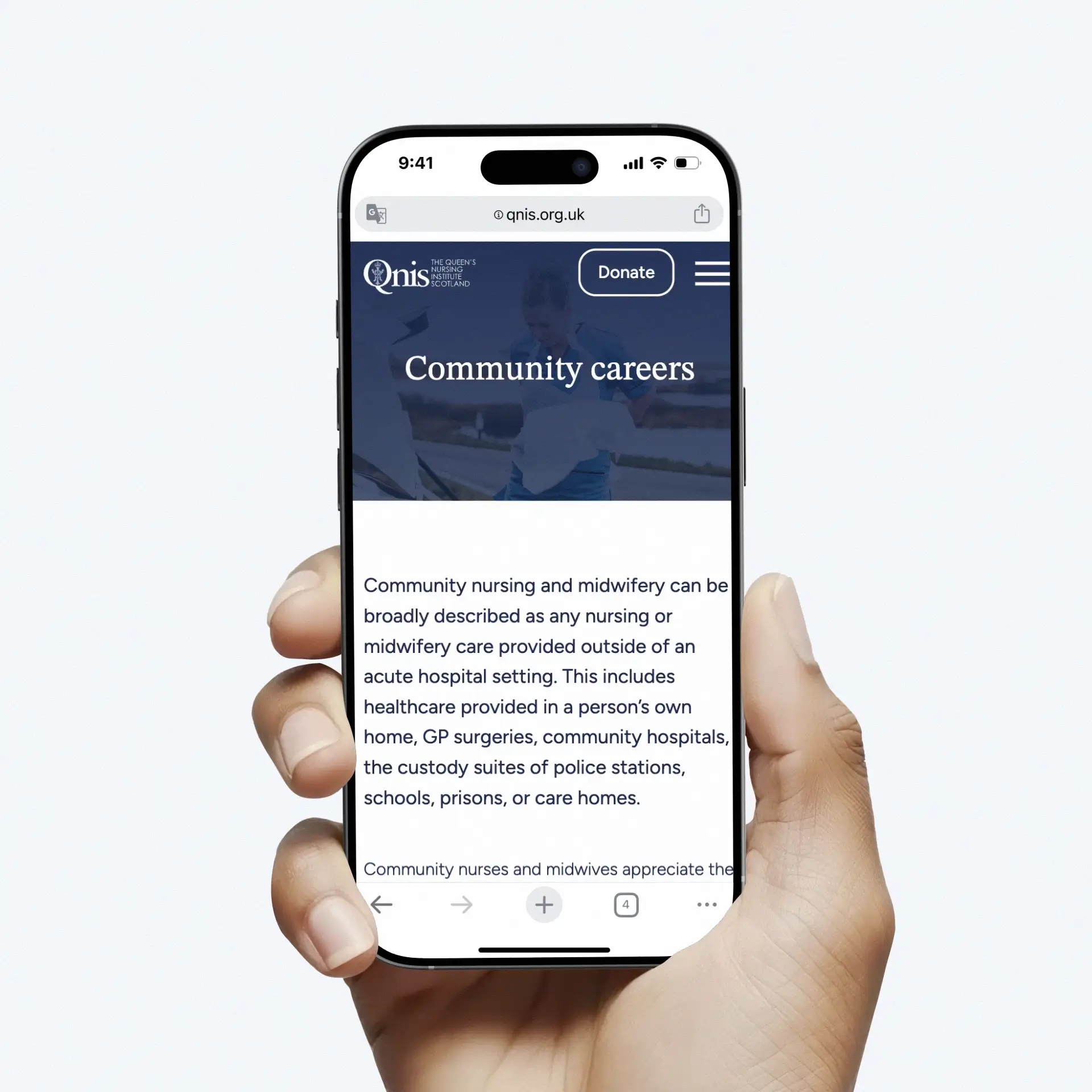
Making it easy for users to find the right content was central to our approach. We restructured the site’s information architecture and introduced a more intuitive navigation system. Content flows were simplified, key calls to action were prioritised, and the use of clean layouts and clear visual hierarchies helped reduce cognitive load.
A critical focus area for us was the donation process which is vital for third-sector organisations like QNIS to sustain and deliver their services. We streamlined this journey to ensure it was quick, user-friendly, and frictionless.
Built to Last
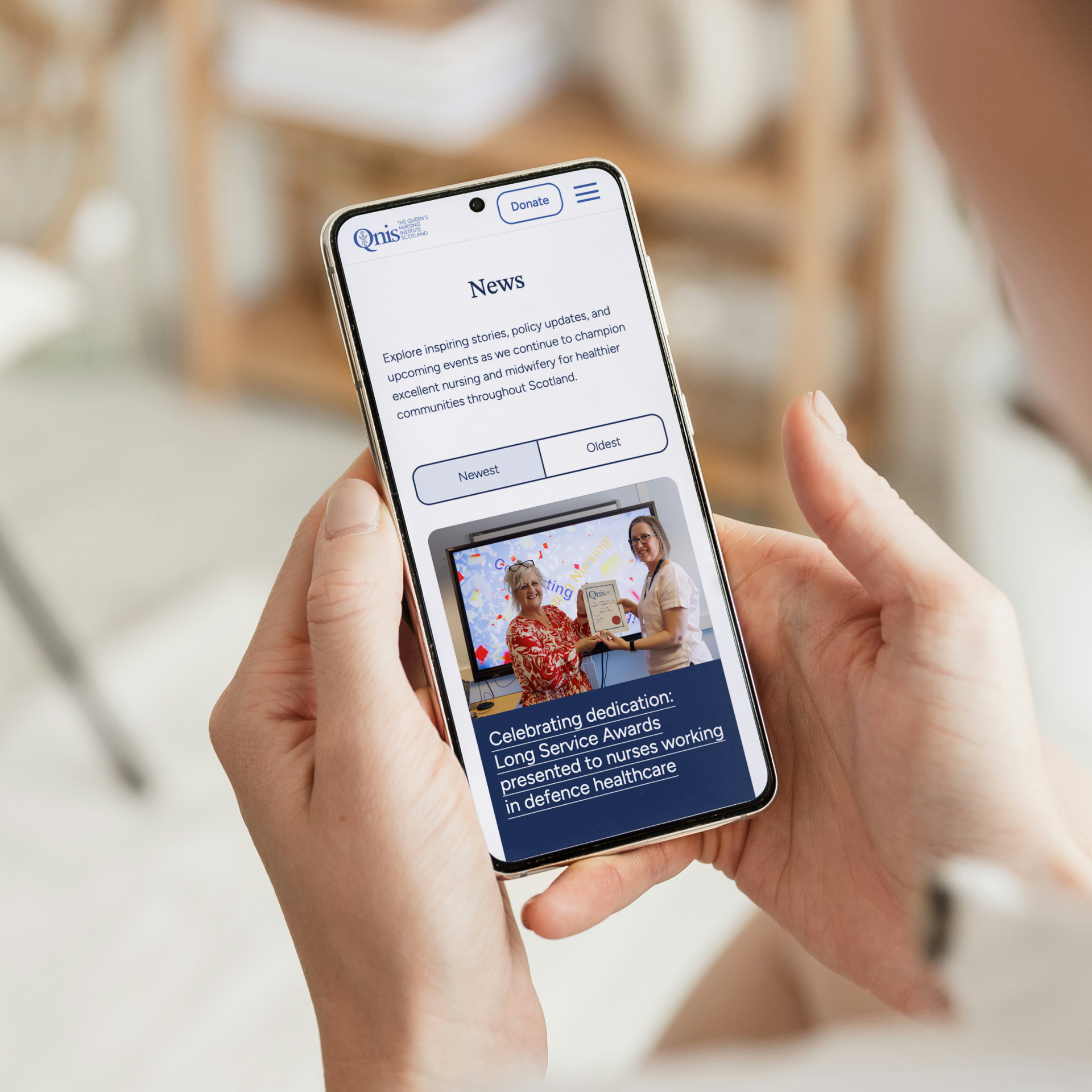
As QNIS actively champions equity, diversity, and inclusion, accessibility was a key focus. We built the site to meet WCAG Level AA standards, ensuring usability for all. Features such as 'Skip to Content' links, visible focus indicators, and descriptive alt text contribute to a seamless and accessible experience.
We also added a user-friendly CMS with advanced features like focal point selection for images and fully dynamic elements, making it easier and faster for the QNIS team to manage and update the site. To maintain visual consistency, we built a custom 12-column CSS raster grid, and subtle AOS animations gave the site a polished, fluid feel as users scroll. Lastly, its future-proof structure allows the client to expand the site as their needs evolve.
Ready for the Future
The end result is a website that feels modern and welcoming while showcasing the important work QNIS does. It tells their story clearly, supports their fundraising, and allows a diverse community to find the information they need.
For our team, this project was a rewarding collaboration and a fantastic opportunity to help QNIS continue their impressive work across Scotland. We’re proud to have delivered a website that’s accessible, intuitive and built to grow alongside QNIS’s mission.
"We are delighted with our new website, it looks modern and fresh. We really appreciated how Imaginary Friends took time to understand us as an organisation, and this is reflected in the design that they created for us."
Sarah Doyle
Chief Executive and Nurse Director
QNIS
Manufacturing
Calfurn
Brand
Non-profit
Playlist for Life
Brand
Travel
Air New Zealand
Campaign
Travel
ExperienceFirst
Brand
Non-profit
MCR Pathways
Digital
Travel
MagiKit
Digital
Education
ICS Learn
Tech
Travel
First Bus
Motion
Travel
Royal Caribbean
Digital